Doctrine
VirusFonts stellt seine neue Schrift Doctrine vor, die außergewöhnlich klassisch daher kommt – der Name bleibt aber Programm. Auf dem Barnbrook Blog erhaltet ihr viele Informationen und Hintergründe zur Schrift.
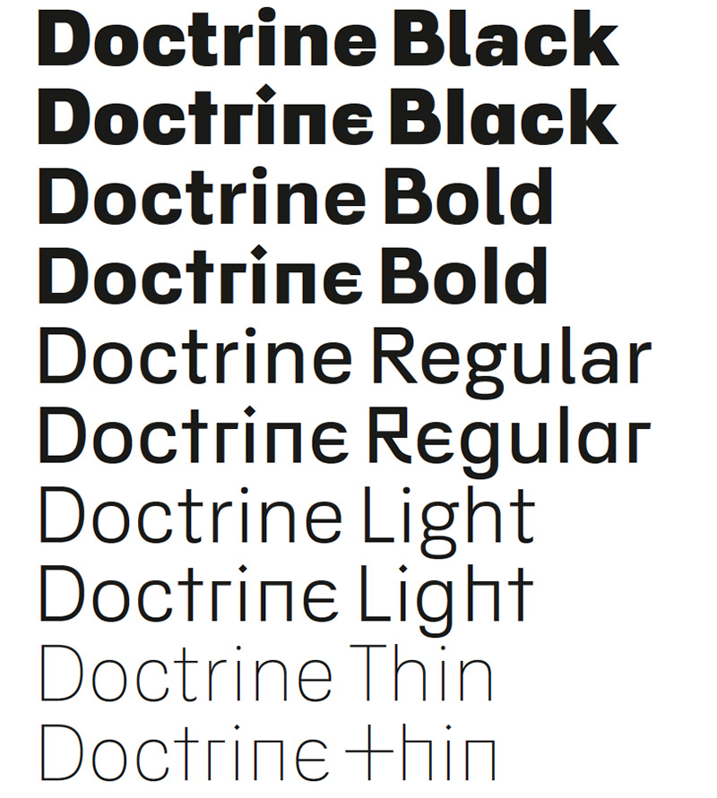
Pressetext: A contemporary sans-serif typeface with an agreeable character, Doctrine Sans is the moderate comrade of the display typeface Doctrine Stencil. From the obscure starting point of the North Korean national airline livery, Doctrine has grown to encompass a series of more mature typographic influences. By blending elements of twentieth-century neo-grotesque, humanist and geometric styles, Doctrine is at once universal and idiosyncratic. Including a vast array of ligatures and alternate characters in five weights ranging from thin to black, Doctrine is capable of handling a multitude of testing typographical situations.
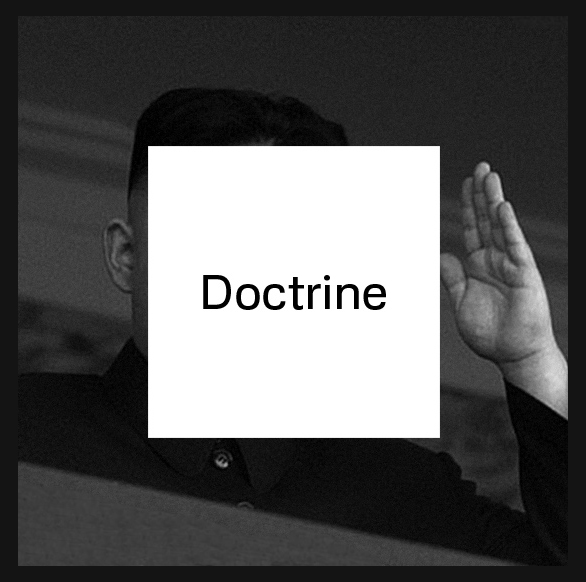
VirusFonts has long been interested in the link between ideology, language and typography, and it is this concept that inspired the creation of a new typeface. Following an extreme isolationist and authoritarian ideology, North Korea – the world’s last Stalinist state – affords its population little freedom of movement. Considered by many to be a fundamental human right, air travel facilitates freedom of mobility between states. Air Koryo, the state-owned national flag carrier airline of North Korea, therefore appears to be somewhat of an oxymoron. With an unsurprisingly dubious safety record and dismal reviews, Air Koryo is not held in high regard, yet there is something wonderfully naive about its attempt to look like a serious airline. Central to this venture is its rudimentary aircraft livery and branding – often crude in application and at times, even looking hand-painted. Once taking the form of a functional stencil typeface, the logo has now metamorphosed into a modern sans-serif. This peculiar conceptual mix – part political philosophy, part corporate branding – inspired the development of a contemporary, human interpretation of the neo-grotesque model, that most ideological of typographic forms.
Escaping beyond the conceptual, political and historical starting points, numerous typographic references have informed the framework of Doctrine. Inspired by mid-twentieth-century modernist idealism but guided by post-modern relativism, Doctrine has evolved into a twenty-first century utopian sans-serif. Pursuit of utopian perfection suggests a purity, or purification — an eradication of extraneous detail — yet, in contrast, the ideology of Doctrine is one of inclusion. The inclusive approach allows a curious blend of modernist, geometric and humanist forms to coalesce in contemporary style.
Doctrine
Foundry: VirusFonts
Designer: Jonathan Abbott, Jonathan Barnbrook, and Julián Moncada
Veröffentlichung: 2013
Format: OpenType
Schnitte: Thin, Light, Regular, Bold, Black
Preis: pro Schnitt $80, Familie $217