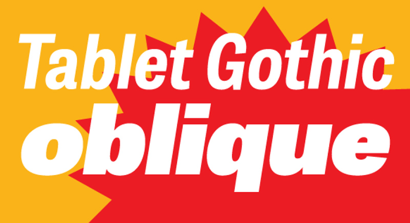
Tablet Gothic Oblique
Veronika Burion und José Scaglione von TypeTogether erweitern ihre beliebte Schriftfamilie Tablet Gothic um einen weiteren Schnitt: Tablet Gothic Oblique. Der neue Schriftschnitt zeichnet sich durch seinen robusten einfachen und sauberen Stil aus.
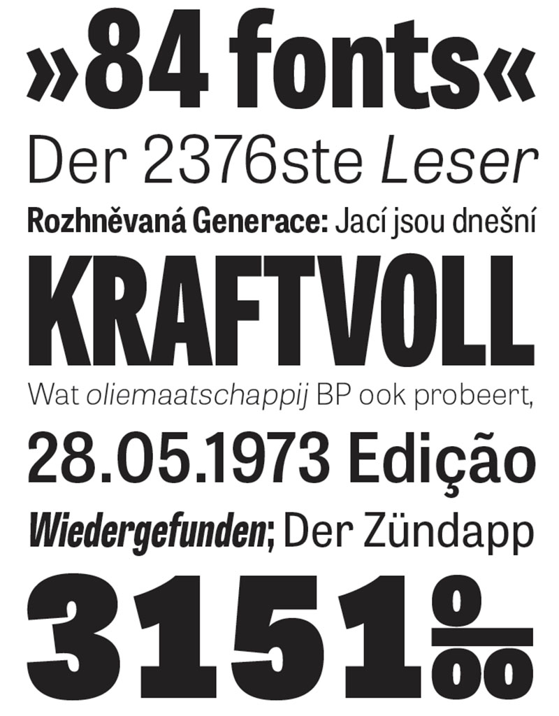
Pressetext: Tablet Gothic was originally engineered as a titling type family, meant to help designers working on publications that require output as hard copies and a variety of digital platforms at the same time. As such, it is a grotesque sans serif that looks to the future of publishing with a clear understanding of its history, and reminiscences that go back to nineteenth century Britain and Germany.
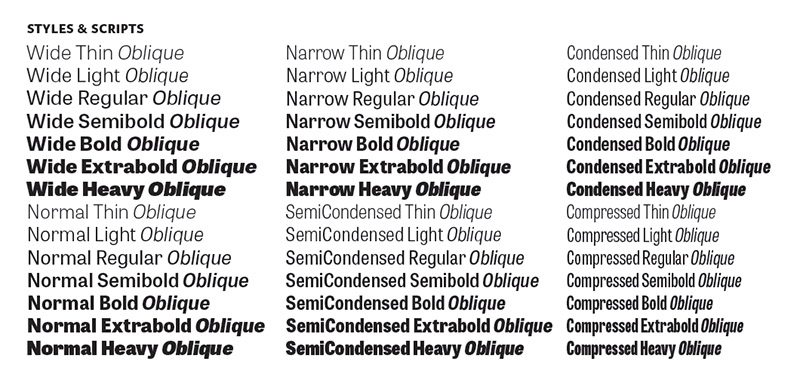
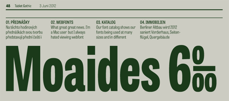
Tablet Gothic delivers the sturdy, straightforward and clean appearance expected from a grotesque, but it allows itself a good measure of personality to make it stand out on the page. Its 84 styles –six series of condensation and seven weights in each series plus obliques– guarantee that, whatever the publication format is, there's a Tablet Gothic font that will do the job and perform well both technically and aesthetically. Furthermore, the rounder styles, Tablet Gothic Wide, Normal and Narrow achieved amazing results at very small sizes, producing a beautiful texture and highly readable text blocks.
Tablet Gothic
Foundry: Typetogether
Designer: Veronika Burion, José Scagline
Veröffentlichung: März 2013
Format: OpenType
Schnitte: Thin, Heavy, Condensed, Compressed Variante, Thin Oblique
Preis: € 35 pro Schnitt und das ganze Tablet Gothic Bundle für € 799