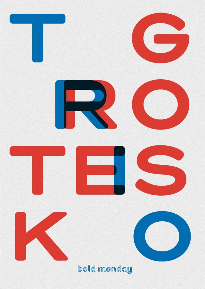
Trio Grotesk
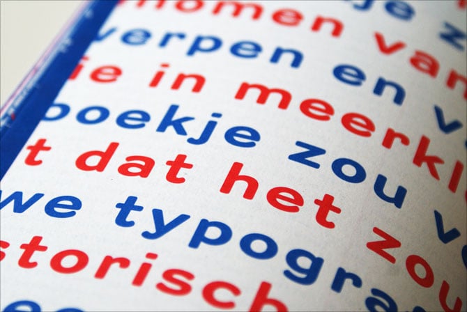
Trio Grotesk ist die soeben veröffentlichte Groteskschrift von Florian Schick, die auf der Kaart Antiek (verwendet in Piet Zwarts bekanntem Booklet für Drukkerij Trio) basiert. Im Slanted Magazin #14 – Grotesque 2 haben wir sie bereits abgebildet, damals noch unter ihrem unveröffentlichten Namen Kaart Antiek. Nun ist die Trio Grotesk da und enthält drei Schnitte (Regular, Medium, Bold) mit je ca. 660 Zeichen.
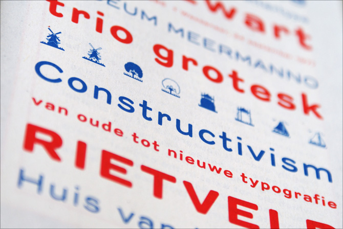
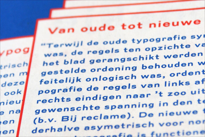
Pressetext: Trio Grotesk is Florian Schick’s personal interpretation of Kaart Antieke – an early 20th century sans serif used by Piet Zwart in his famous, yet never officially published essay about modern typography called “Van oude tot nieuwe typografie”.
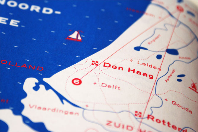
Trio Grotesk started as a student project for the KABK Type & Media masters course in type design. During a visit to the Meermanno Museum in Den Haag Florian discovered the only two remaining copies of Piet Zwart’s essay. Being struck by the historical value of this booklet, he decided to revive the typeface it was set in instantly.
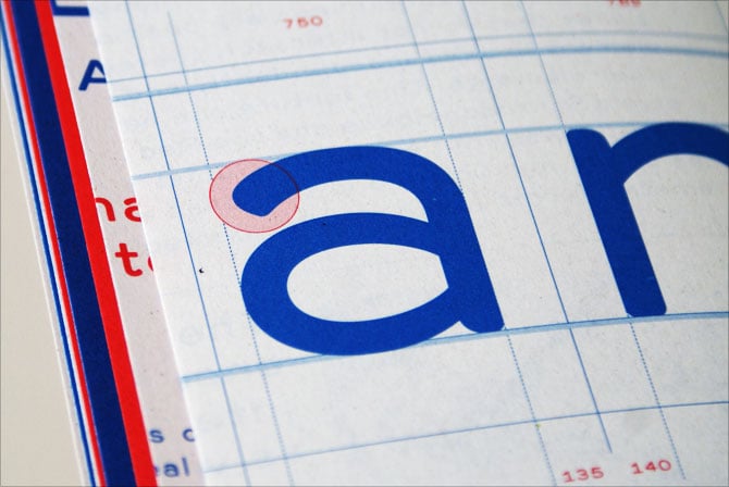
Florian enlarged and examined the original 7 point printed typeface in great detail and tried to replicate the image of this typeface as faithfully as possible. Certain features which are unique to letterpress printing, such as roundings caused by ink spread, have been preserved for instance.
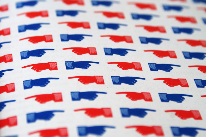
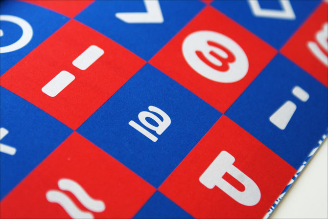
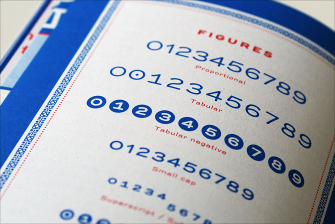
Trio Grotesk comes in three weights, sports a Latin extended characterset and includes small caps, seven ranges of figures, and numerous arrows, ornaments and dingbats.
Designer: Florian Schick
Jahr: 2011
Schnitte: Regular, Medium, Bold
Preis: 49 Euro (je Schnitt), 129 Euro (Familie)