25. poesiefestival berlin
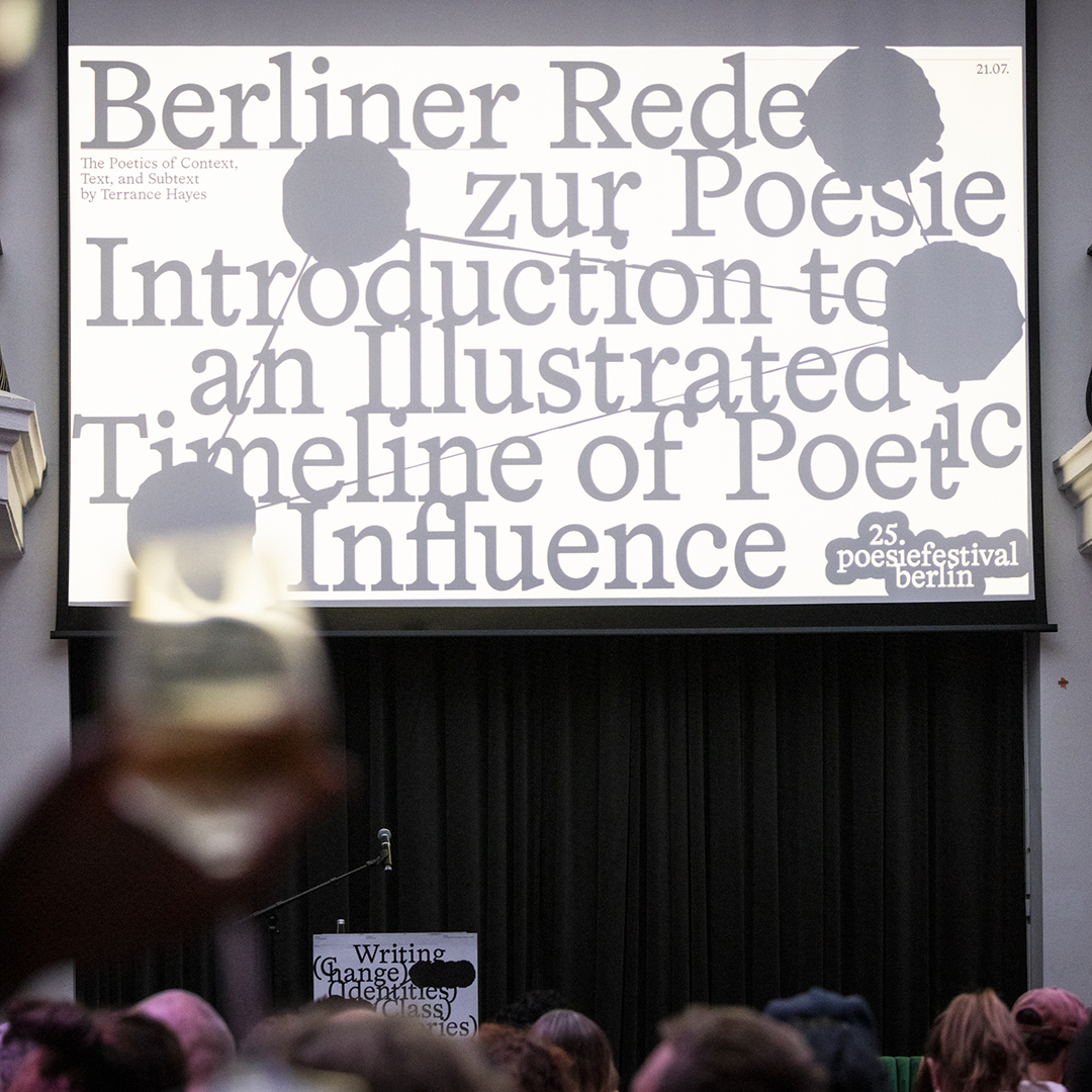
In the design of the 25th anniversary edition of the poesiefestival berlin, the AG Grafik focused on the essentials: A classic Antiqua font combined with hand-drawn lines, punched dots and typesetting errors are reminiscent of the manual process of writing. The color space is as reduced as possible: black text on a white background stands for the relevance of the written word. The visual concept is irritating, not always legible and explores the possibilities of presenting poetry through design.