Typeface of the Month: Nakoso
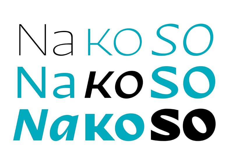
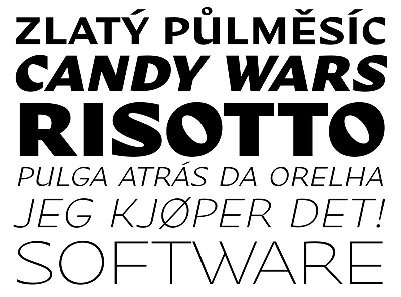
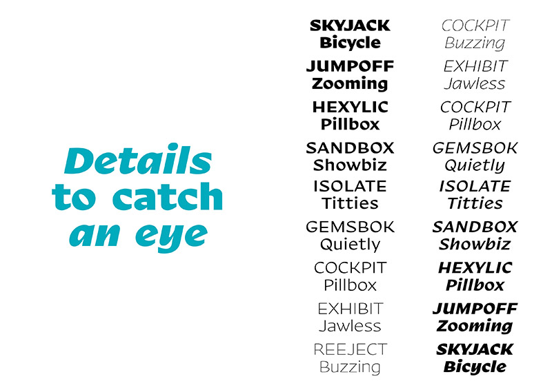
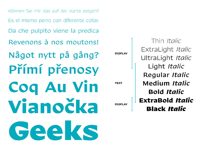
Nakoso von DizajnDesign ist unsere Typeface of the Month für den Monat Mai. Nakoso bedeutet Slanted auf Slowakisch und natürlich auch deshalb ist diese Schrift momentan sehr beliebt bei uns. Der Name drückt sich visuell durch den schrägen Neigungswinkel aus. Dadurch bekommt die Sans Serife ein frisch-freudiges Aussehen, das gleichermaßen Text- und auch Displayansprüchen gerecht wird. Verfügbar ist sie in neun Schnitten von Thin bis Black plus Italics und in einem zusätzlichen Caps Bold Schnitt. Dieser ist momentan als Free Font erhältlich. Also seid schlau und werft einen Blick auf die verspielte Nakoso.
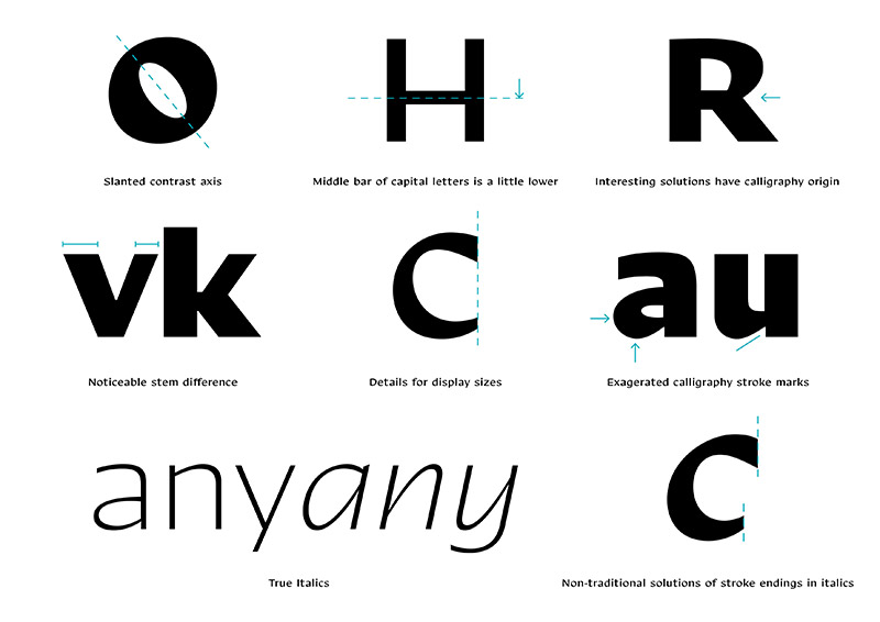
Nakoso is a fresh and playful sans-serif typeface based on broad-nib pen calligraphy and inspired by sign painting. Its contrast angle is visibly slanted, and influenced the choice of name (“nakoso” in slovak = slanted).
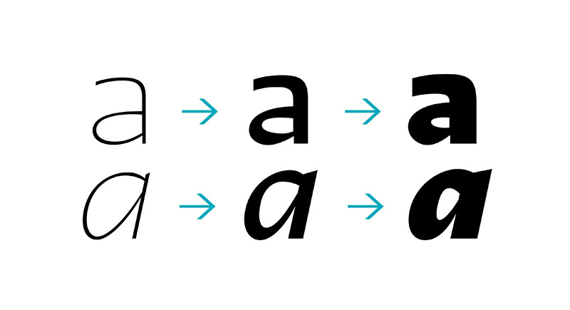
Nakoso can be described as both a text and a display typeface. It consists of nine weights and each one of them is meant to be used on text or display. Light and Dark weights are supposed to be used for large inscriptions and headlines. “Neutral” weights (from Regular to Bold) are designed for small sizes.
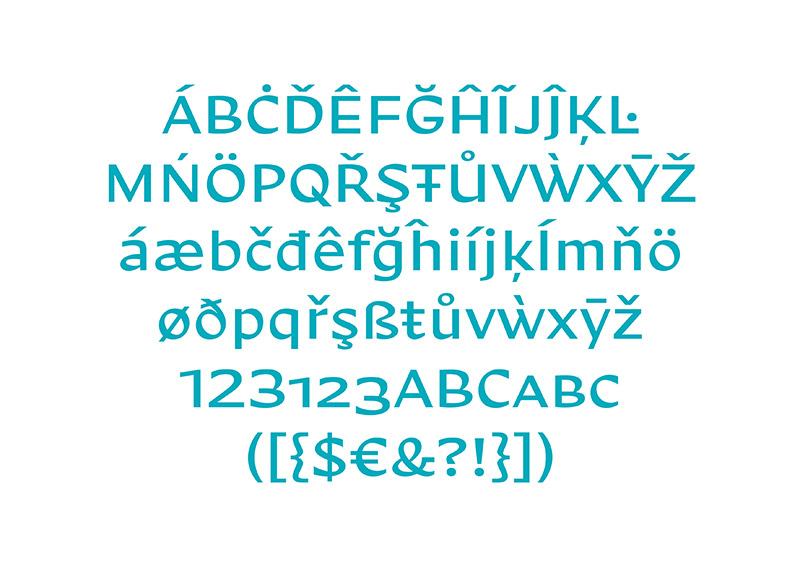
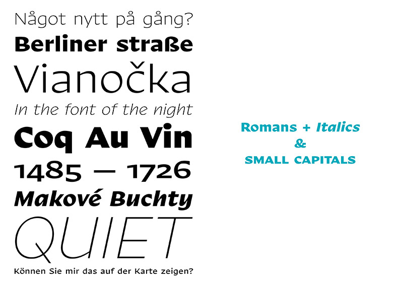
The drawing of three font masters (Thin, Regular, Black) made room for an individual approach to spacing (letter space). Display variants therefore have a tighter letter space (+ kerning), and the spacing of text variables is more adequate for small sizes. The usability of the typeface family is enhanced by the presence of true cursives, small capitals, old style numbers and other useful glyph sets.
From the aesthetic point of view, the typeface’s most interesting feature is the use of a visibly slanted contrast axis, as influenced by broad nib calligraphy. This type of calligraphy is often easy to identify because of its visible pen angle. Stroke marks after broad nib pen were visibly emphasized. Another source of inspiration was American sign painting, which influenced capital letters construction, by placing the middle bars a little bit lower than usual.
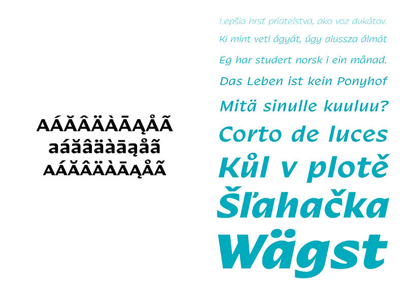
The strength of Nakoso relies in its universality, both for running text and headlines. It is suited for magazines, visual identity programs, advertising text and small print. Calligraphy and sign painting features bring playfulness into the digital type. Nakoso departs from tradition and celebrates the most recent design trends of the 21st century.
Nakoso
Foundry: DizajnDesign
Designer: Ján Filípek
Format: otf, eot, woff
Weights: Thin, ExtraLight, UltraLight, Light, Regular, Medium, Bold, ExtraBold, Black each with Italics, Nakoso Caps Bold
Price: 45,– Euro / weight, 440,– Euro / family
Free: Nakoso Caps Bold
