Stratos
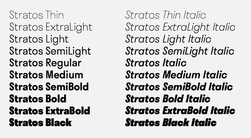
Bei Production Type ist die neue Schrift Stratos von Yoann Minet erschienen. Die geometrische Grotesk weist als Besonderheit eine spezielle Proportionierung auf.
Pressetext: A family that rethinks concepts of weight and width, spanning multiple hierarchies within a single style. Stratos is a geometric grotesque whose peculiar utility is derived from unusual ideas about proportion. It eschews conventional notions of typographic relationships — not just for novel effect, but to empower the user to do more interesting things with type.
The first and most obvious of these surprises can be seen in the difference between its upper- and lowercase. The caps are condensed, inspired by gothic wood type of the 20th century, while the minuscules are akin to certain classic geometric sans serifs, with circular rounds (o, d, b, p, q) and horizontal terminals (a, c, e, g, s). This contradiction presents intriguing possibilities. Used separately, the two designs exude individual personalities: the compact caps fill a page with the impact of a Victorian-era poster; the lowercase conveys an austere modernity. When employed together, the look is unexpected but surprisingly functional, thanks to carefully balanced spacing and weight.
Stratos
Type Label: Production Type
Designer: Yoann Minet
Original art direction with Emmanuel Labard
Veröffentlichung: 2016
Schnitte: Thin, Extralight, Light, Semilight, Regular, Medium, Semibold, Bold, Extrabold, Black + Italics
Preis pro Schnitt: 30,- Euro
Preis Familie: 370,- Euro


