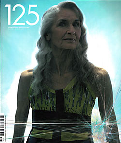
125 / Ausgabe »Decades«
125 ist ein monothematisches Magazin – Thema dieser Ausgabe ist »Decades«.
Editorials lese ich immer. Und bin immer wieder überrascht, was für ein langweiliges, dummes Zeug darin steht. Bei dem Editorial von 125 hat mir gefallen, dass es Aufschluss gibt über die Idee welche hinter dieser sehenswerten Publikation steckt. Daher hier alles 1:1. Der Content erschließt sich jedem von selbst und ist einfach lecker. Gibt mir Lust, mit den Bildern zu arbeiten. Euch nicht?
Hier der EDITOR'S LETTER
»As one of the new breed of independent magazines, we are often witheringly asked how we are doing. The simple answer is: great. In the last few years, independent magazine publishers have flourished, while many established titles flounder or close down completely. The market is changing - consumers are more demanding, and the whole industry is becoming more specialised. While it would be premature to say that mass-market publishing is dying, it is definitely re-evaluating its aims. Why would a consumer want to spend almost £5.OO on a glossy magazine that has (at best) 5O pages that actually contain any information, when you could buy a title that is dedicated to your particular interest? That's where 125 comes in. We are dedicated to delivering new and exciting photography to people in a format that highlights the narrow scope of conventional gallery shows. At the same time, we are putting modern art into the homes of people who are not able to get to the latest mega-show at Tate Modern, or who are not aware of the power and importance of it in our society, and even more crucially, we are actively encouraging a new generation of art collectors through or print sales service. In short, we are a gallery space in print and feel no need to commercialise or dilute what we offer with unnecessary padding, no matter what conventional publishing rules may dictate.
Rant over.
As a bi-annual publication, people tend to think that we spend a fair amount of the year twiddling our thumts, but the truth is we are a small team running a magazine alongside regular jobs. Before we start work on each new issue, I'm always amazed that it's been 6 months since we embarked on our last frenzied rush to get everything together in time for the printers, and I vow each time to make sure things are organised better next time.
In truth, we couldn't do it any other way.
Each issue of 125 grows organically from the theme upwards - photo shoots arrive at our office daily and build into a mountain of work to be sifted, cultivated and planted in print.
Writing this now, I'm not even completely sure what this issue will Iook like on the newsstand. The cover was shot yesterday and we go to print tomorrow, which brings me to what has been quite a hotly contested cover choice. It would be an understatement to say we have decided to run with an unconventional cover this time around, and if conventional publishing research is to be accepted, we are breaking all tite rules.
That's what 125 is all about though - we want photographers to be able to come to us with work that is based on new concepts and that pushes current boundaries, so I suppose we are trying to lead by example.
If you want conventional, you are in the wrong place.«
Perry Curties


