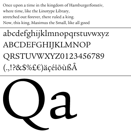
Legacy
Die ITC Legacy ist jetzt als vollständiges Family Package erhältlich.
Basierend auf einer der ältesten romanischen Schriften steht die Legacy als Ergebnis von zwei unterschiedlichen Designansätzen (Serif und Sans) und einer 10-jährigen durchführenden Arbeit da.
Ich hatte das Vergnügen, vor 8 Jahren zwei Quarter bei Ronald Arnholm an der University of Georgia zu studieren – Teile der Familie waren bereits fertiggestellt. Neben wertvollem Unterricht in Typography im Allgemeinen waren für mich Einblicke in eben diese Arbeit eine wichtige Erfahrung.
Grundsätzlich wird die Legacy in Europa als sehr schöne Antiqua mit humanistischer Sans-Variante relativ selten verwendet. Ob das an einem geringen Bekanntheitsgrad oder am vor allen US-amerikanischen Faible für Old-World-History liegt (welches man der Schrift durchaus ansieht) wäre zu diskutieren. Die Legacy stellt jedenfalls einen bemerkenswert kohärenten, umfangreichen und gelungenen Einsatz im überschaubaren Feld ernstzunehmender Serif-/Sans-Familien dar.
–
www.itcfonts.com
www.linotype.com
–
About ITC Legacy® Font Family
Designer Ronald Arnholm, 1992
ITC Legacy® was designed by American Ronald Arnholm, who was first inspired to develop the typeface when he was a graduate student at Yale. In a type history class, he studied the 1470 book by Eusebius that was printed in the roman type of Nicolas Jenson. Arnholm worked for years to create his own interpretation of the Jenson roman, and he succeeded in capturing much of its beauty and character. As Jenson did not include a companion italic, Arnholm turned to the sixteenth-century types of Claude Garamond for inspiration for the italics of ITC Legacy. Arnholm was so taken by the strength and integrity of these oldstyle seriffed forms that he used their essential skeletal structures to develop a full set of sans serif faces. ITC Legacy includes a complete family of weights from book to ultra, with oldstyle figures and small caps, making this a good choice for detailed book typography or multi-faceted graphic design projects.
In 1458, Charles VII sent the Frenchman Nicolas Jenson to learn the craft of movable type in Mainz, the city where Gutenberg was working. Jenson was supposed to return to France with his newly learned skills, but instead he traveled to Italy, as did other itinerant printers of the time. From 1468 on, he was in Venice, where he flourished as a punchcutter, printer and publisher. He was probably the first non-German printer of movable type, and he produced about 150 editions. Though his punches have vanished, his books have not, and those produced from about 1470 until his death in 1480 have served as a source of inspiration for type designers over centuries. His Roman type is often called the "first true Roman." Notable in almost all Jensonian Romans is the angled crossbar on the lowercase e, which is known as the "Venetian Oldstyle e."


