Nordvest / Monokrom
Heute stellen wir euch die neue Schrift von Nina Stössinger vor. »Nordvest« ist seit dem 1. September 2016 bei Monokrom erhältlich und besteht aus vier Gewichten und acht Schnitten. Sie besticht durch ihren ungewöhlichen umgekehrten Strichstärkenkontrast und ihre dynamische Art und ist dabei für Fließtext sowie Headlines optimiert. Den Entstehungsprozess und das fertige Resultat kann man bei Monokrom als Reisetagebuch bewundern.
Nina Stössinger’s Nordvest emphasises the horizontal direction of the line, reversing the traditional order of thick and thins. A versatile type family in four weights and eight styles, it takes on a friendly, approachable appearance in the heavier weights, while the lighter text styles embody all the marks of a workhorse text face. A Swiss national, former KABK student and now type designer with Frere-Jones Type in New York, Nina has had her compass pin askew all her life. Nordvest is her second major typeface release.
Nordvest has grown into a fully functional text typeface, despite breaking one of the basic conventions of Latin type design — that vertical strokes are generally made heavier than horizontal ones. The origins of this convention can be traced back to traditional writing tools and their usage. Designers have attempted time and again to rethink the traditional rules of stroke contrast. Sometimes simply in order to create something outrageous and eye-catching (as first seen in Caslon’s 1821 Italian); later also for functional reasons, by designers like Roger Excoffon or Evert Bloemsma who explored which parts of letters to emphasize for readability. But most commonly, these clunky faces with their big feet and odd features simply remind us of “Wanted!” posters, cowboys and cartoons.
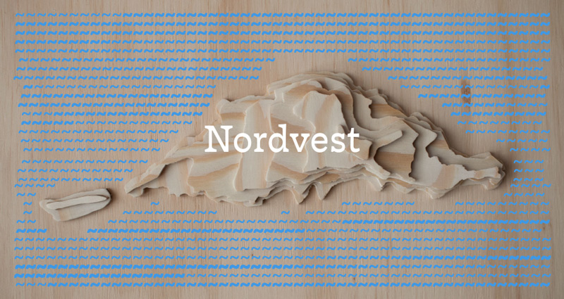
Nordvest is a subtle take on the genre of reversed-contrast typefaces, aiming to be useful first and interesting second. Dressed in an organic drawing, the extra weight on its horizontals has been carefully molded for discretion. The result is an eminently readable typeface with a unique voice and texture whose lines of text strongly band together. If its reversed-contrast design bears faint echoes of the “cowboy” legacy of the West, it couples this with a Northern European attitude that is more subtle and restrained. Its lighter weights are optimized for text sizes, while the black weight is ideally suited for larger sizes and headlines. This targeted, but versatile range is ideal for both editorial design, branding, packaging and more. Marking the release of our new typeface Nordvest, we embark on this tour, boarding a flight northwest from Norway to Vágar and the Faroe Islands. Join us each day as we publish new installments in our combined digital specimen and travelogue.
Nordvest
Foundry: Monokrom
Designer: Nina Stössinger
Veröffentlichung: 1. September 2016
Schnitte: 8 Schnitte (Regular, Medium, Bold, Black plus Italics)
Preis pro Schnitt: ab 60,- Euro
Preis Familie: 450,- Euro


