Dédale
by 205TF
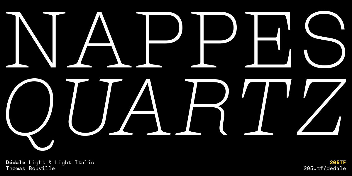
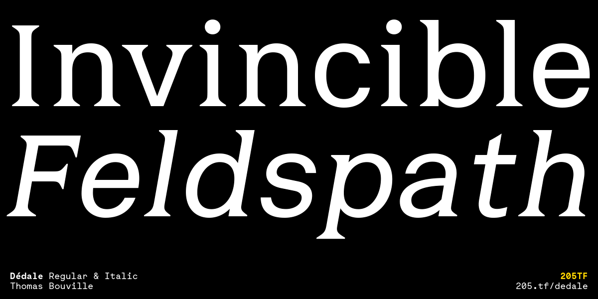
Dédale, designed by Thomas Bouville in 2020, is a hybrid type family inspired by inscriptions cut into the stone of the underground passages of the Paris Catacombs.
Identified while exploring underground, the diversity of the inscriptions and their varying states of erasure inspired the designer’s unique approach. Rather than seeking to unearth the original drawings of the stone engravers (in an attempt to “rewind” the flow of time), Thomas Bouville sought to reveal links between the inscriptions and wanted, on the contrary, to give a sense of the passing of time.
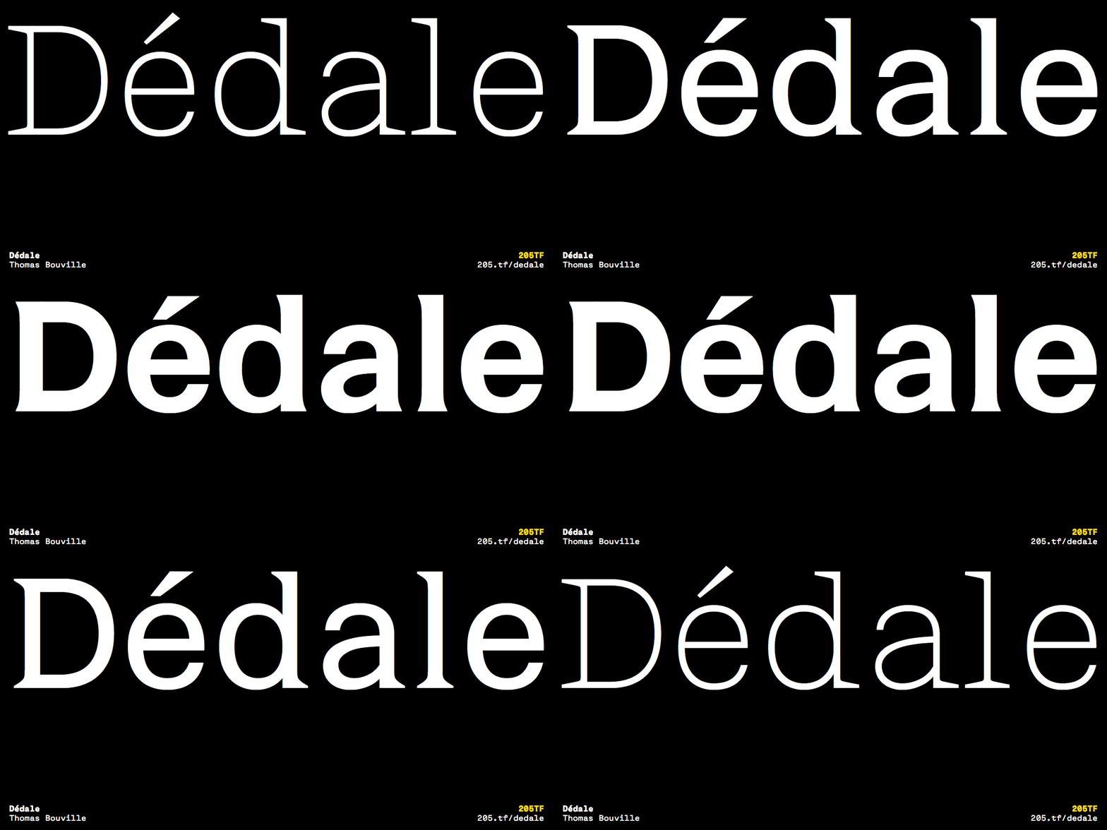
The varying structure of the letters, common between styles, skillfully evokes the ossuary. It emphasizes an analogy between the letter and the human body, composed of both a skeleton and a physical envelope. The evolution of the three styles—from slab serif to lineal—shows the effect of time and the passage of life towards death.
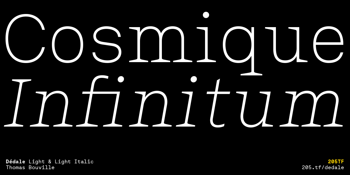
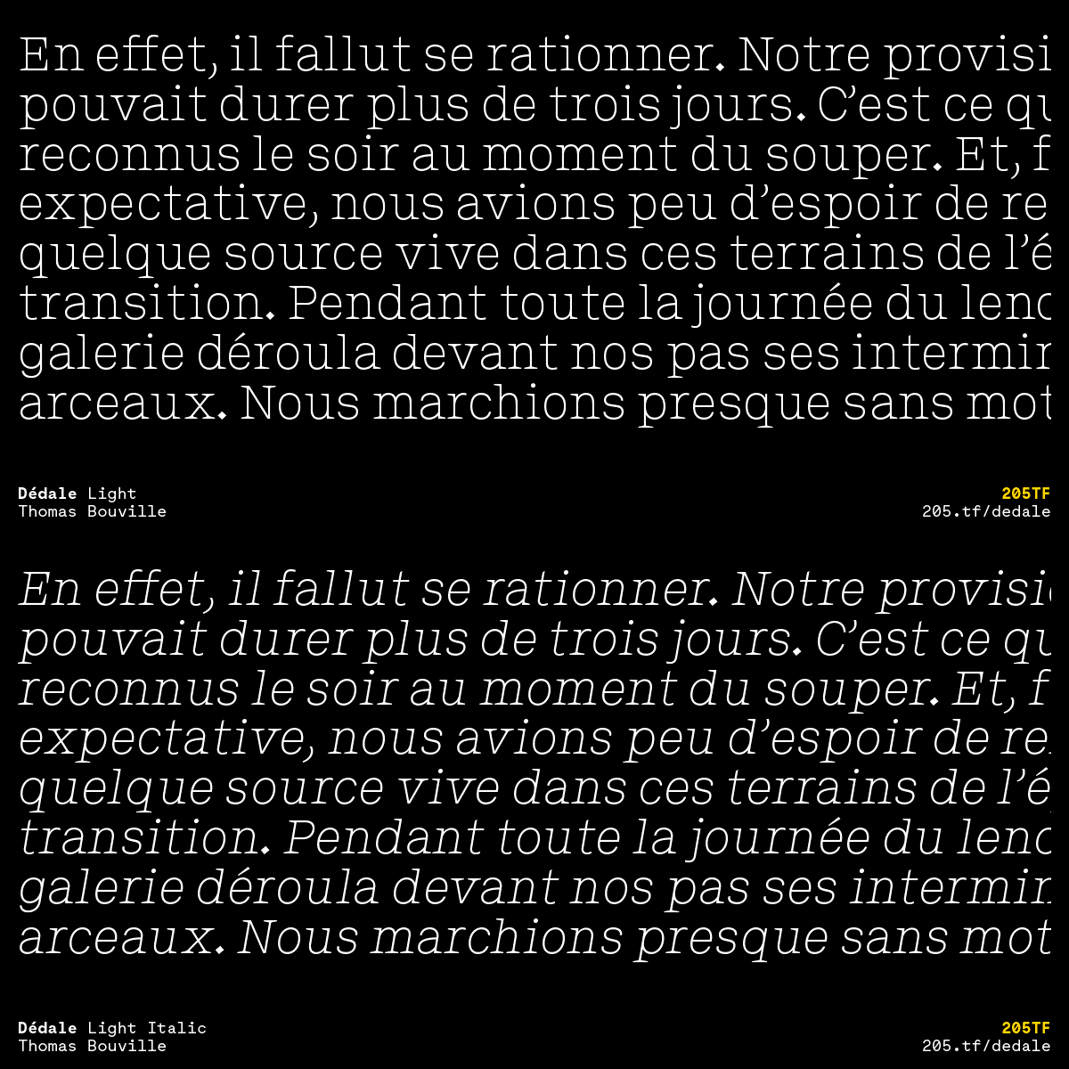
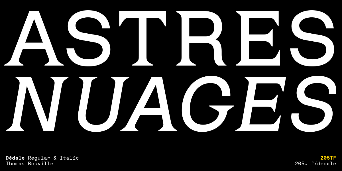
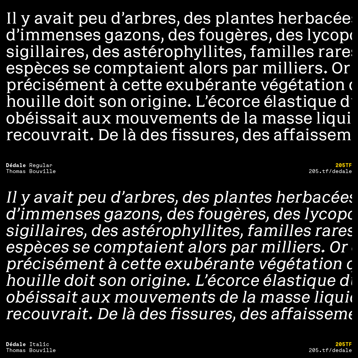
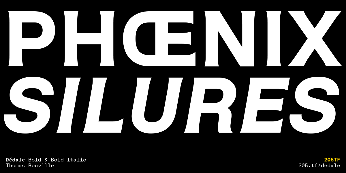
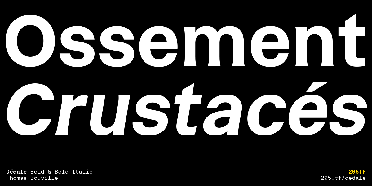
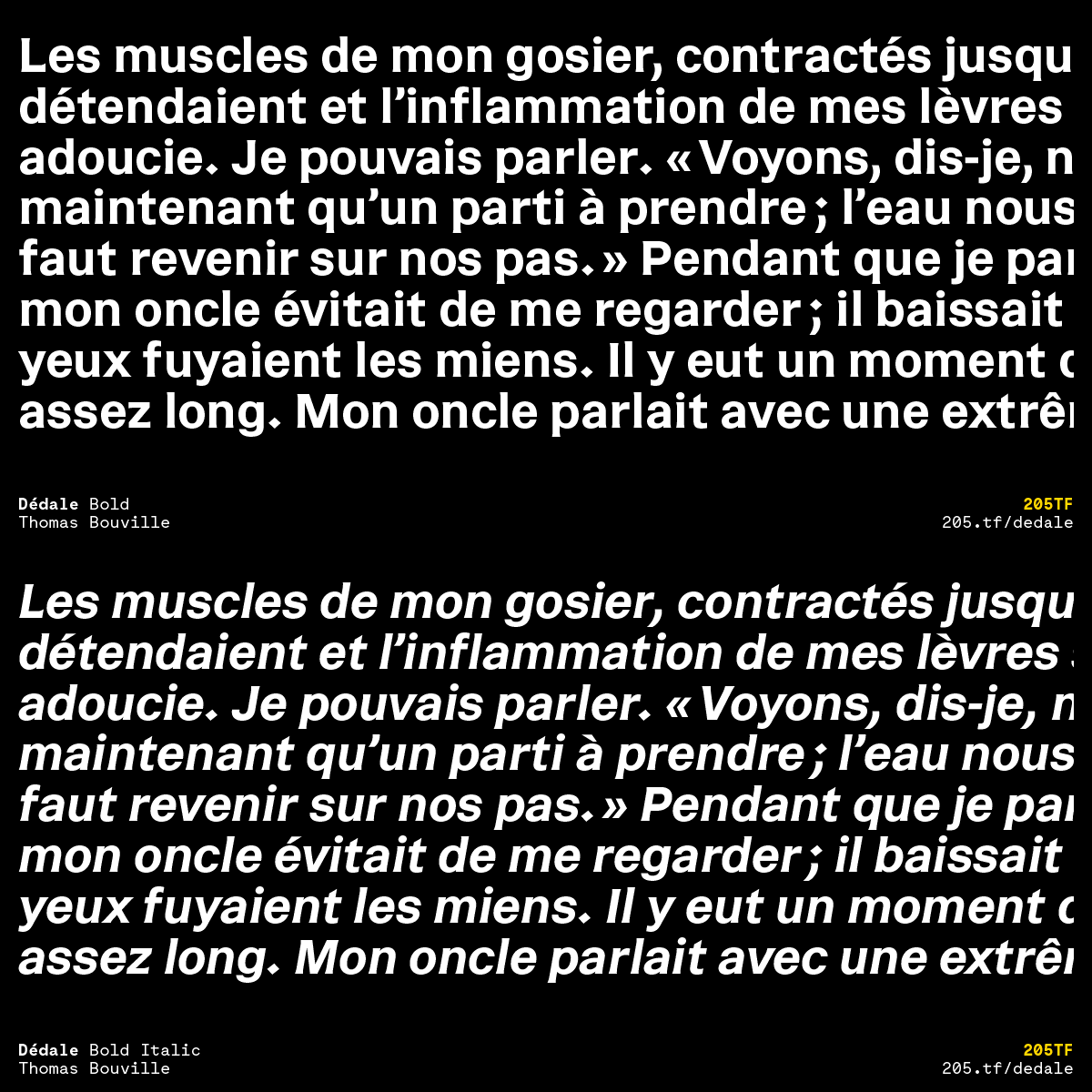
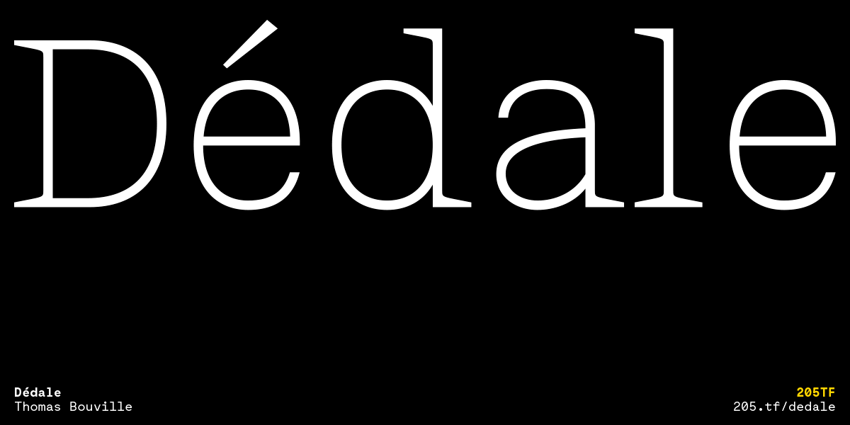
The Light version—a slab serif made elegant by the contrast between its refined appearance and the prominent serifs—is designed for composing large sized titles with subtlety. The Regular—an incised typeface with pronounced extremities, is designed for reading long texts. The Bold version—a neo-grotesque sans serif that conserves certain details of the incised form—is useful for its strong lines. Each style has its own Italic.
Dédale is also available as a variable font, allowing the design to move freely between the three styles, with the technology seeming to play with time.
Dédale
Foundry: 205TF
Designer: Thomas Bouville
Release: October 2020
Format: .otf (desktop); .woff, .woff2, .eot, .ttf (web, app, epub); .ttf (variable font)
Styles: Light, Regular, Bold + Italics
Price family: 260.– Euro (desktop)
Price packages: 120.– Euro (desktop)
Try the variable font here
Buy
