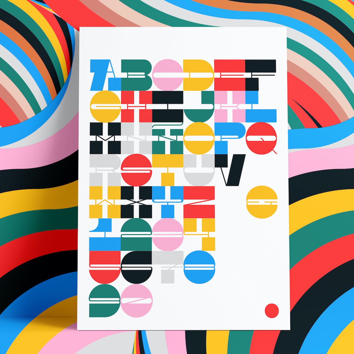
Pata Slab
By In-House International
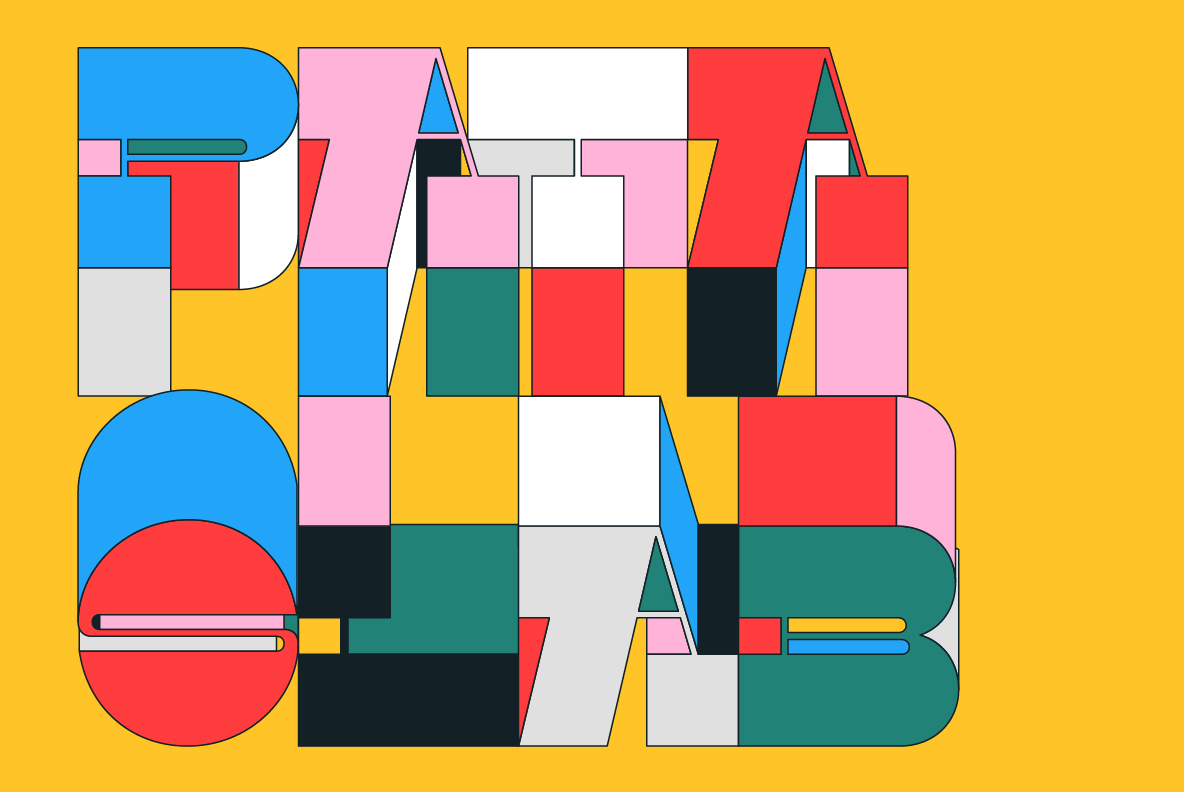
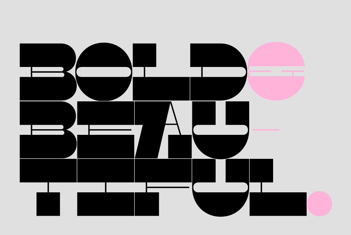
Pata Slab was created as a letter-based balm to a very difficult past year, of which it’s safe to say that the mounting parfait of unprecedented events left no one unscathed. Pata Slab is an optimistic typeface that, lacking descenders, is all upside.
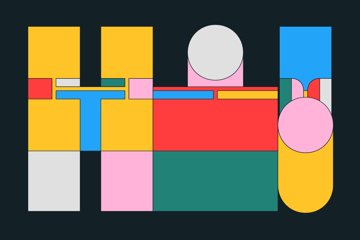
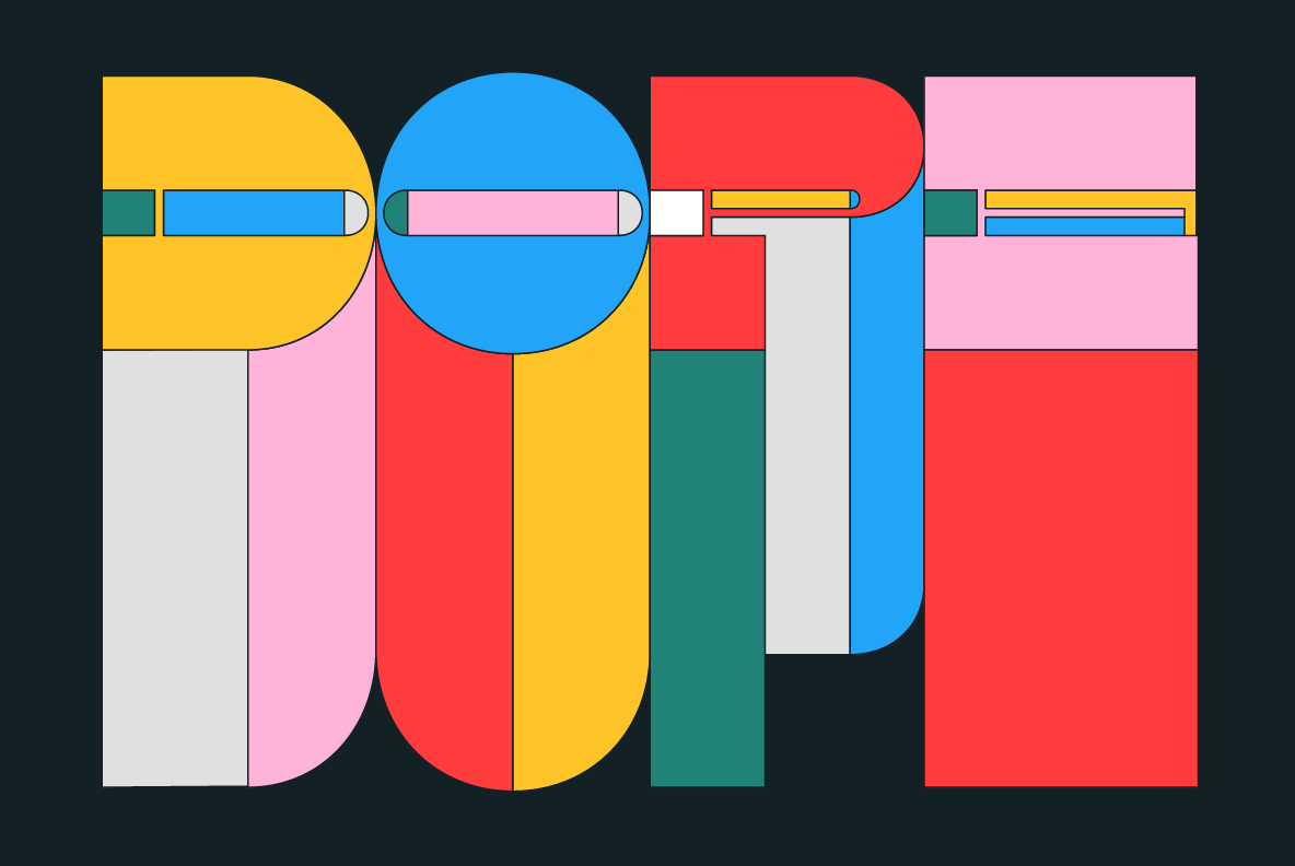
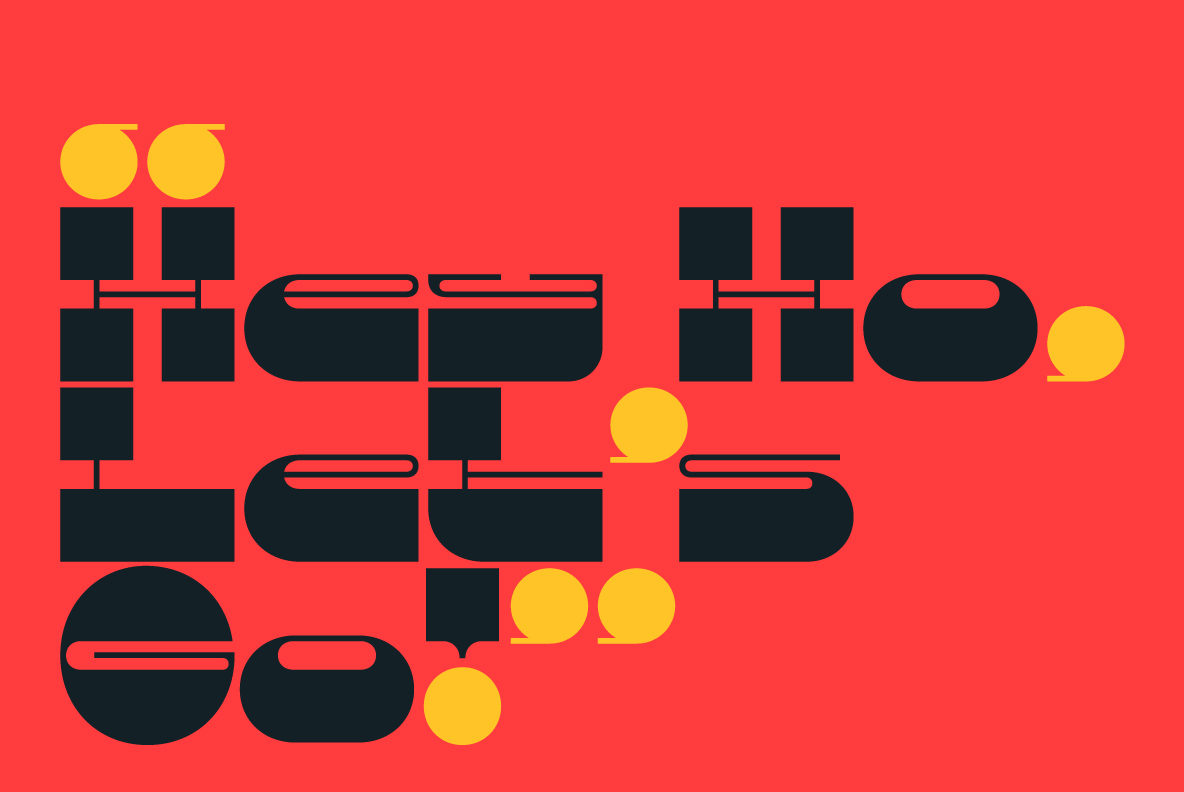
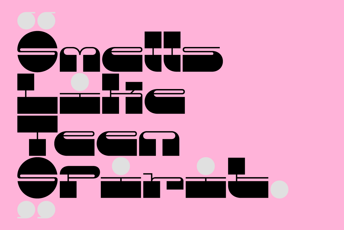
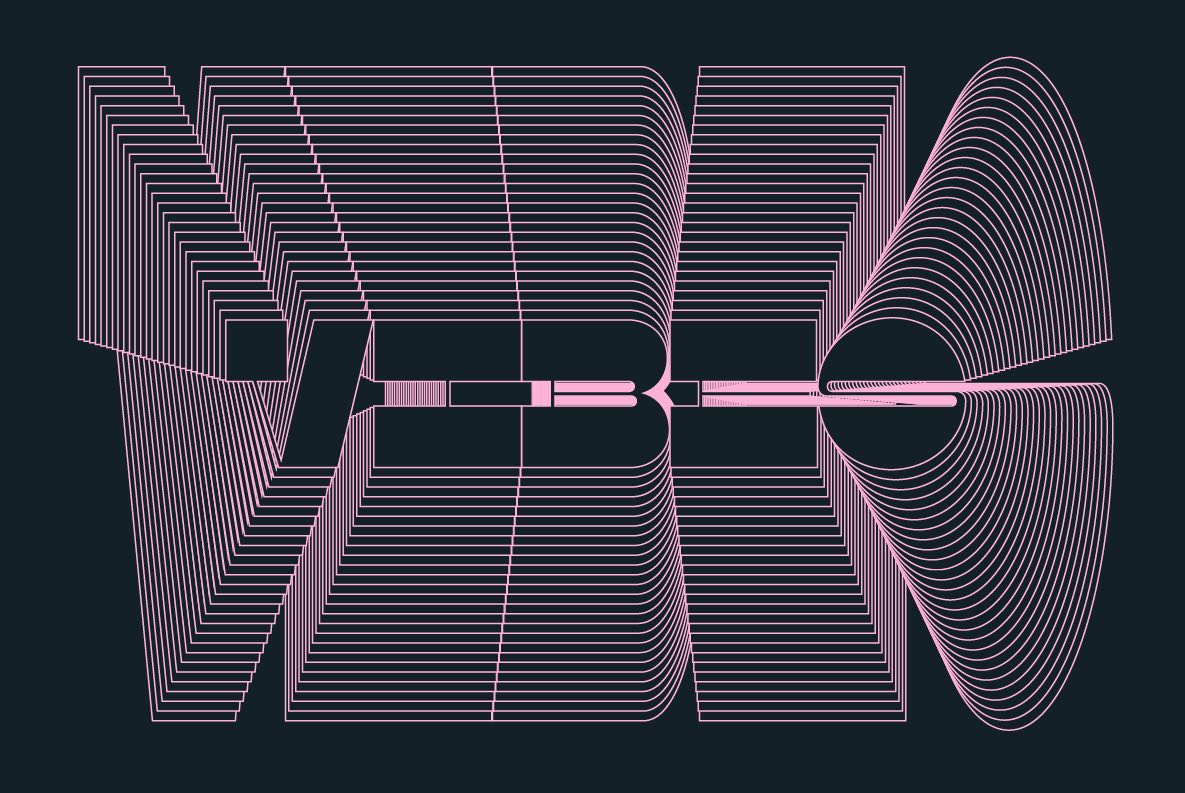
Pata is a font that’s assertive, funky, and more than a little sexy. All characters grow upward from the baseline. Named after a colloquialism for “feet,” it features ultra-heavy slabs and contrasting hairline centers that rise from its chunky footprint. The resulting, retro-inspired vertiginous curves add instant attitude to any design.
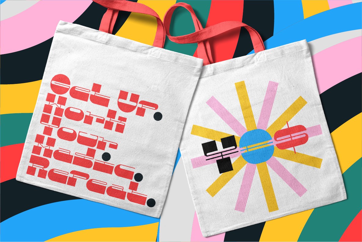
All uppercase characters were built to fit precisely inside a square, so they’re all the same width and height. The lowercase alphabet, eñes, cedillas, punctuation, numbers, and symbols all follow the same height restrictions. Despite all that confinement, Pata sports standard-height terminals that connect seamlessly so there’s nearly endless options for modular ligatures. The upshot of all this meticulous awesomeness is that laying out, customizing, and stacking text super simple.
Pata Slab was created by In-House International, designed by Alexander Wright in collaboration with Rodrigo Fuenzalida. It is available via YouWorkForThem and MyFonts in Opentype format (.otf) compatible with Mac and PC.
This font is our way of ending the year on a hopeful note.
Pata Slab
Foundry: In-House International
Designer: Alexander Wright, In-House International, and Rodrigo Fuenzalida
Release: December 2020
Weights: Regular
File Formats: .otf
Price starts at: $ 10.–
Buy: available via YouWorkForThem and MyFonts
