Latinotype
A Chilean Independent Type Foundry
Today, we would like to present you Latinotype, a Chilean independent type foundry:
The power of letters combining to form words to communicate thought is monumental. From scribbling on cave walls and stone tablets, to writing on paper and typing them out, words have been a fundamental part of life as we know it for thousands of years. Words tell our story, evoke emotion and action. They are essential.
And so Latinotype formed, a group of graphic designers, type designers, account managers, translators, and programmers dedicated to making the most out of words. Based in Chile, the foundry began in 2008 as the first typeface distributor in Latin America. Since then, they have grown into a dynamic team of typography lovers with more than 200 original fonts, and they distribute many more. If their library does not have what you’re looking for, they will create the font you need to make each word of yours carry the meaning it deserves.
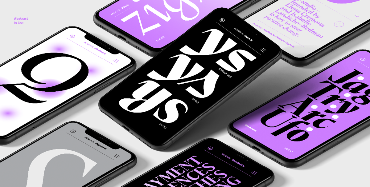
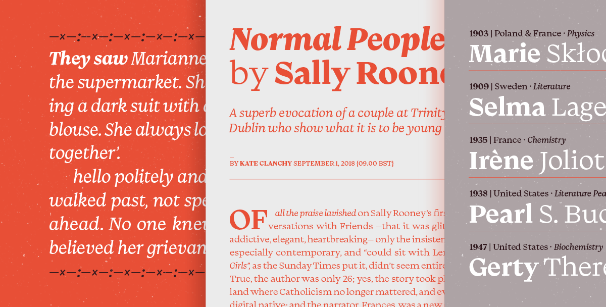
Fonts like Abstract, created during a pandemic, a contemporary and eclectic serif typeface with a generous family, including a true italic variant that has a personality of its own.
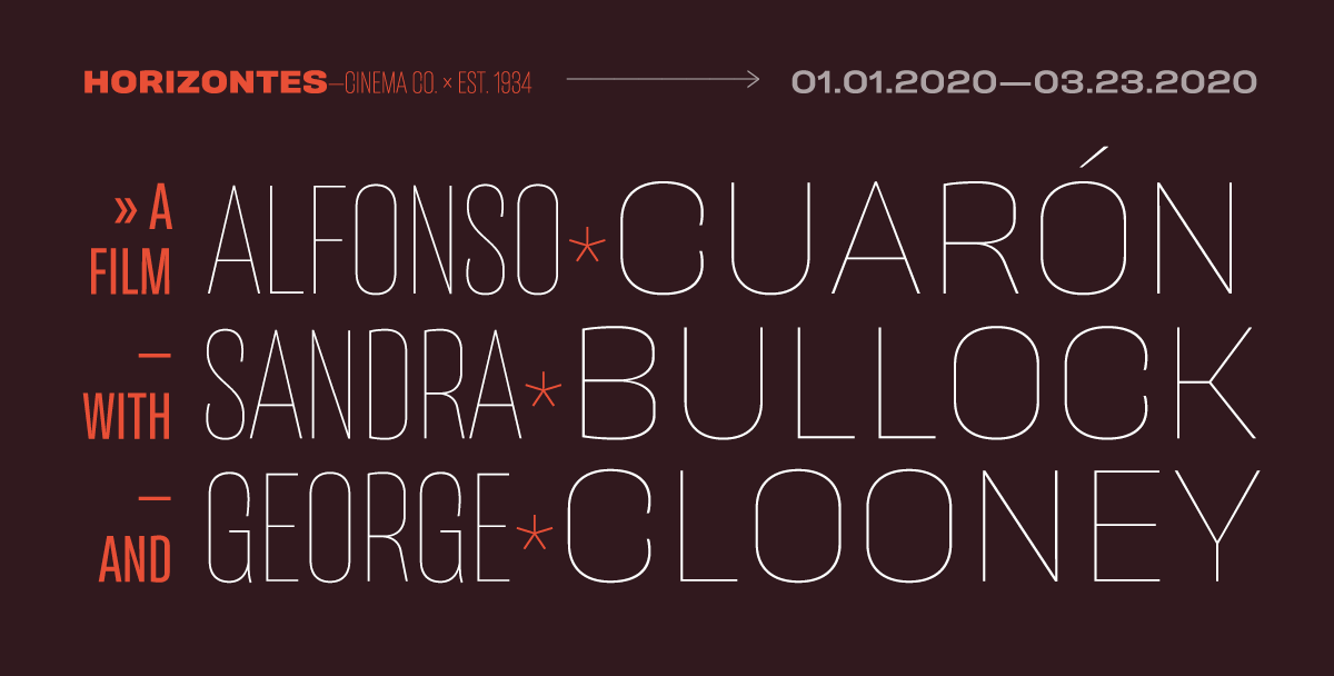
Straight lines combined with curves and triangular shapes, Águila and its set of more than 400 characters supports over 200 Latin-based languages. Another singular font in Latinotype’s portfolio.
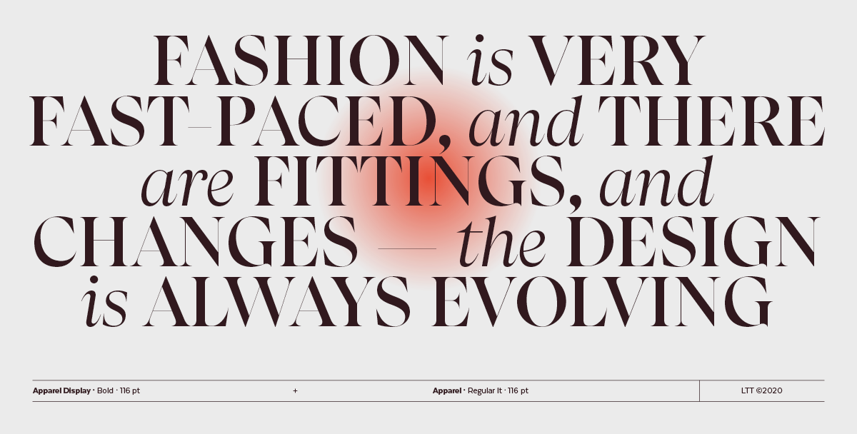
The foundry prides itself on creating and distributing fresh fonts, and Apparel is a testament to that. Apparel is the perfect blend of class and freshness. Times New Roman meets Caslon.
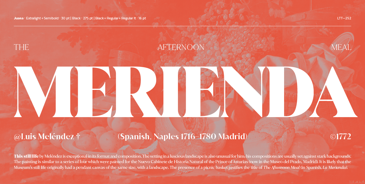
In case it’s not yet clear, their library is extensive and varied. Offering superfamily fonts such as Galeana, a flat-sided san serif typeface that features a closed aperture, representative of their Latin American roots. Top-sellers such as Juana, based on the Jazmín typeface that offers an extreme contrast between thick and thin strokes for balance and poise.
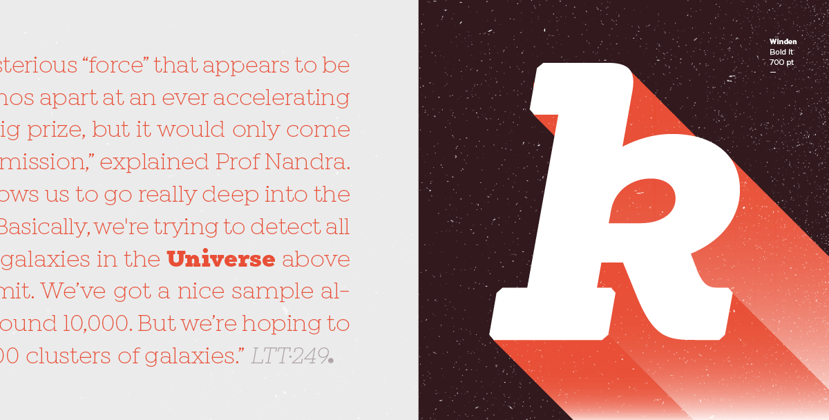
Kenac, distinct yet practical, particularly fit for headlines, headers, anything to accentuate brand identity. And then a whiplash to Winden, a slab-serif typeface that wants to be seen, giving off a modern feel.
Add a varied library like theirs to an array of customization options and it’s clear why Latinotype has grown to become a well-known and trusted source for fresh fonts. Modifications, customizations, and all the options in-between, this foundry is a household name when it comes to making words stand out.
For more details, the “finer print,” visit the Latinotype website. The main purpose as of now is that this foundry formed by Luciano Vergara and Daniel Hernández is now on your radar, if it wasn’t already. Ample options and services make Latinotype a source to bookmark.
