Lexik
By Binnenland Typefaces
Today, we would like to share the typeface Lexik by Binnenland Typefaces and Thomas Hirter with you.
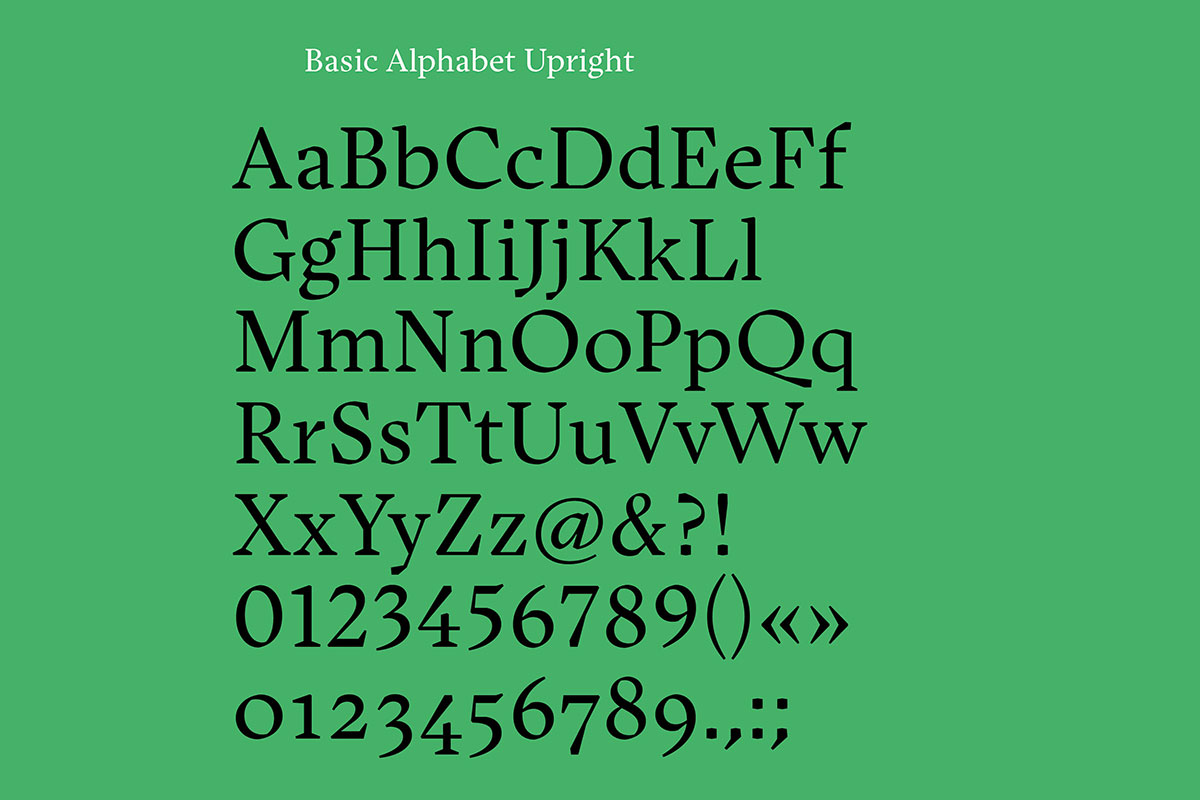
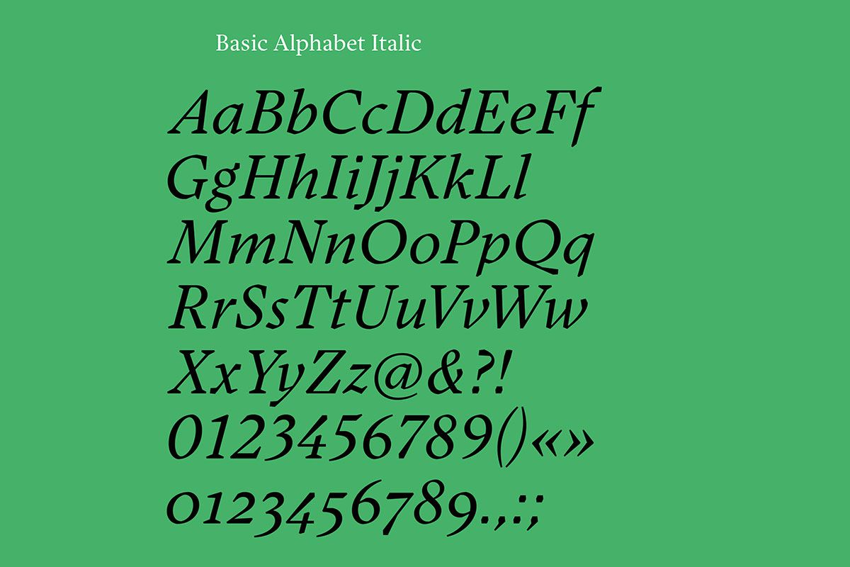
Have you ever wondered what the vocabulary of a typeface is? From a designer’s point of view, it is the shapes which determine the character of a font. Typefaces don’t communicate with words, but instead are able to convey a message with their visual appearance. Binnenland’s new release Lexik consists of organic curves along with sharp straight lines. This juxtaposition of round and pointy shapes is what makes up the formal language of their new serif typeface.
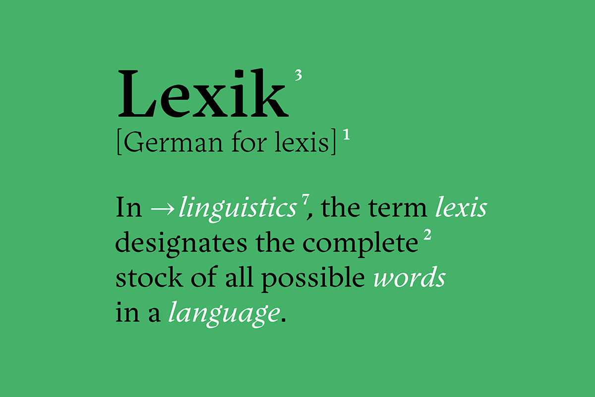
Lexik comes from the Greek léxis (“speech,” “word”) and means something like the vocabulary of a language. In terms of typography, this raises the question of the vocabulary, the formal language of a typeface. In the case of Lexik, it is the juxtaposition and interplay of organic round forms and sharply cut terminal forms and serifs.
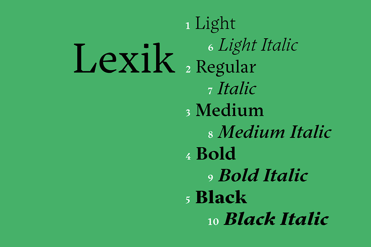
Lexik was designed by Thomas Hirter for the layout of the men’s newspaper (now ERNST Magazine). Under a long process of refinement and in close cooperation with Binnenland it was optimized for fluid reading and expanded to a family of five weights and their corresponding Italics.
Lexik
Foundry: Binnenland Typefaces
Designer: Thomas Hirter
Release: 2021
Styles: Light, Light-Italic, Regular, Italic, Medium, Medium-Italic, Bold, Bold-Italic, Black, Black-Italic
Price: € 60.– per Style, € 435.– for the Complete family
Buy


