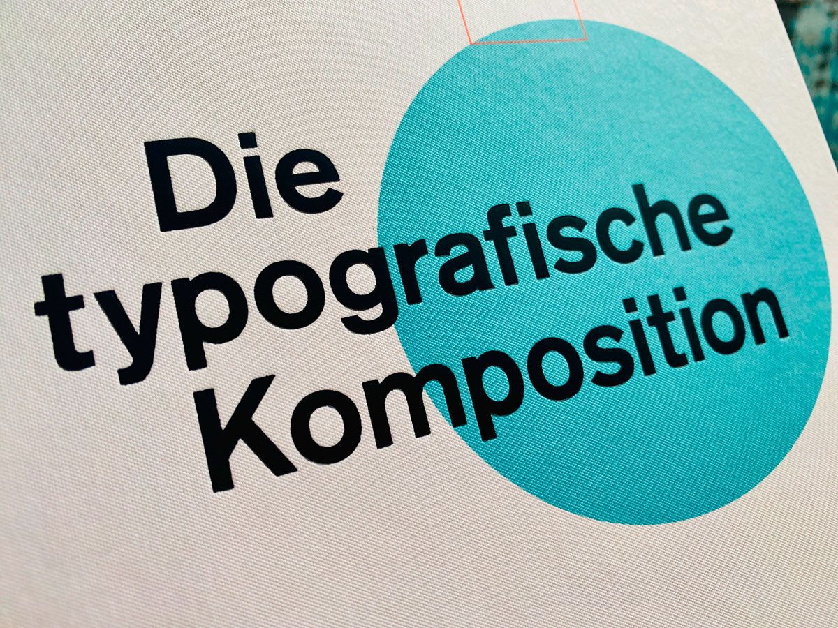
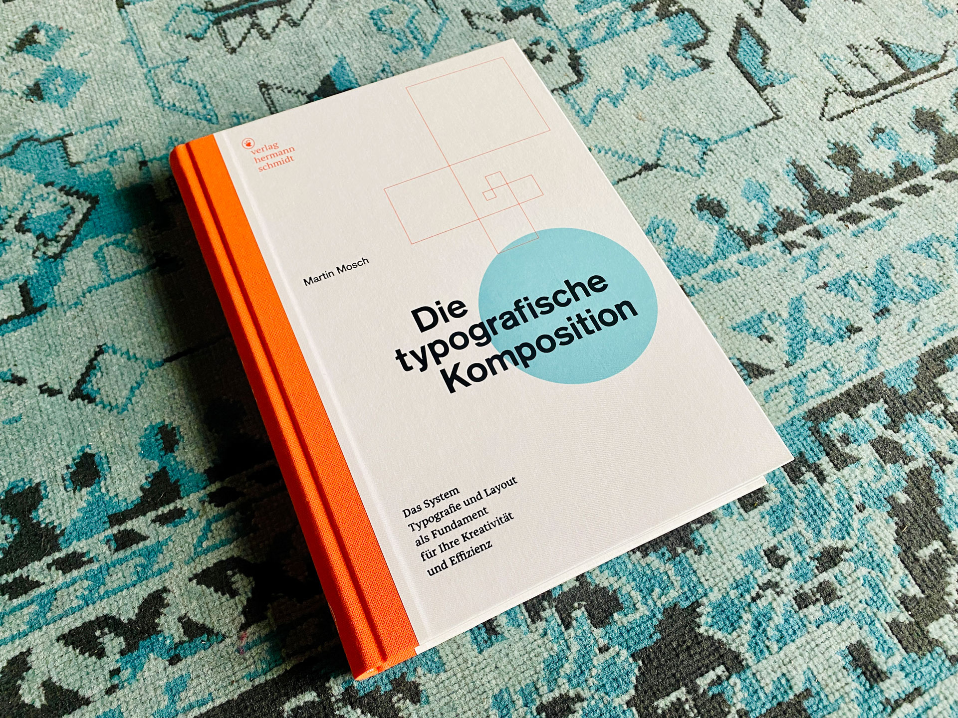
Die typografische Komposition
The typographic system and layout as the foundation for your creativity and efficiency
Who doesn’t know them, standard works in typography that one simply needs when striving for excellence. Once again, the publishing house Hermann Schmidt has released such a standard work: Die typografische Komposition by Martin Mosch. “The typographic system and layout as the foundation for your creativity and efficiency.”
Typography and layout are based on proven craftsmanship and aesthetic principles, providing guidance and stability in the design process, bringing confidence and efficiency. This allows designers to focus entirely on content and its presentation to the audience, channeling their creative resources where they are most needed: in making text and images accessible.
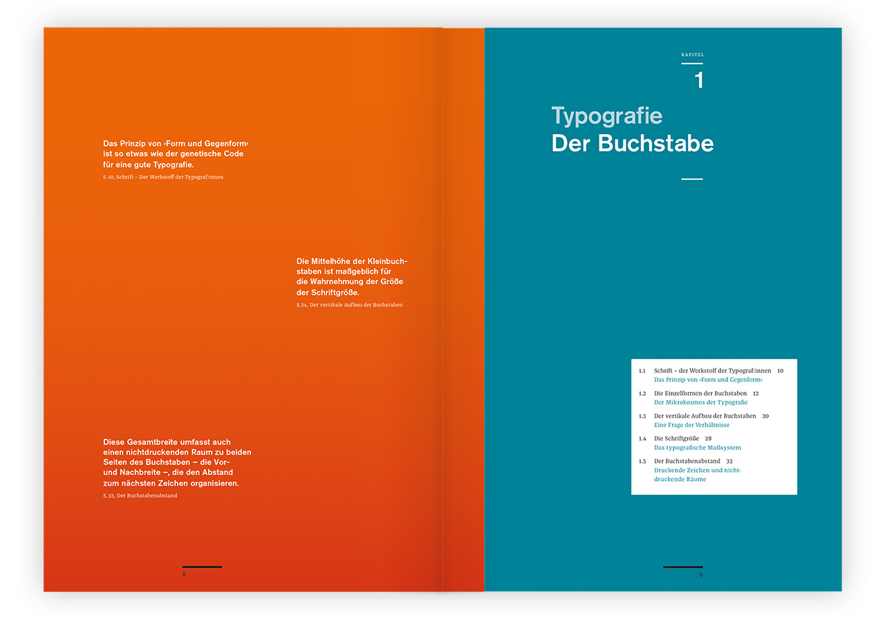
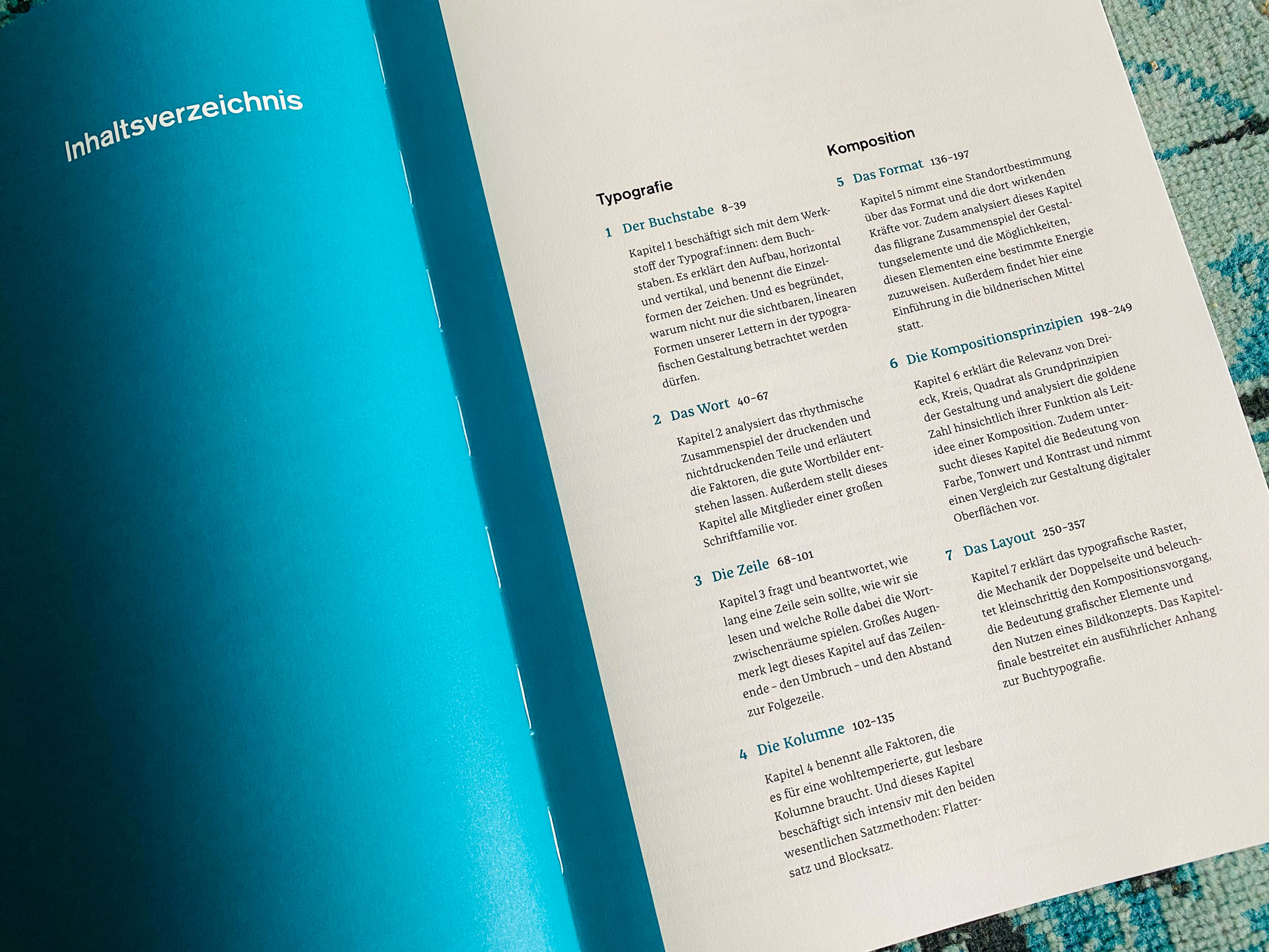
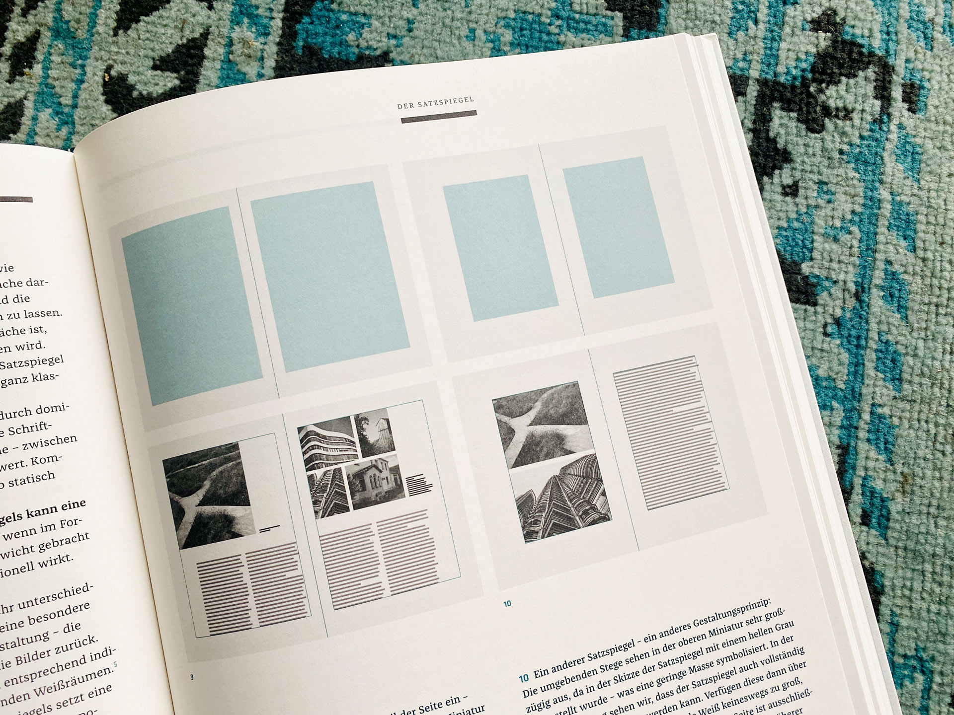
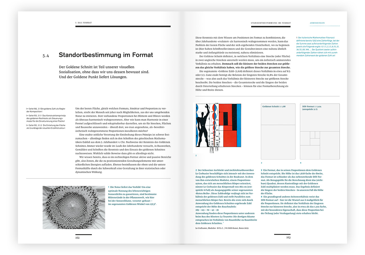
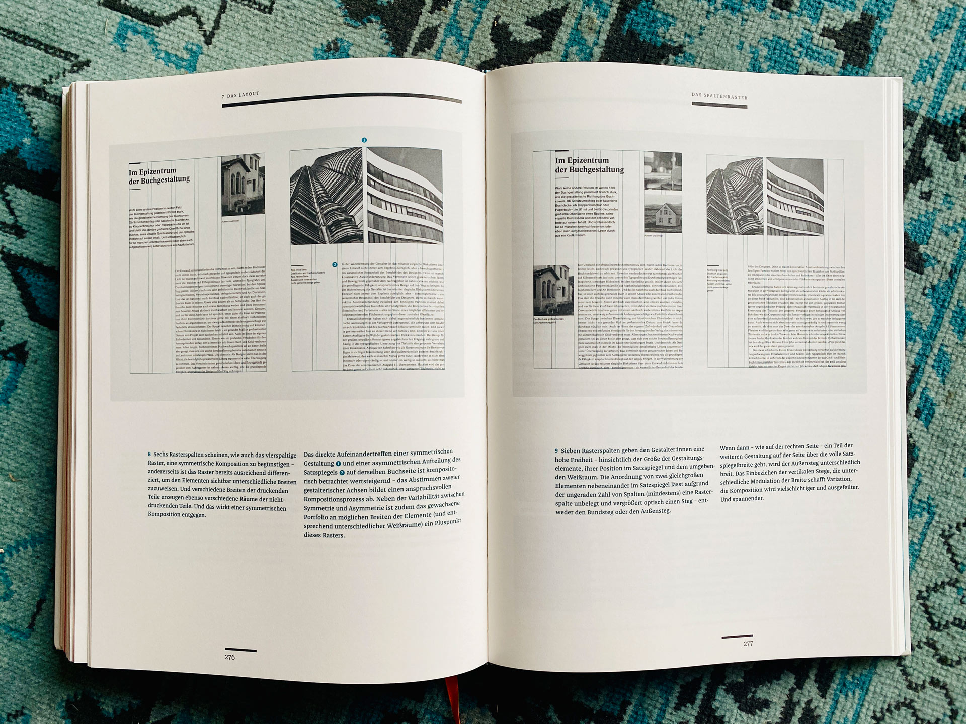
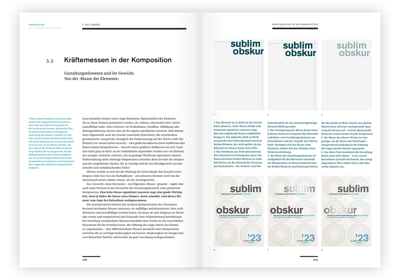
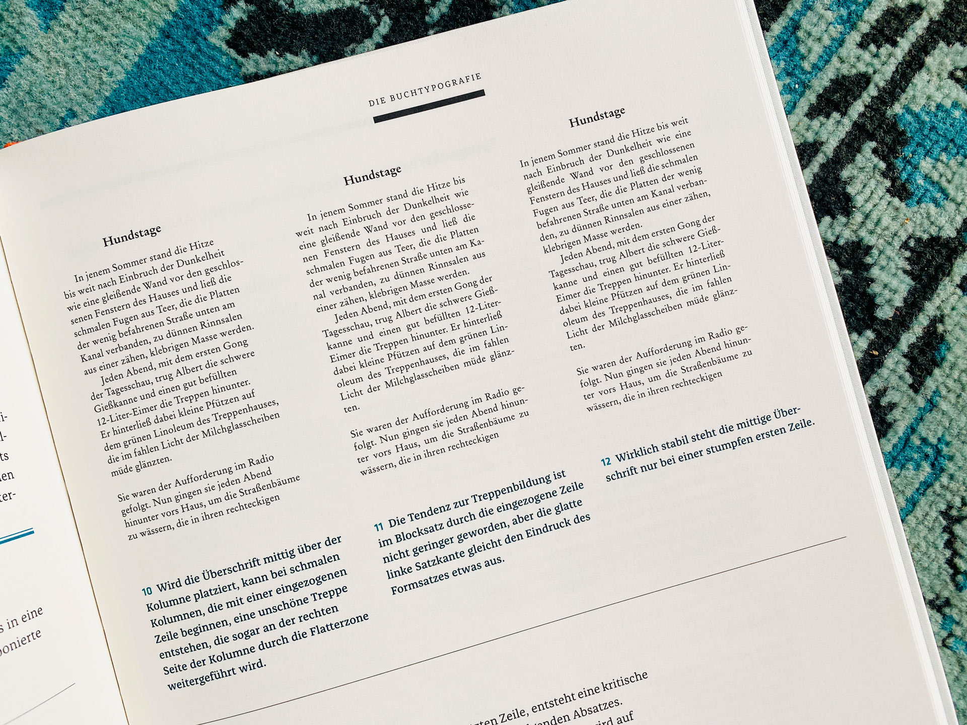
The author guides from the smallest element, the letter, through word and line, column and format, to the big picture, composition principles, and layout. He addresses not only the visible parts of design but also the crucial white spaces that provide rest for the eye.
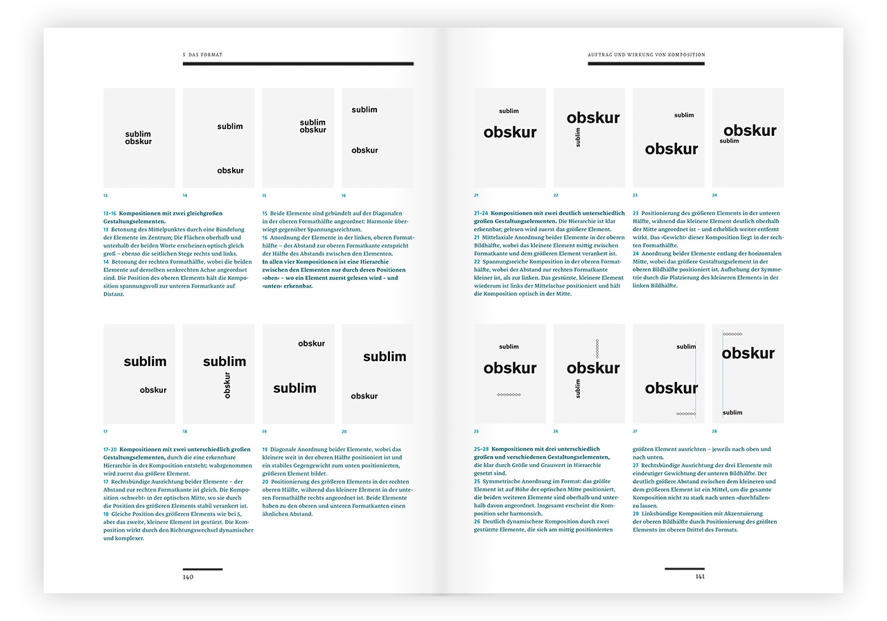
He vividly analyzes practical examples that demonstrate how aesthetic perception builds on learned traditions such as proportional theory and composition principles.
This practical workshop demonstrates how detailed decisions influence the overall composition, how various visual strategies work, what to consider in the design process, and how designers can simplify and enhance their creative workflow.
Now available in the Slanted Shop!
Publisher: Hermann Schmidt
Author & Designer: Martin Mosch
Volume: 364 pages
Format: 21 × 29.7 cm
Workmanship: Hardcover with linen and hot foil embossing
Printing: Offset with 2 spot colors
Language: German
Price: € 68.–
ISBN 978-3-87439-873-2
