PAGE magazine
Redesign
PAGE magazine is thrilled to unveil its extensive redesign, reflecting a complete overhaul of its format, paper choices, and content structure. The new design aims to enhance reader engagement with a contemporary aesthetic and enriched features. This transformation includes a broader range of topics, in-depth articles, and innovative visuals.
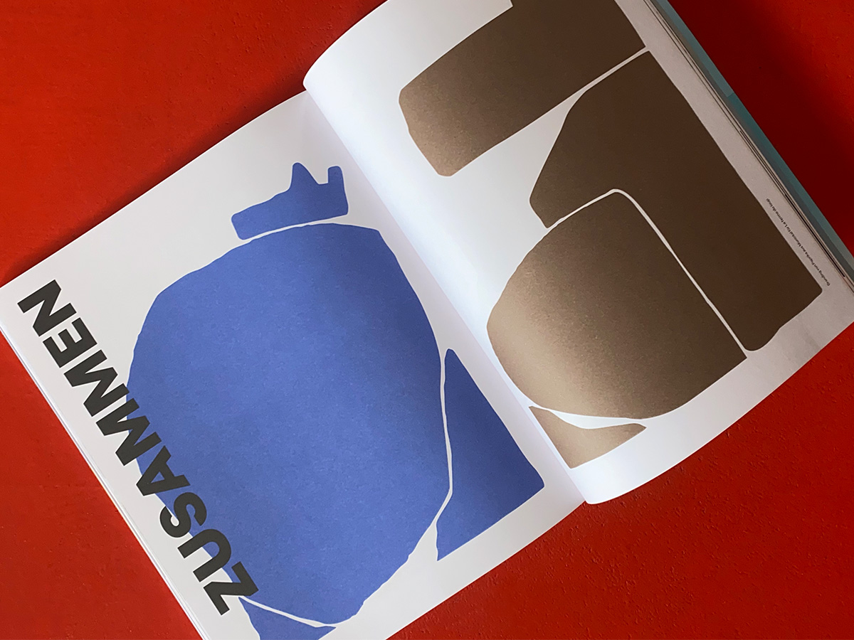
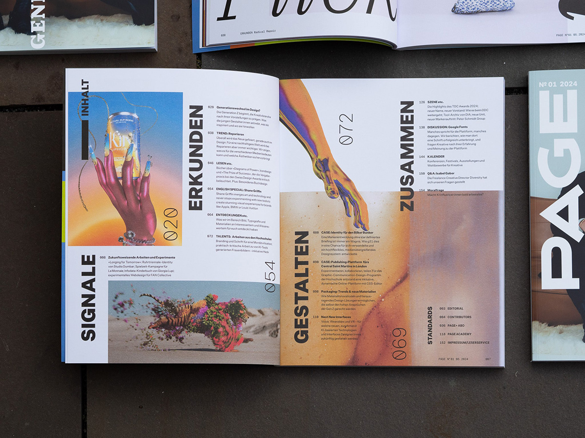
PAGE magazine has undergone a significant make-over, embracing a more digital-centric approach while continuing its deep-rooted love for print. Now published quarterly, each issue features over 150 pages filled with rich content and innovative design. The relaunch introduces four new sections—Signale, Erkunden, Gestalten, and Zusammen (Signals, Explore, Design, and Together)—that provide diverse and in-depth coverage of the design industry.
Signale serves as an inspirational entry point with a curated selection of projects in branding, imagery, and web design. Erkunden explores emerging trends and ideas within the design community collaboratively with readers. Gestalten highlights case studies and craftsmanship across various media, providing a comprehensive look at design developments. Finally, Zusammen focuses on industry themes, fostering conversations among designers, clients, and the wider audience to emphasize the importance of dialogue within the creative community.
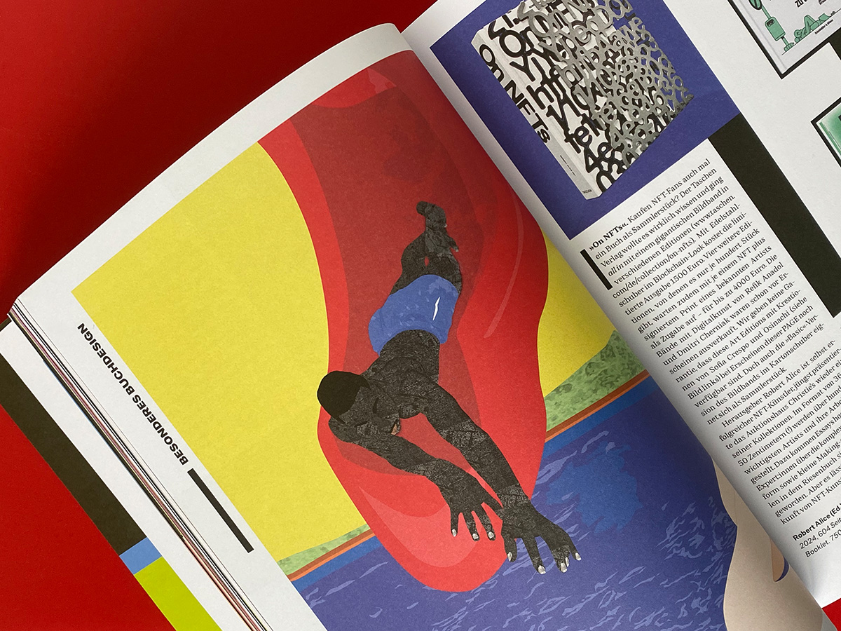
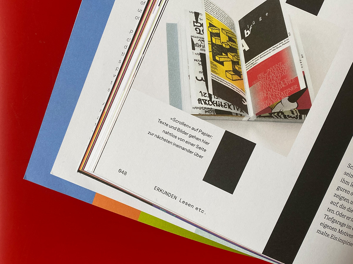
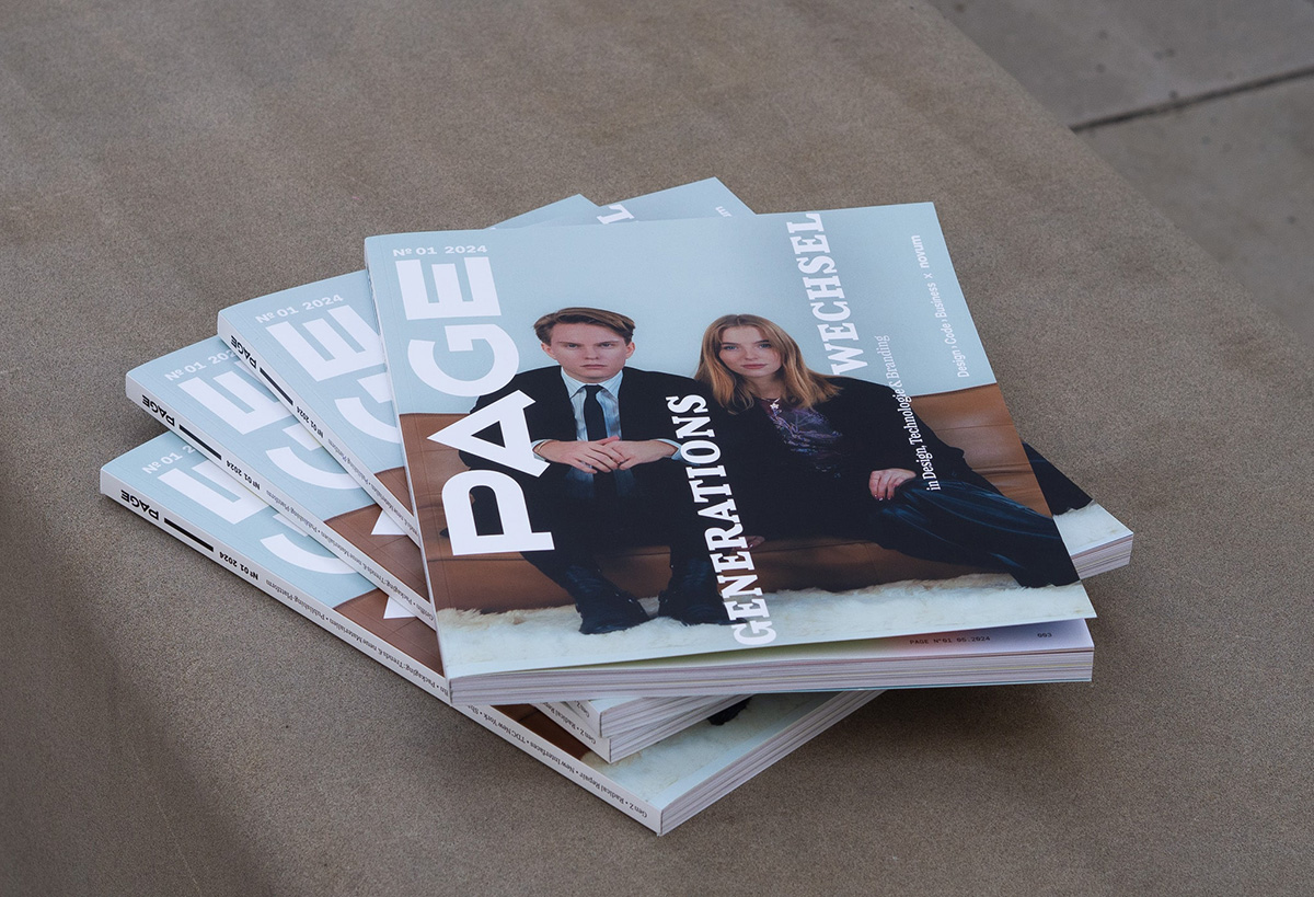
The design overhaul, led by Art Directors Christine Krawinkel and Julia Kleinwächter, features a new layout that offers more flexibility and space for visual storytelling. Typography plays a crucial role in the redesign, with attention to vertical elements inspired by the inverted PAGE logo on the cover. This vertical motif appears throughout the magazine, in section openers, headlines, and quotes, adding movement and interactivity to the layout. The magazine’s new layout features a footer using Allrounder Mono, a typeface also employed in the spacious captions. This font, part of the Allrounder family, is paired with Edie&Eddy to form PAGE’s new house style. The combination of these fonts creates a cohesive and stylish look throughout the magazine, enhancing both readability and aesthetic appeal.
The relaunch cover features two young designers, whose portrait symbolizes the next generation of creatives. This choice reflects PAGE magazine’s commitment to supporting and showcasing emerging talent, while also serving as a visual representation of the magazine’s generational shift.
With this comprehensive redesign, PAGE reaffirms its dedication to providing insightful, relevant, and aesthetically pleasing content for the design community, effectively bridging the gap between traditional print and contemporary digital media. The relaunch sets the stage for continued innovation and engagement in the years to come and PAGE Magazin keeps on to be a leading source of inspiration and information for the creative industry.
We are very pleased to have PAGE as a comprehensive network in the design cosmos and congratulate on the successful redesign. Furthermore, we are pleased with and thankful for every feature of our publications in the magazine. Spot us in the newest issue of PAGE Magazin!
