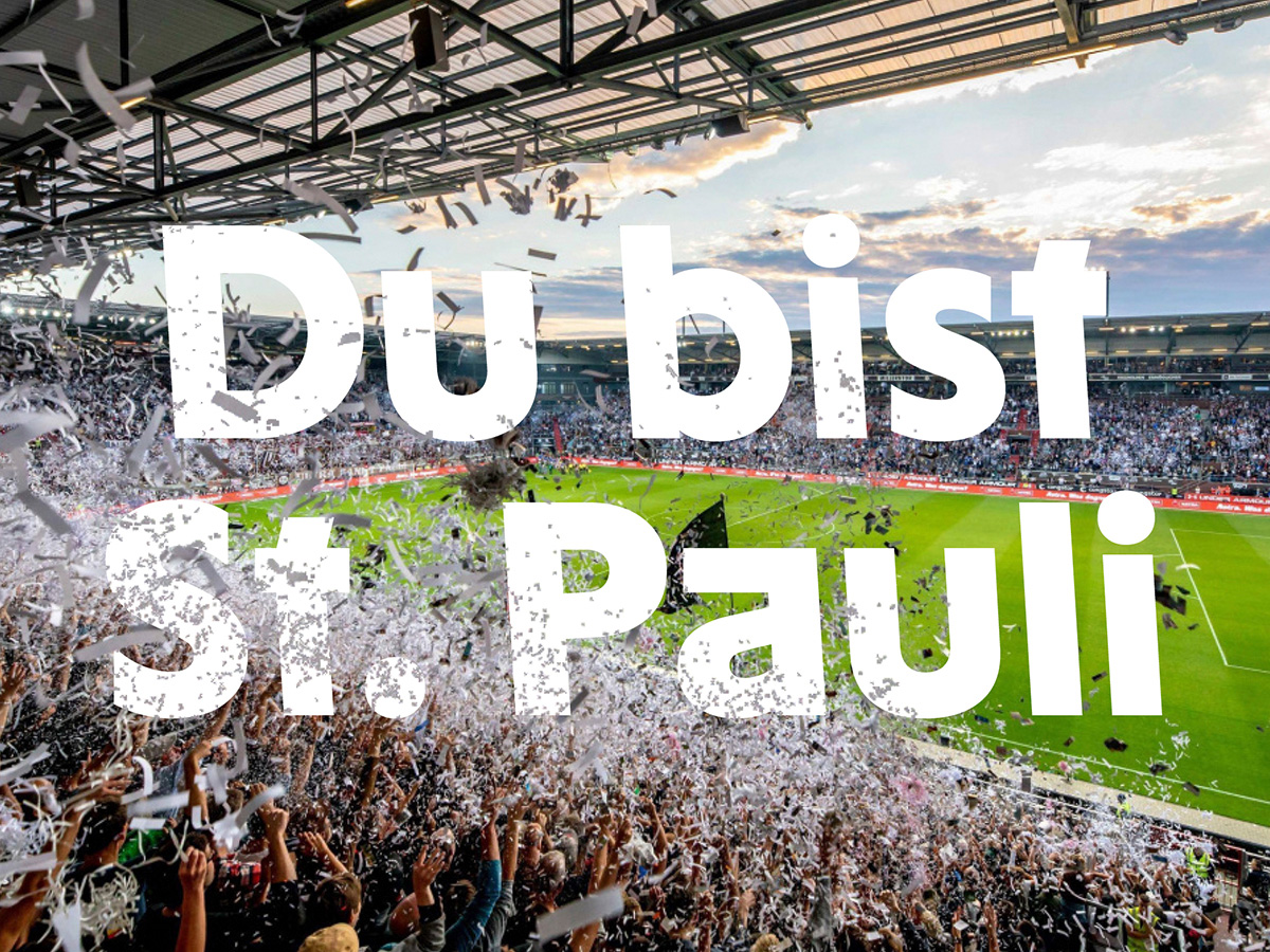
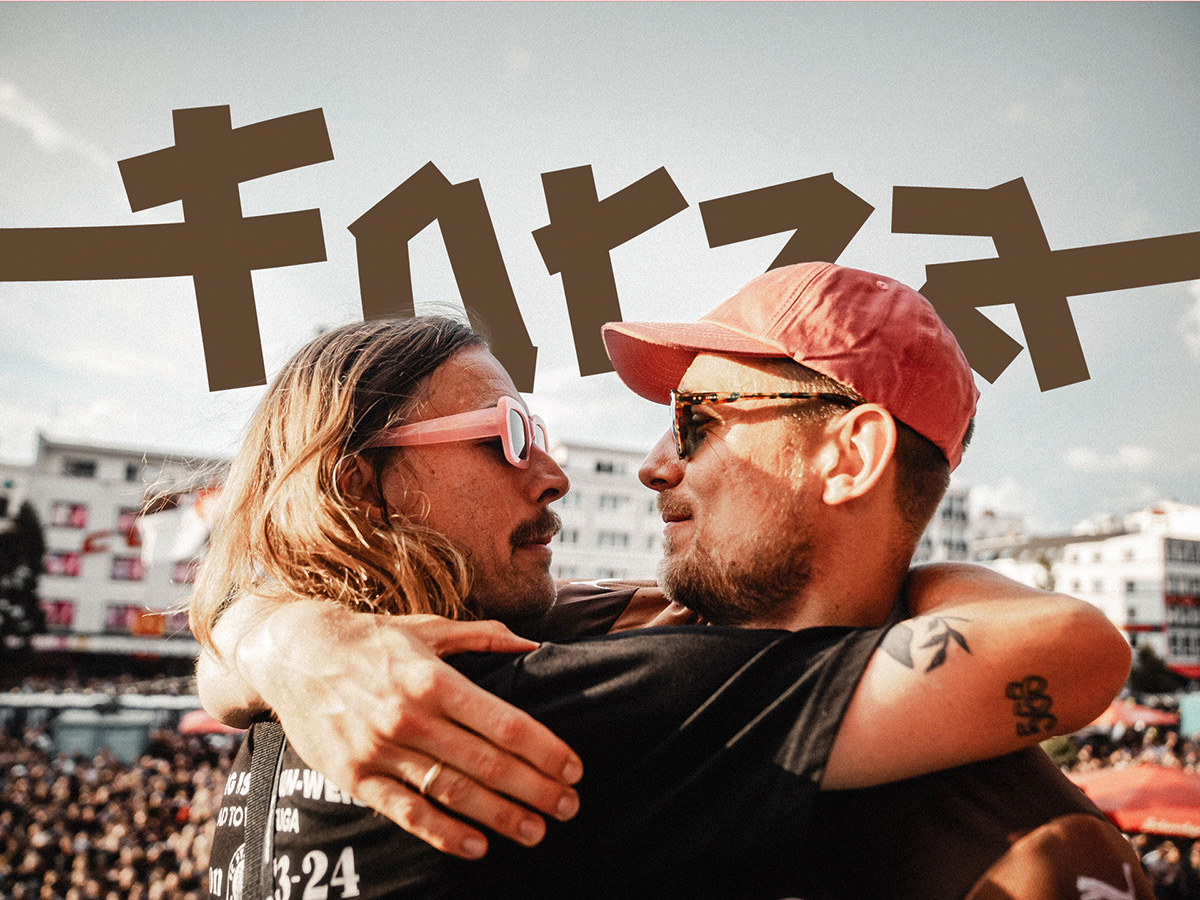
FC St. Pauli, known for its unconventional approach both on and off the field, has introduced its new custom typeface, FC Sans Pauli. Created by contemporary branding agency Karl Anders in collaboration with Christoph Koeberlin, this typeface replaces the previous Futura font. It reflects the club’s unique identity and rebellious spirit.
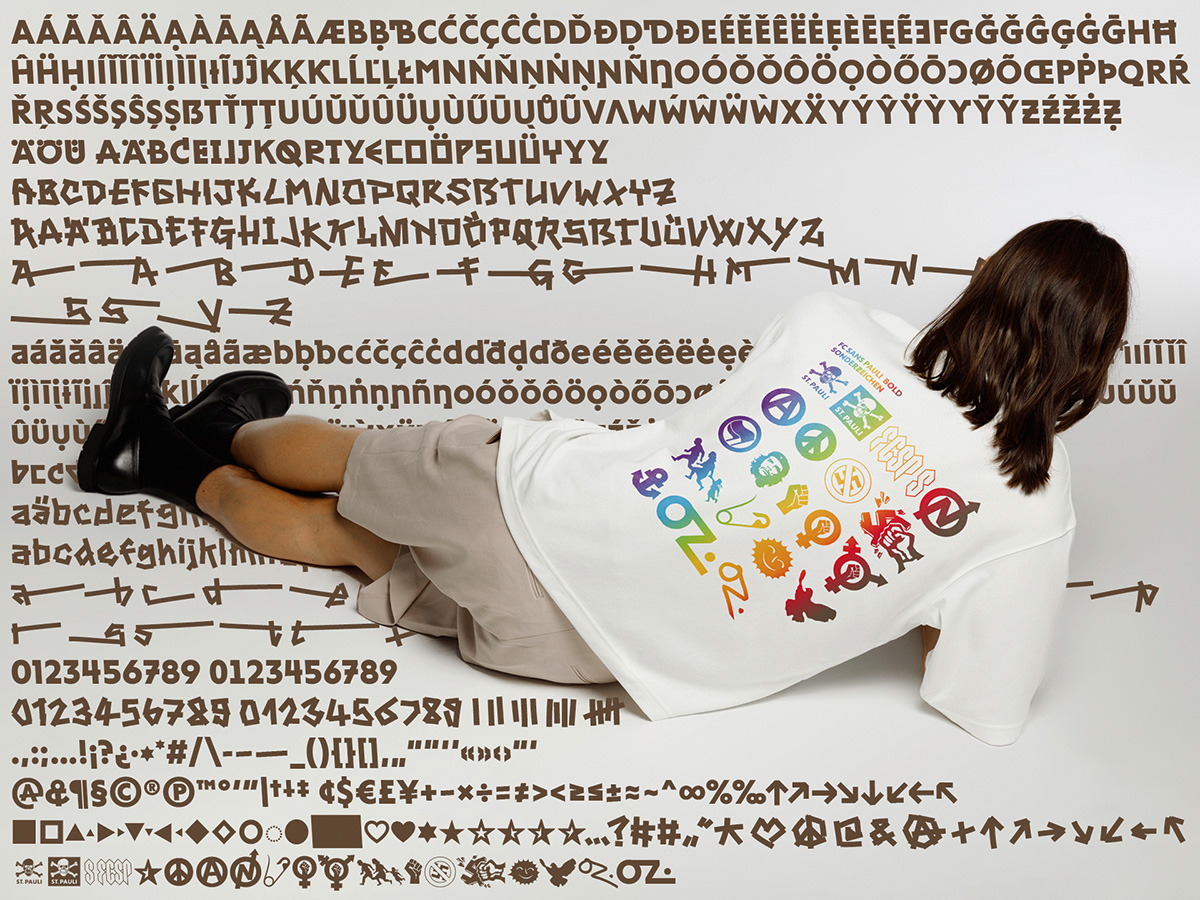
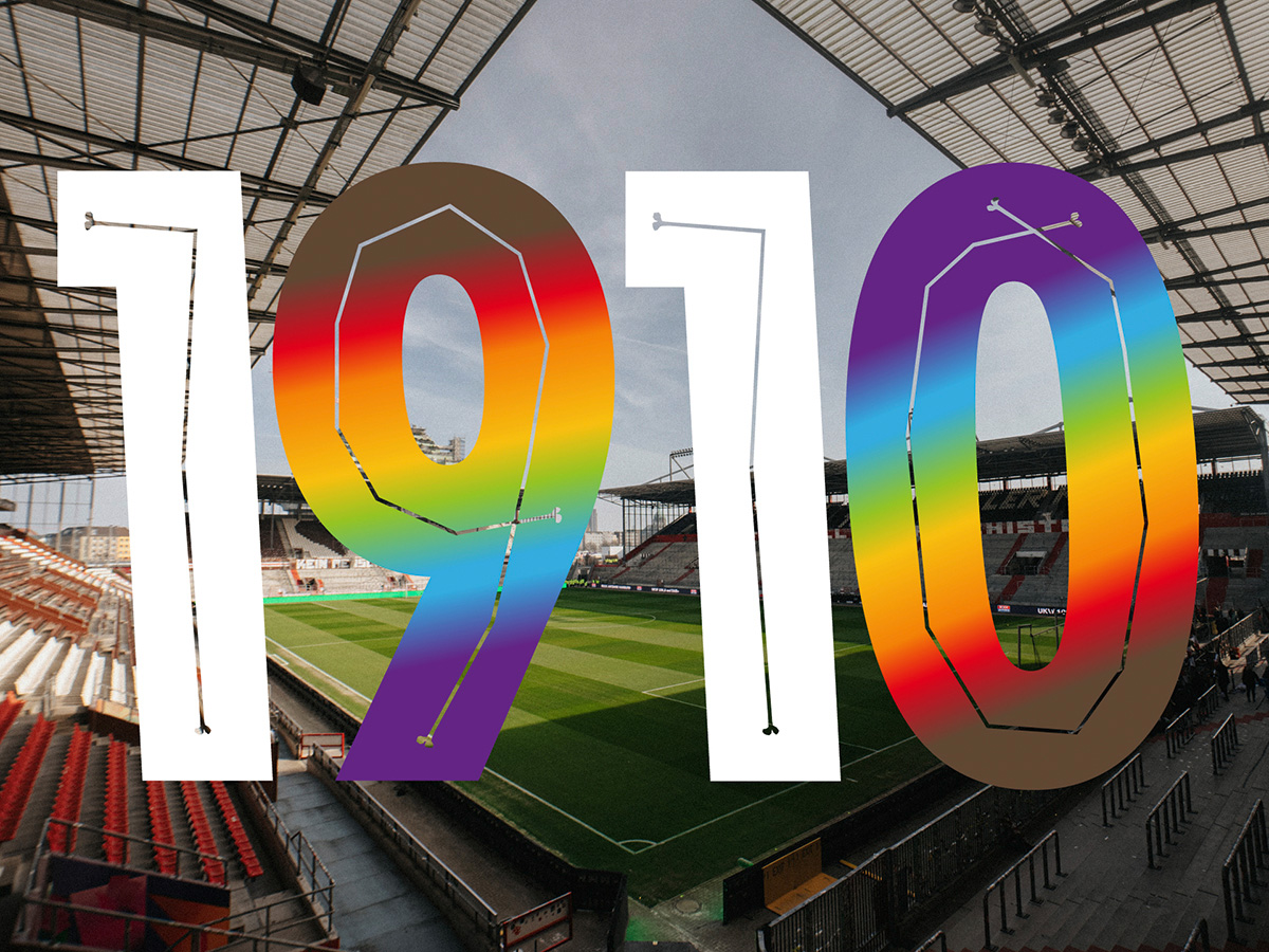
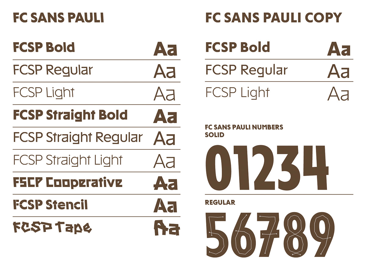
FC Sans Pauli stands out with its characteristic leftward slant, visually representing the club’s commitment to being “different.” More than just a font, it’s a statement and attitude that embodies FC St. Pauli’s unwavering character and deeply ingrained convictions. Left-leaning and inclusive, the typeface offers 13 styles, including a Copy variant that ranges from Light to Bold. It includes jersey numbers, a tape style, OpenType features, and alternative glyphs. This provides a dynamic typographic toolbox for a vibrant club. The extensive Latin-S glyph set supports 100 additional languages, extending FC Sans Pauli’s reach to 200 million more speakers than typical glyph sets.
This typeface isn’t just a design—it reflects the indomitable spirit and core beliefs FC St. Pauli has always championed. “With FC Sans Pauli, we’ve created a typeface that is highly activist,” says Claudia Fischer-Appelt, founder and Executive Creative Director of Karl Anders. “It is an expression of the club’s deepest convictions and paves the way for further independence of the brand.”
Christoph Koeberlin, one of Europe’s leading type designers, collaborated on the development of FC Sans Pauli. Known for his work on the font FF Mark, Koeberlin designed a font that is technically precise and memorable. The typeface is being used immediately in all of the club’s communications, strengthening FC St. Pauli’s brand identity. This marks another step in the club’s mission to promote alternative football culture and make its values accessible to a wider audience. “This typeface doesn’t just reflect attitude—it is an attitude,” says FC St. Pauli’s Brand Director, Martin Drust. “It allows us to move from leasing to ownership, creating lasting brand value.”
Lars Kreyenhagen, founder and Executive Strategy Director at Karl Anders, highlights the brand’s interactive potential. “Our brand thrives by being used by many people. We want to encourage that engagement,” he says. “The new typeface strengthens the brand’s identity and recognition while simplifying its use. This will make it easier for those involved to support the club’s sporting, social, and political mission.”
The team at Karl Anders responsible for this project includes Claudia Fischer-Appelt (ECD), Marcel Häusler (CD), Gregor Frotscher (CD), Henry Monse (AD), Anna Hilgenstöhler (Copy & Concept), and Lars Kreyenhagen (ESD). They worked closely with Christoph Koeberlin, who designed the typeface.
At FC St. Pauli, brand management is led by Martin Drust, Managing Director of Branding and Marketing.
