PENNY Price Packs
Typographic Packaging Design
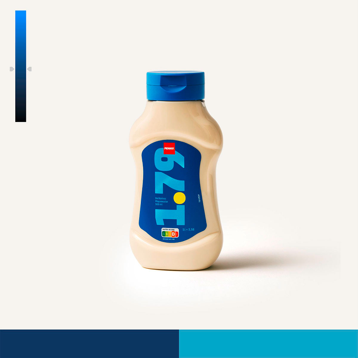
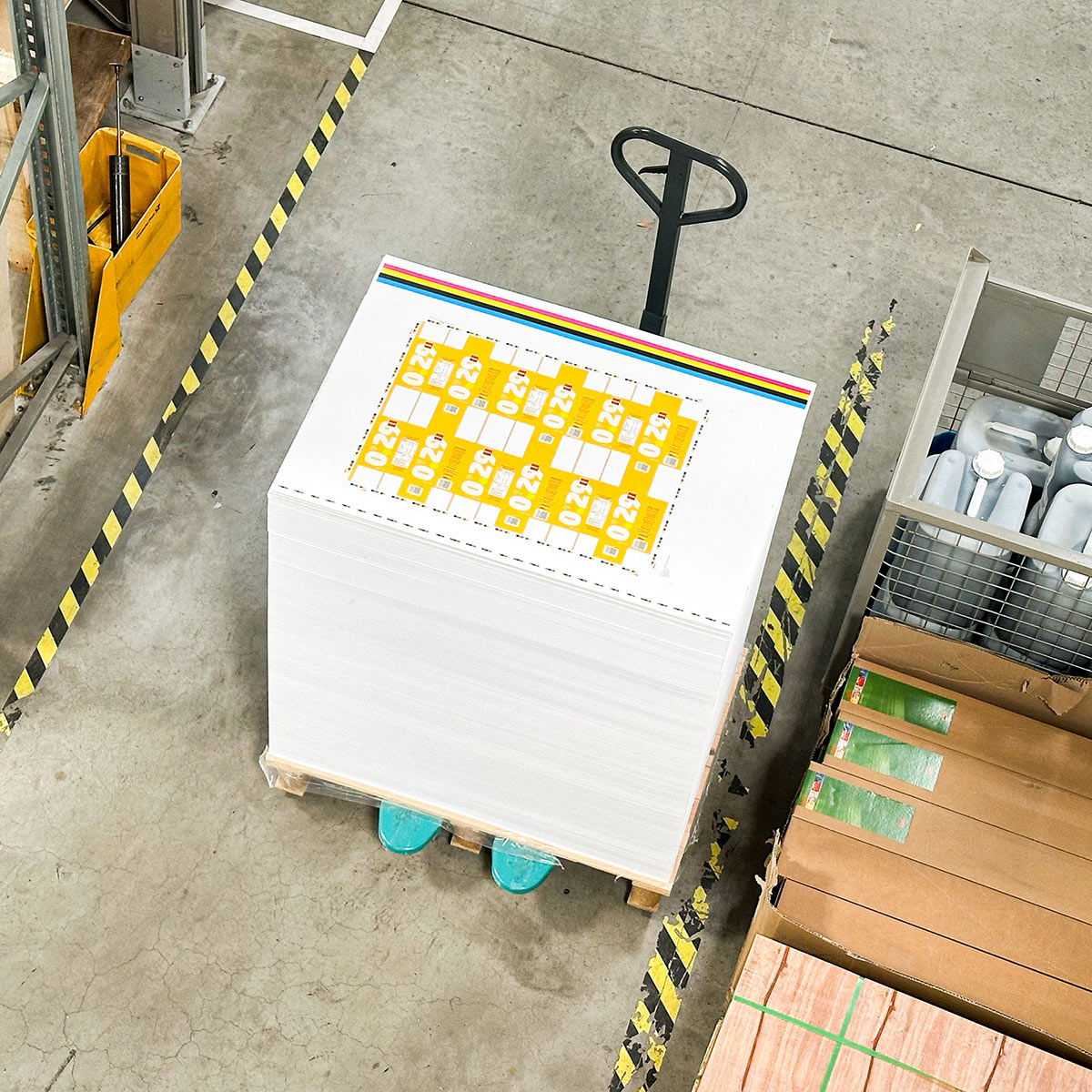
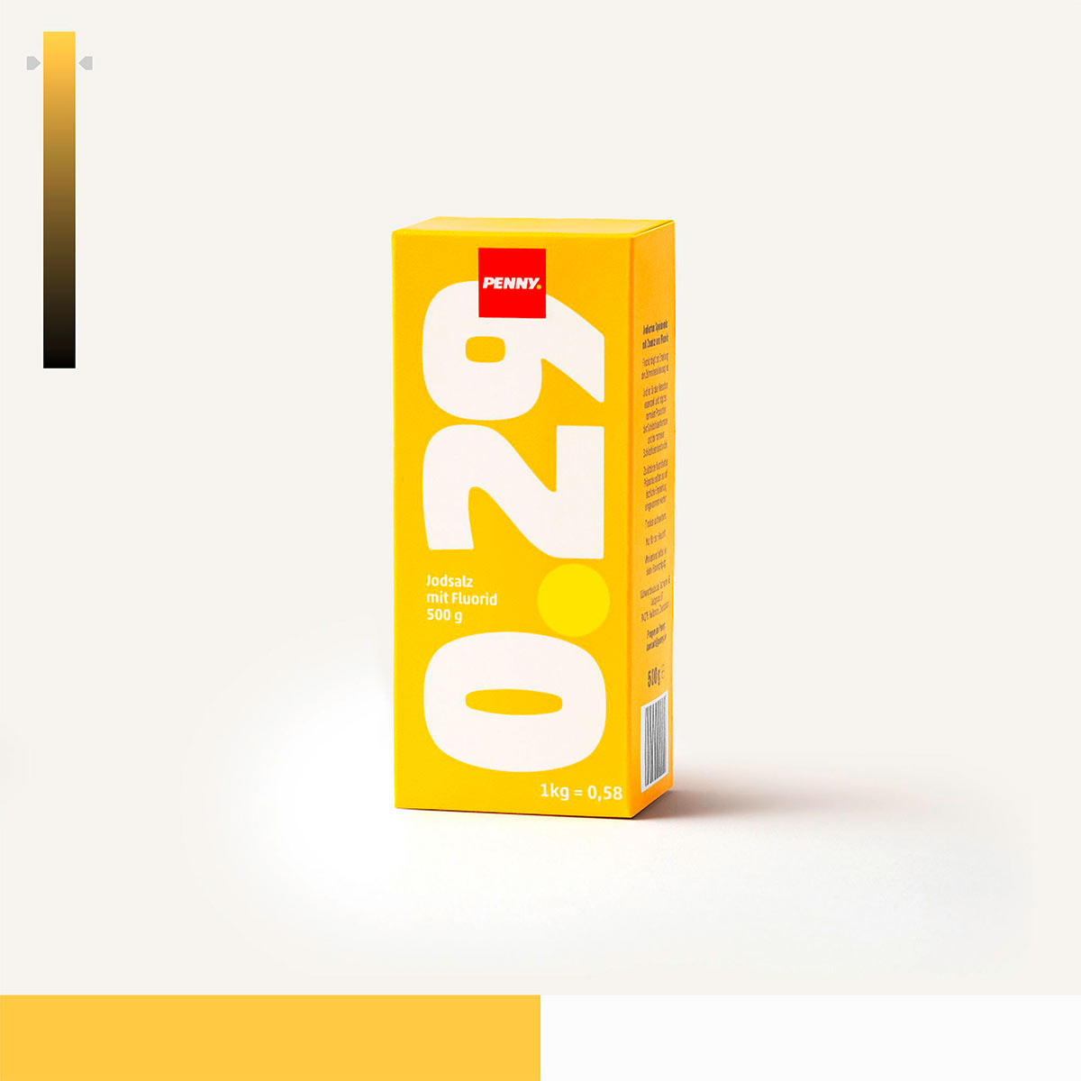
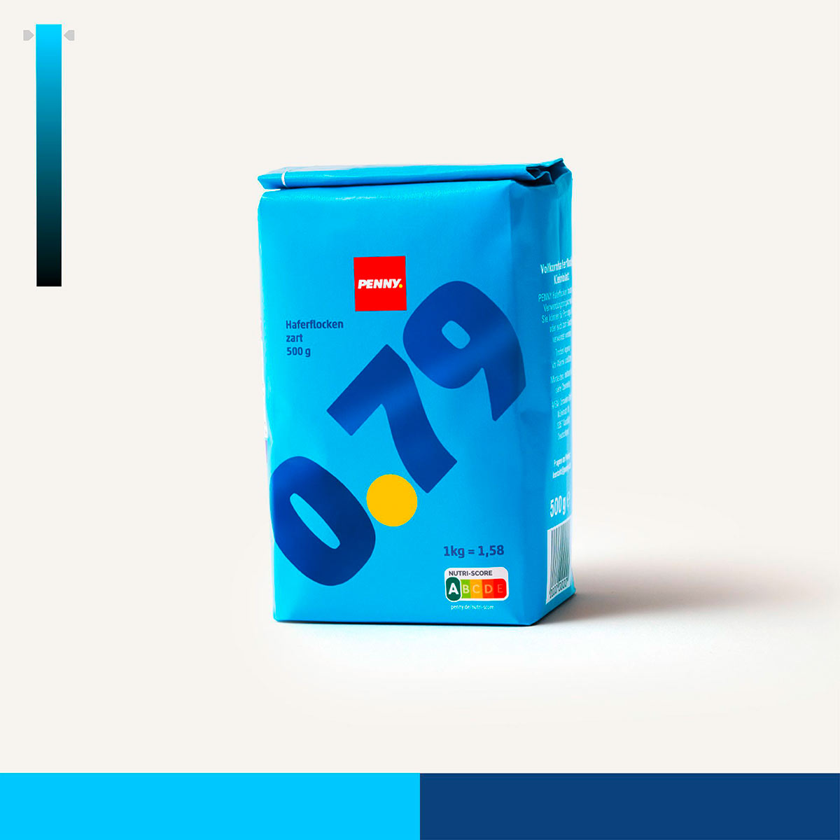
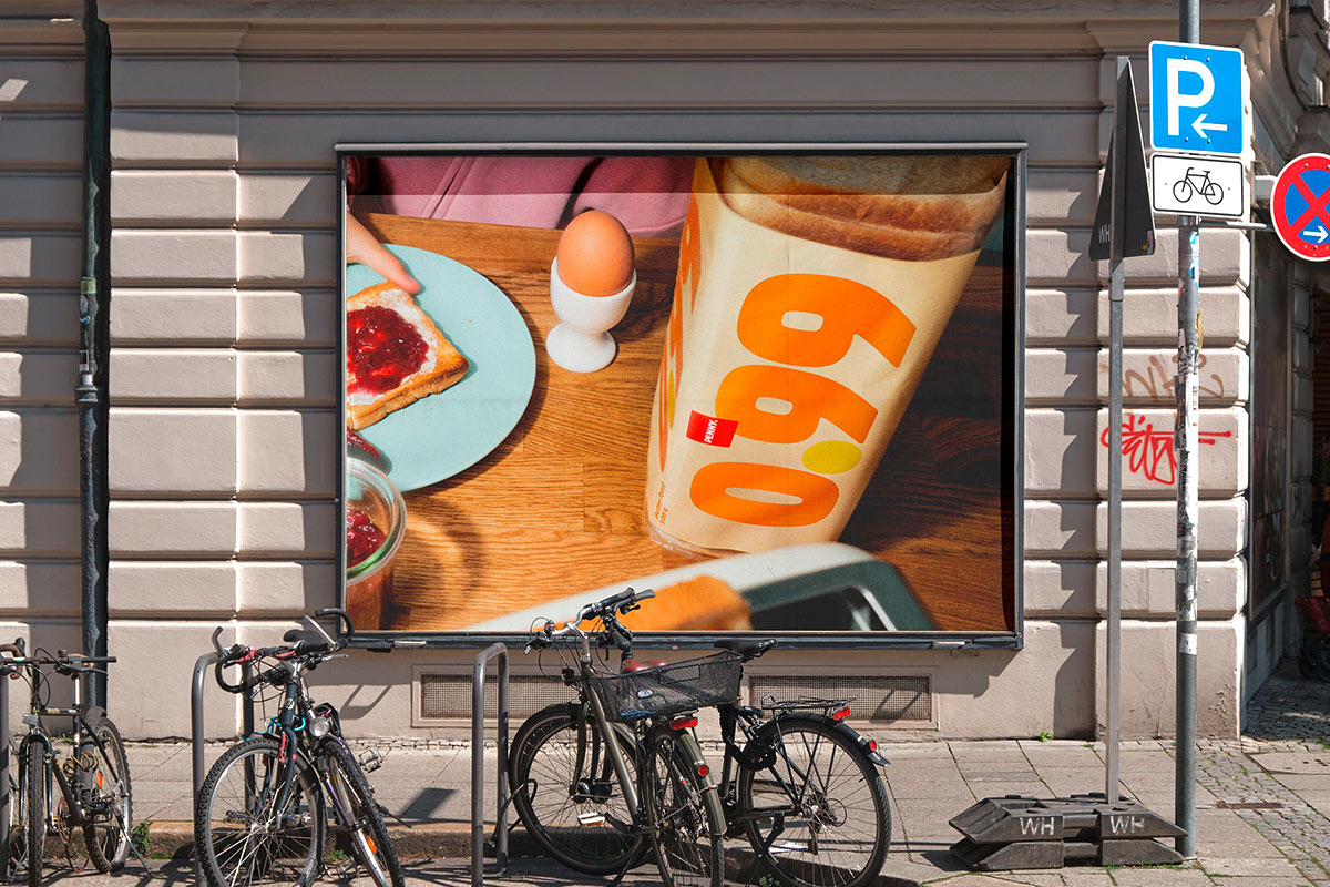
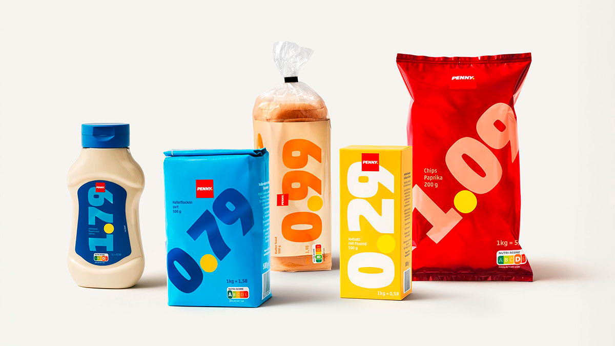
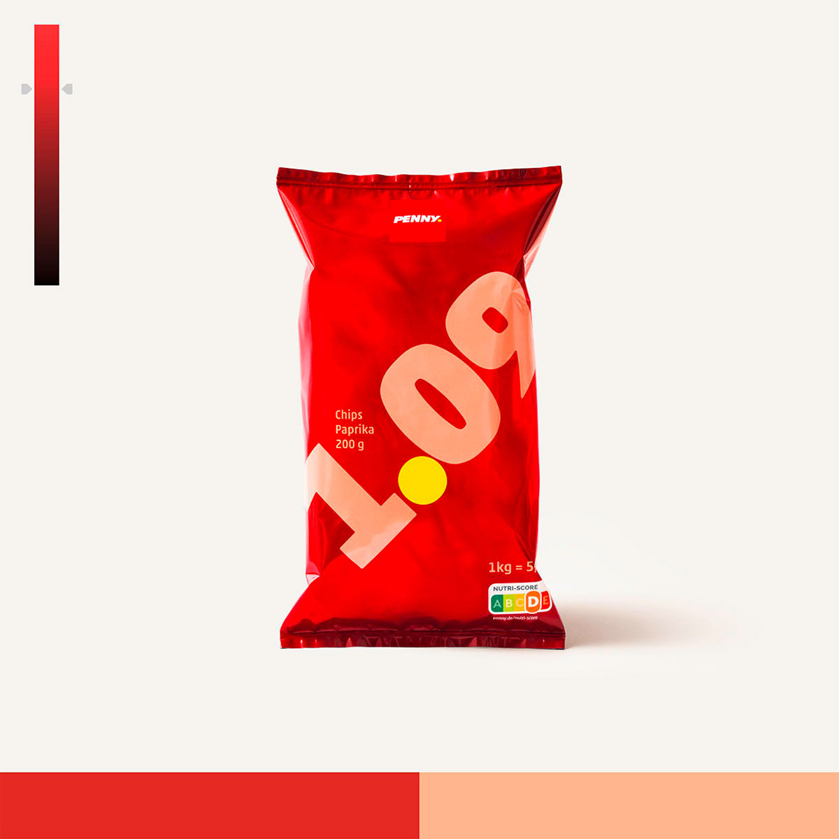
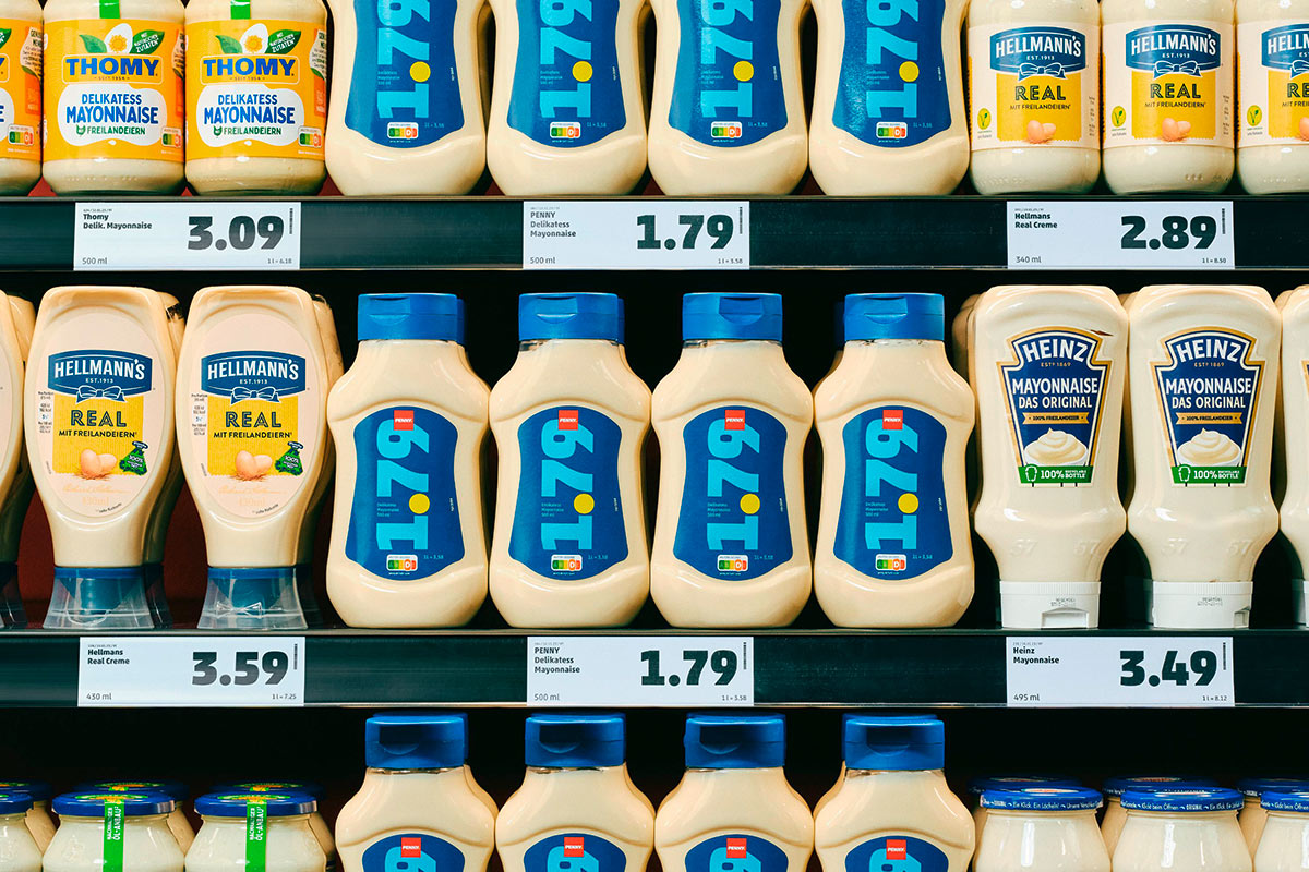
Packaging is a tricky topic: it needs to appeal to the consumer, speak to them directly, and ideally convince them to buy the product—regardless of price. In fact, these products should look premium and reflect quality. So, what’s happening at PENNY? They’re emphasizing low prices by making them the central element in the new packaging design for their store brands.
This idea comes from Serviceplan, whom we asked about the idea behind this approach. Matthäus Frost, Creative Director, answered our questions:
Discount stores are an integral part of the supermarket landscape in Germany. Nevertheless, food products are almost always advertised based on quality, rather than a low price. What’s the idea behind this?
In Germany, quality often defines food advertising, even at discount stores, to build consumer trust and value perception. With PENNY, we took a different approach by focusing on price to address inflation directly and reassure customers seeking affordability. This bold emphasis on price stability over conventional quality messaging reinforces PENNY’s unique value promise in a competitive market.
What role does the typography used play? Which typeface was used and why?
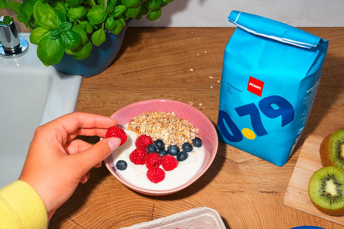
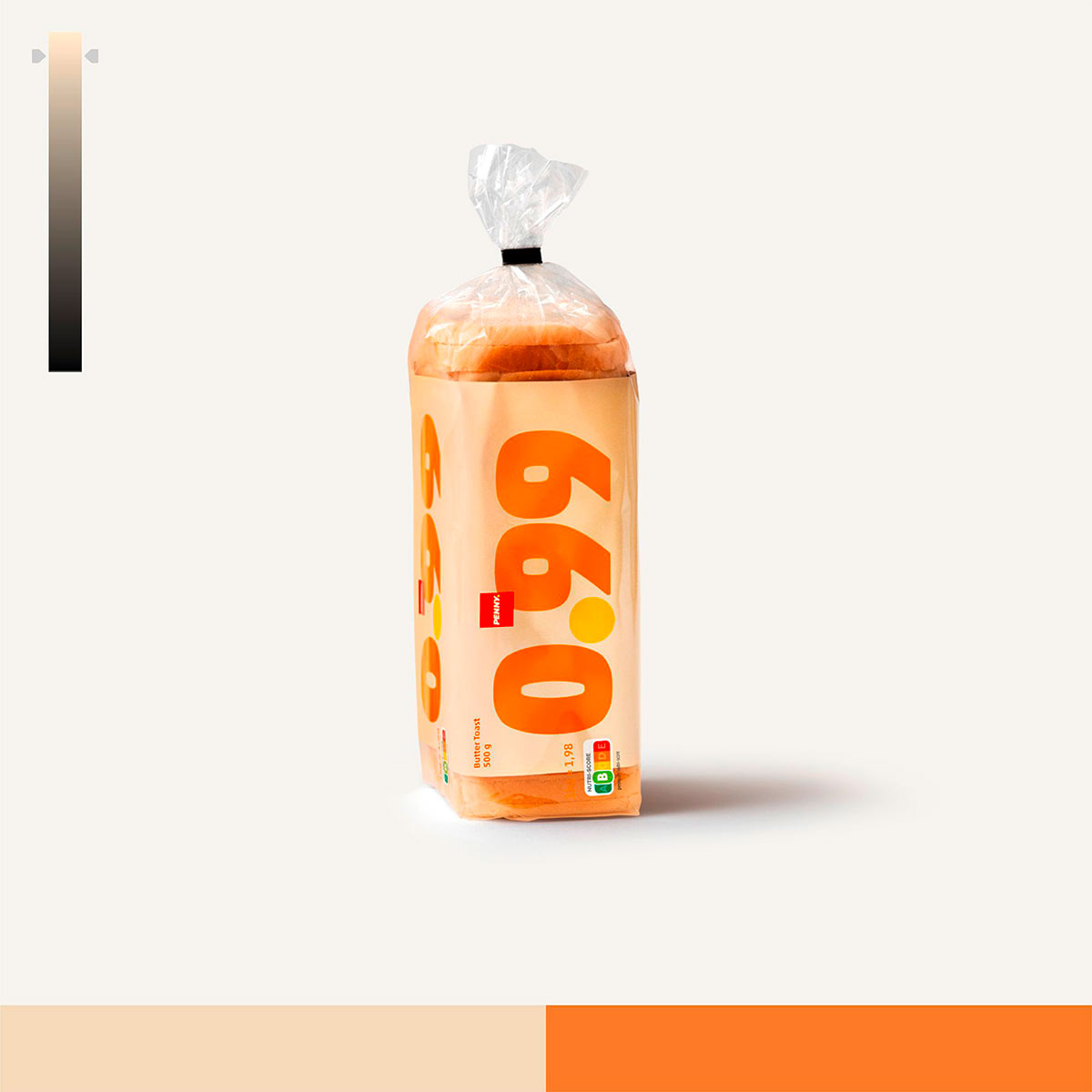
Typography plays a crucial role in the packaging design, with the PENNY signature Akko font chosen for its bold clarity and familiarity with the brand. Akko black was selected due to its bold structure, amplifying legibility and impact to ensure that the price stands out unmistakably on shelves. Since most of the packaging uses illustration and visuals, with Price Packs the typography became the key element. This choice reinforces simplicity, making pricing instantly recognizable and aligning with PENNY’s promise of affordability.
The product colors are strongly based on the primary colors. What was the reasoning behind this?
The idea was not to use the PENNY brand colors, but instead focus on primary colors for their simplicity and strong shelf impact, making products highly visible. Additionally, these colors were aligned with category conventions, so customers could easily recognize each product type—like yellow for toast or blue for oatmeal and mayonnaise—while reinforcing PENNY’s emphasis on affordability and clarity.
Have there been any responses from consumers yet?
Consumer responses have been overwhelmingly positive. Shoppers appreciate the bold, straightforward pricing, with some products even selling out temporarily due to high demand. In some other cases, people couldn’t believe it. A frequently asked question became what would happen when the price changes. And the point is, we don’t. By locking in prices months in advance, we’re making a bold commitment to price stability. This builds trust with consumers and ensures they know they can count on PENNY for consistency.
Thanks a lot for the insights! We’re definitely fans of the typographic style they’ve chosen! :)
