A is A is A
Exhibition of the Smallest but Also Most Interesting Parts of Typography
When it comes to analyzing typography it is not only about serif or sans serif, alternating strokes, their widths, proportionality or equal thickness, round or angular shape parts (e.g. or the axial position of single letters, it is also about taking a closer look into the DNA of a typeface. The exhibition A is A is A shows such visual research projects concentrating on even the smallest but also most interesting parts of typography.
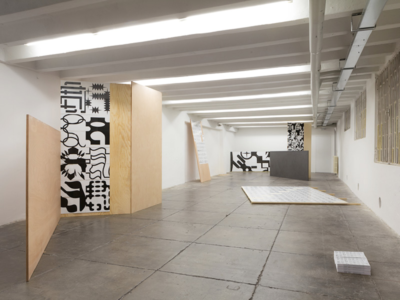
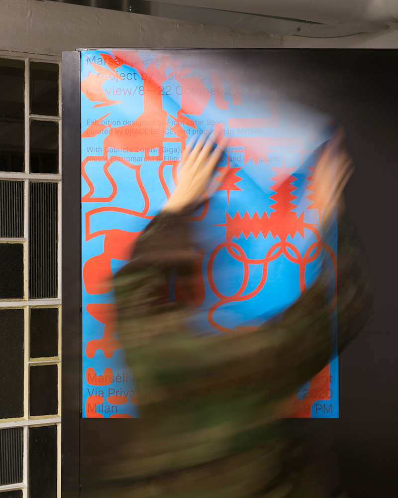
Marcello Jacopo Biffi teamed with Marsèll Paradise in Milan to produce the exhibition A is A is A to present a selection of his alphabets. The exhibition comprises an installation designed by From outer Space, and a 16 mm film titled Détour directed by Nicola Pietromarchi and Filippo Castellano and produced by Olympìque. BRACE BRACE curated the project supporting its development and writing along with Michele Galluzzo the curatorial texts. Lastly, Gabriele Donini developed the website.
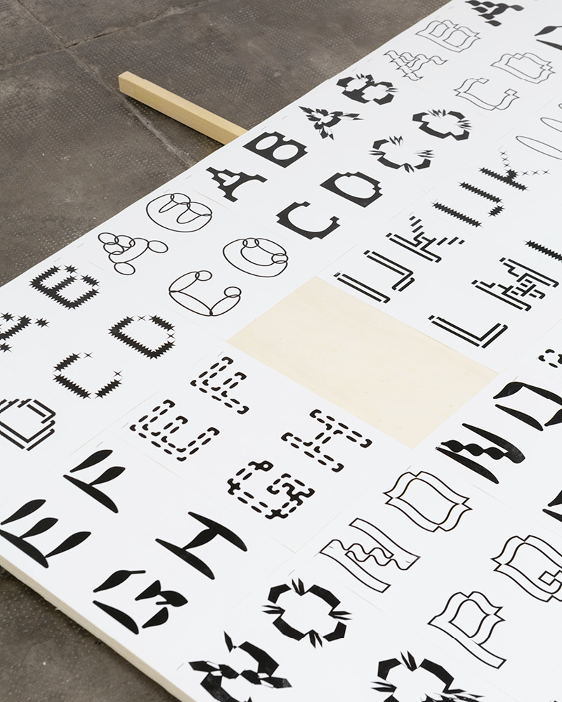
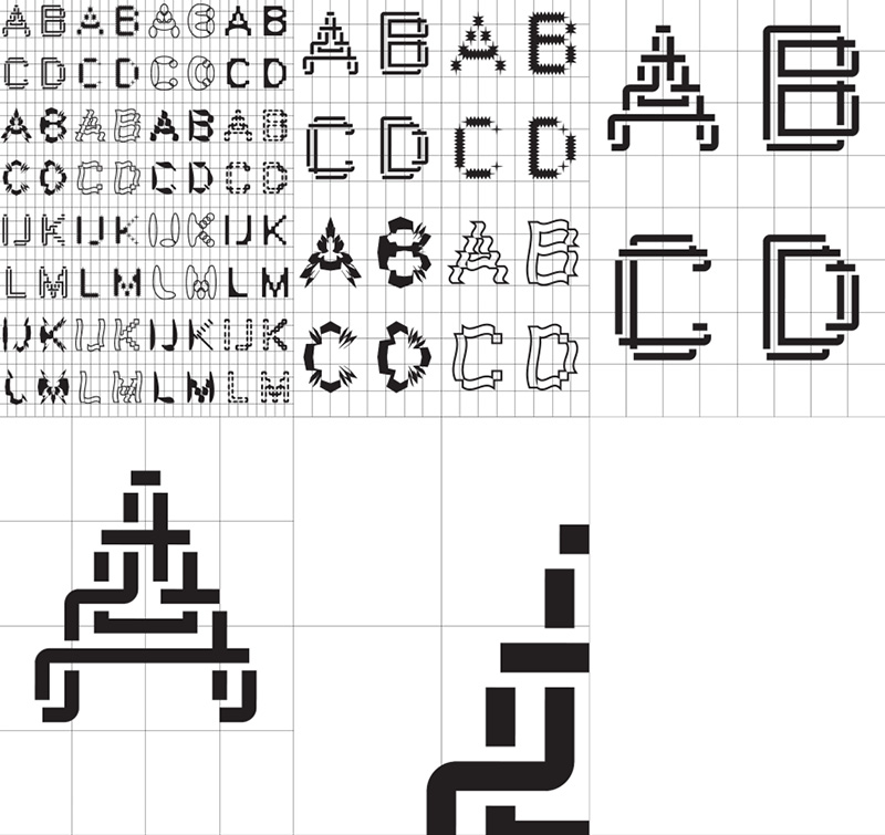
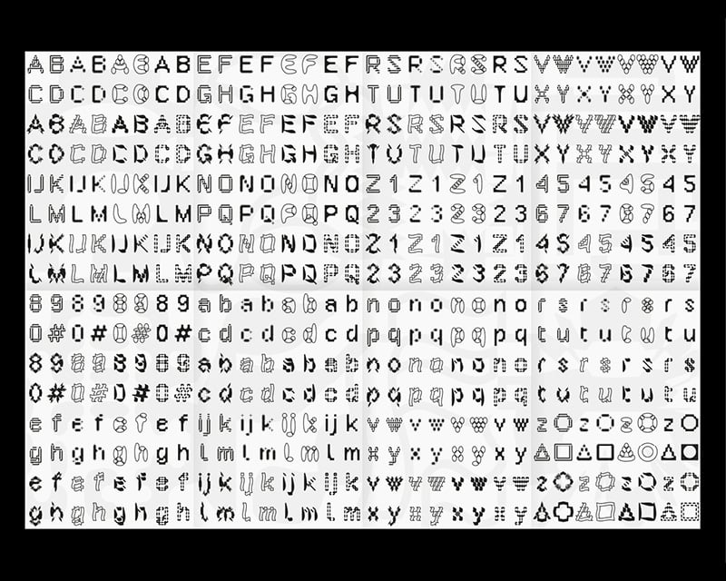
Alphabets is a visual research project by Marcello Jacopo Biffi in the field of typography and the key piece exhibited in A is A is A. As the title suggests, it consists of a group of related alphabets, which share the same DNA but look considerably different. They are all developed from an elementary pixel matrix—the lowest form of the alphabet—which undergoes many digital transformations leading to atypical results. Within the design process, the order of execution, the intensity of distortion, and the number of different steps are some of the variables that determine the result, which is never final.
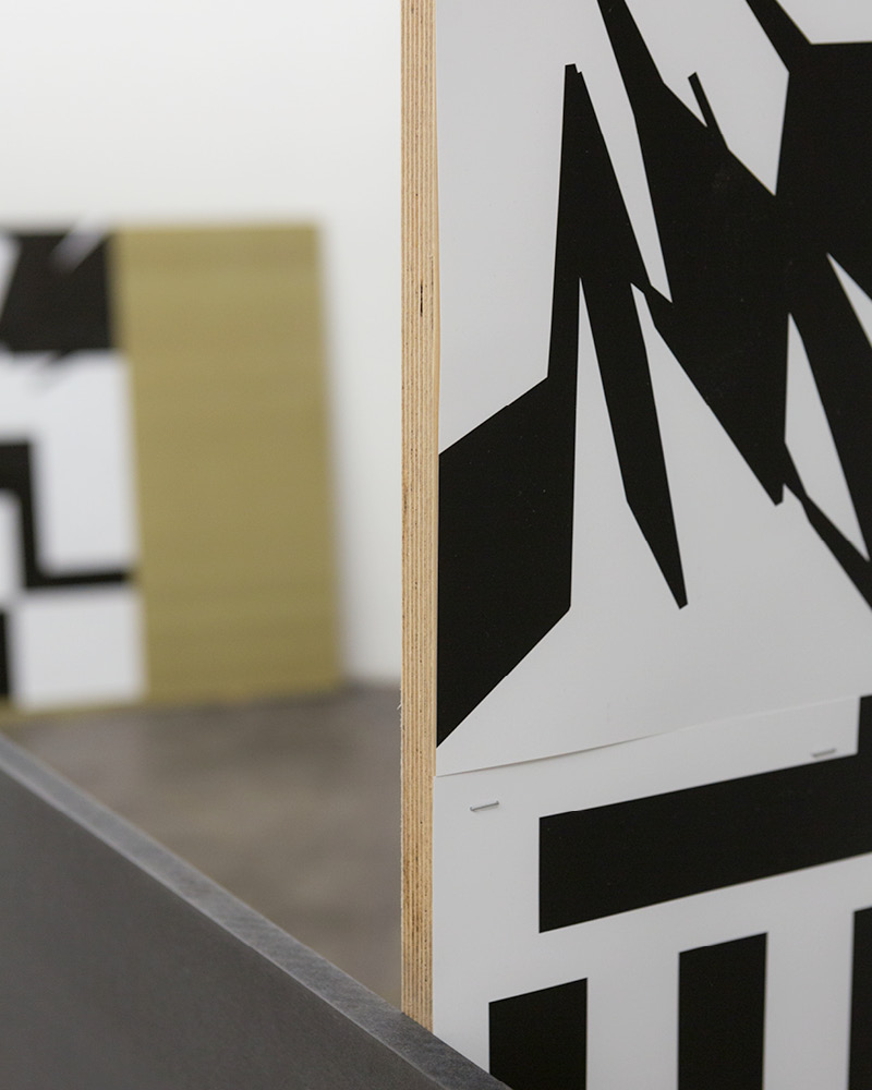
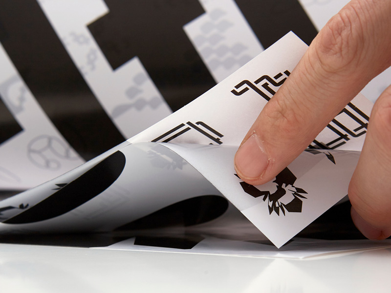
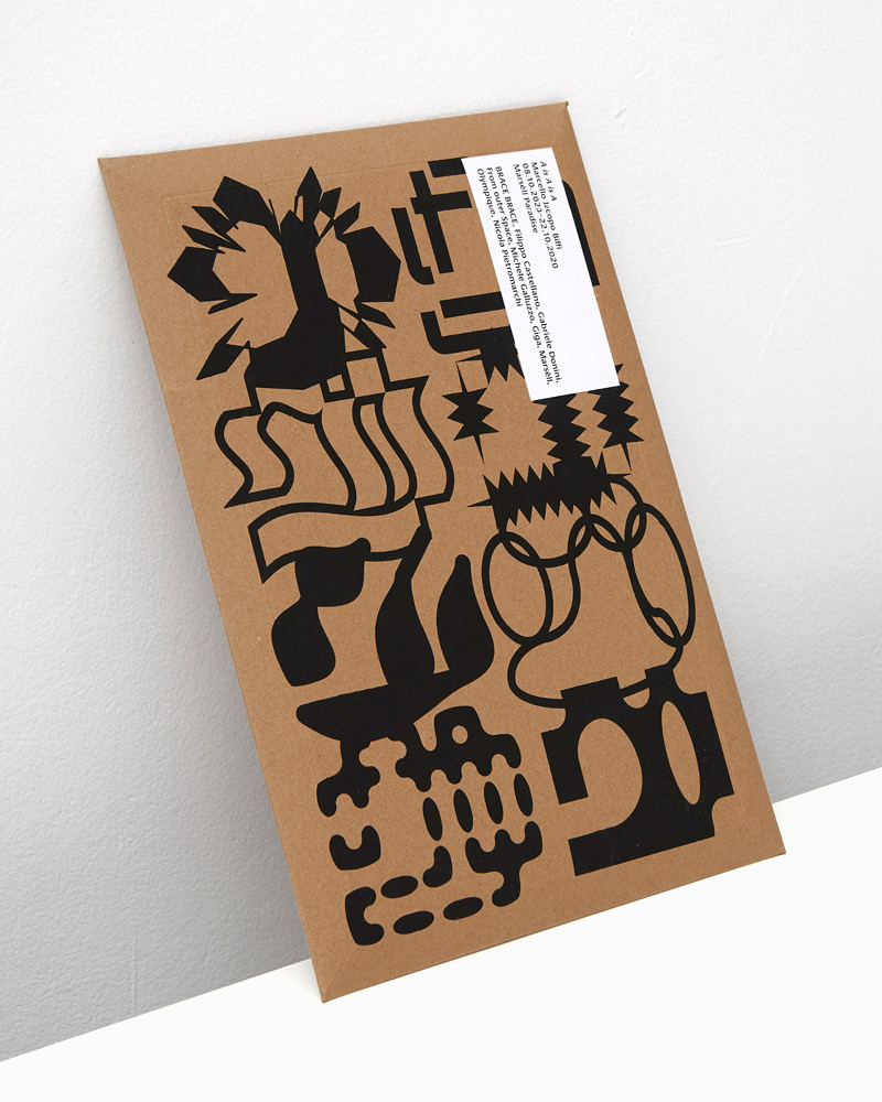
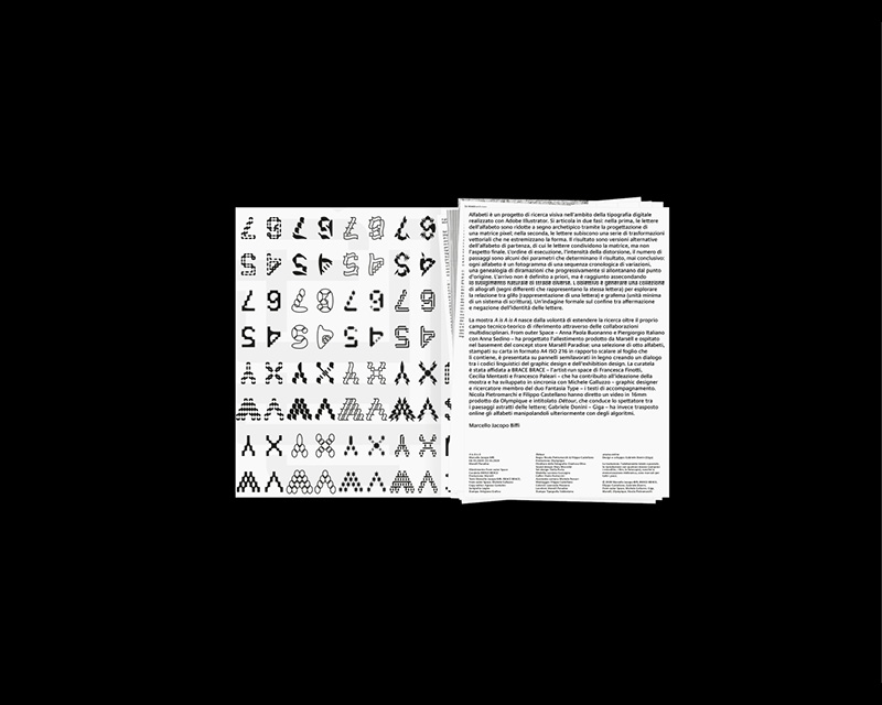
For the exhibition, Marcello Jacopo Biffi designed a booklet that unfolds to a double-sided A1 poster showing all the letters on display and contains the texts and technical drawings printed on loose sheets of paper. He also published a limited edition catalog collecting in an envelope a replica set of the sheets of paper used to build the exhibition. A double grid system—a combination of square units and the ISO 216 standard—guided the positioning of the letters in the page. All the single page artworks have been generated by simply scaling and cropping one bigger artboard.
A is A is A
Alphabet: Marcello Jacopo Biffi
Directors: Nicola Pietromarchi & Filippo Castellano
Production: Olympìque
Director of Photography: Gianluca Oliva
Sound design: Mara Miccichè
Set design: Stella Porta
Hands Model: Lucrezia Cuccagna
Gaffer: Paolo Pastaccini
Assistant Camera: Michele Porcari
Editing: Filippo Castellano
Colorist: Leonardo Masoero
Location: Marsèll Paradise
Print: Tipografia Valdostana
