Adobe Hidden Treasures: Bauhaus Dessau
Part 3: Alfarn
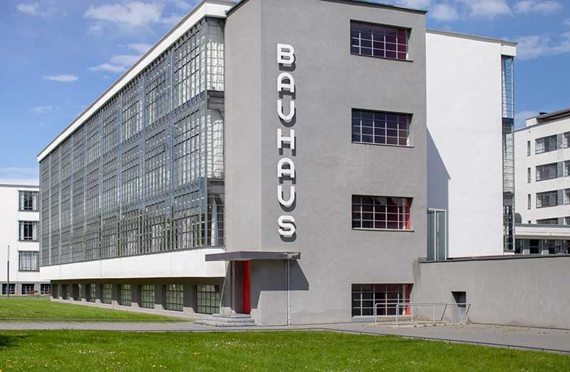
For the 100th anniversary of the Bauhaus Dessau, Adobe has launched the beautiful project “Adobe Hidden Treasures—Bauhaus Dessau,” in which almost forgotten, unfinished font designs and letter sketches of legendary Bauhaus masters have been taken from the archives and now completed.
In collaboration with the Bauhaus Dessau Foundation and Erik Spiekermann, Adobe has realized the project and will now successively publish five new fonts based on legendary Bauhaus designs by Xanti Schawinsky, Joost Schmidt, Carl Marx (July 2018), Alfred Arndt (August 2018) and Reinhold Rossig (September 2018). Three fonts are already published: Xants, Joschmi and CarlMarx which are available via Typekit.
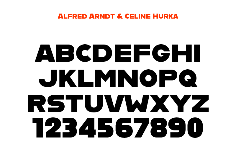
We are proud to present the fourth font: Alfarn, based on the work of Bauhaus student Alfred Arndt. It was designed by Céline Hurka (Royal Academy of Art (KABK) in The Hague). We conducted an exclusive interview with the designer in which she gave us personal insights into her work on the Alfarn.
What do you spontaneously think of about the Bauhaus?
I have to think mainly about how many fundamental ideas in art, architecture and design have changed at that time. It also reminds me how important studying can be, as it has the potential to form new general approaches and structures. Visually I associate with the Bauhaus a certain simplicity and reduction in forms and colours, as well as a playful precision and rigour.
How did you come to the Adobe Hidden Treasures project?
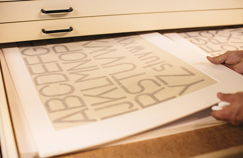
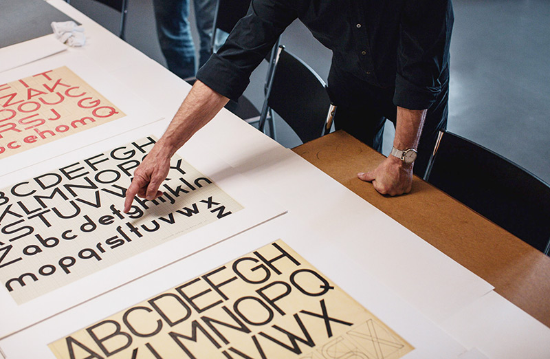
In mid-April, Erik van Blokland wrote to me and introduced me to the project. When he offered me to participate, I was naturally very happy. We were shown the various original designs from the Bauhaus and the letters on Alfred Arndt’s posters immediately appealed to me. Fortunately, I was able to start designing exactly these letters a week later.
What thoughts did you have when designing the letters?
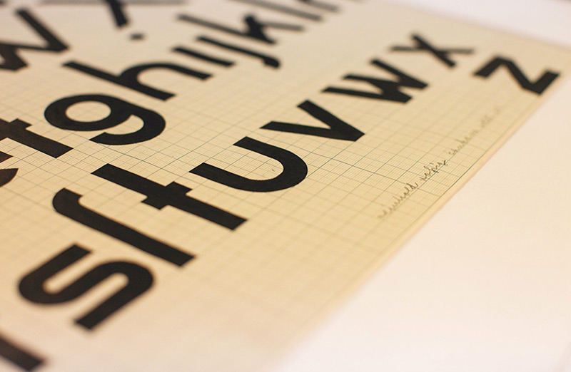
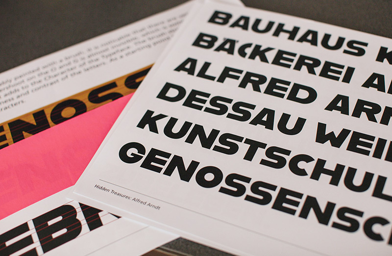
At the beginning of the project, I first of all dealt visually with the technique Alfred Arndt used on the poster. On closer inspection, you will notice that he probably worked with a brush. That was enormously important for the general construction and for some details, since the technique is also associated with certain limitations.
At the same time I researched Arndt’s curriculum vitae and found out that he had a connection to both painting and architecture. I then decided to construct the typeface geometrically on a grid of lines and reduce many of the optical compensations to a minimum. One of the biggest difficulties was also that I had very few letters available in the original and that I had different cuts to choose from. In the end, I worked out several that can be used as features in the font. Altogether it was very important to me not to keep the font too rigid and geometric but also to handle the shapes playfully.
What do you take out of the project for yourself, what did you learn?
Before the project, I hadn’t really dealt with type design from the Bauhaus. Looking back, it was of course exciting to learn more about this time and to experiment with its approaches. The nice thing about the project was to get to know other students and to exchange our fonts.
At the same time this font is my first to be published and there were some technical and organizational things I learned. Since everything went quite fast and we only had one month to design, it was a very different process than with previous fonts that I designed at KABK over several months. Finally, I would like to thank Erik van Blokland, Paul van der Laan, Peter Verheul, Ferdinand Ulrich and Erik Spiekermann for their feedback and support. I’m pretty sure I’ve learned many things from this project that I’ll need in the future.
Alfarn
Alfarn is based on capital letters that Bauhaus student Alfred Arndt (1898–1976) drew for a poster in 1923, designed to advertise a bakery in Jena, Thuringia. The poster is an example for what we call today “Bauhaus features”: yellow circle, red square, black bars and an indication of geometric lettering that became so popular in the following years. Céline Hurka carefully analysed Arndt’s lettering and derived two weights in different widths: wide and condensed, available as OpenType alternates. She took on the characteristic bars and transformed them into an underlined weight of its own. Hurka also drew perfectly balanced small caps, which make up for a missing lower case. Alfarn captures the spirit of 1920s Bauhaus-influenced posters—a timeless style quite suitable for contemporary designs.
Design competition:
With the publication of the fonts, Adobe is also launching a five-part design competition in which all creative people are invited to design with the new fonts for the first time. There are exclusive prizes to be won, including a trip to the Bauhaus Dessau Foundation. More information on how to participate can be found here.
Coming soon:
Font 5: September 2018—Designed by Elia Preuss, based on the work of Bauhaus master Reinhold Rossig
Background:
Although the Bauhaus was only active for 14 years after its opening, it is still considered today to be the best known modern school for architecture, design and art of the last 100 years. In 1932 the Dessau municipal council, dominated by the National Socialist Party, decides to dissolve the Bauhaus School in Dessau. The unfinished masterpieces of the designers Xanti Schawinsky, Joost Schmidt, Carl Marx, Alfred Arndt and Reinhold Rossig have therefore remained in the archives to this day.
“Hidden Treasures of Creativity is an ongoing project that aims to revive lost creative history to inspire current generations. Last year, Adobe worked with the Munch Museum and the world’s leading Photoshop brush expert, Kyle T. Webster, to recreate Edvard Munch’s brushes. Tens of thousands of people downloaded the brushes and were inspired by the old master. This year, Adobe recognizes the unbroken influence of the Bauhaus, whose goal was to rethink the future, unfold it in everyday creativity, to shape modernity in all its demands—including typography and design from the beginning, which has driven us to innovation to this day. We hope that by bringing these hidden treasures to the present day, we can inspire many creative people,” said Sabina Strasser, Head of Brand Marketing, EMEA at Adobe.
