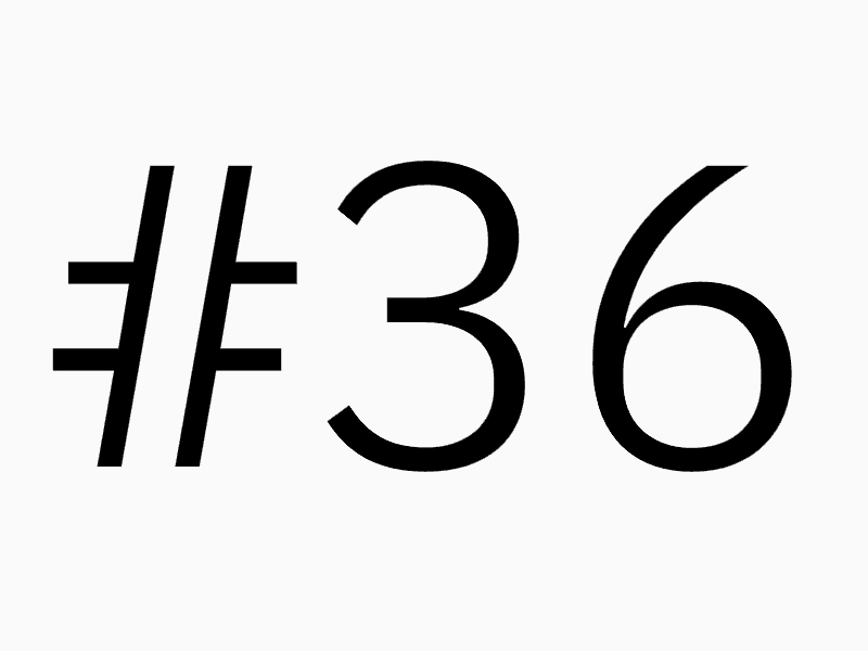
Animated Alphabet of Variable Fonts
by 36 Designers Curated by letterspace.amsterdam
If you’re interested in variable fonts, that are fun to play with, hop over to letterspace.amsterdam to find an Animated Alphabet of Variable Fonts.
letterspace.amsterdam usually showcases Amsterdam’s typography through informal monthly gatherings, lectures and presentations at the studio of typographer Johannes Verwoerd and type designers Diana Ovezea, Sabina Chipară, and Edgar Walthert. However, with the 23rd edition of letterspace aligning with #36daysoftype and coinciding the height of the global CoViD-19 pandemic, the organizers decided instead to invite their speakers and visitors to push the possibilities of the OpenType Font Variations technique and generate a hallucinogenic animated alphabet for an online presentation to everyone stuck indoors.
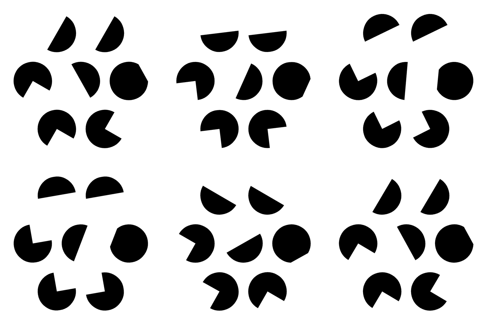
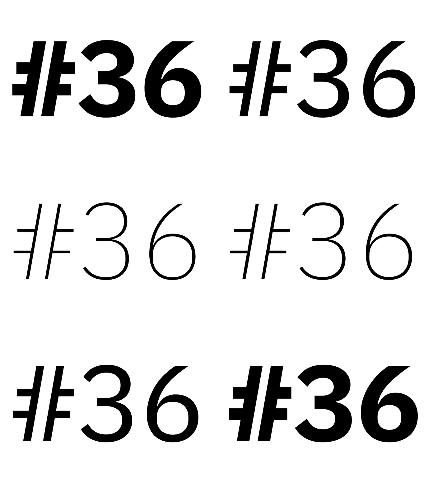
Variable font technology has been around for years, yet its full potential has largely remained untapped. Fonts based on multiple axes and masters quickly become too complex and time-consuming to finish. Thus, for the purpose of this alphabet, the 36 participating designers have each focused their creative energies on a single letter, resulting in a psychedelic world of possibilities. The designs range from architectural to organic, from pixelated to glitchy, and from historical to futuristic. These letters aren’t short movie clips, but variable font files that can be enjoyed by everyone, adjusted, used as inspiration and grown into a wildly variegated jungle of breathing leaves. When viewed together on the dedicated mini-website, the animated letters revive the old dream of newly created, kinetic, illuminated codices. One can almost already envisage the words that will be set with these electrifying initials. Furthermore, the alphabet is an open-ended, unofficial snapshot of who’s who in Amsterdam’s current typographic design world.
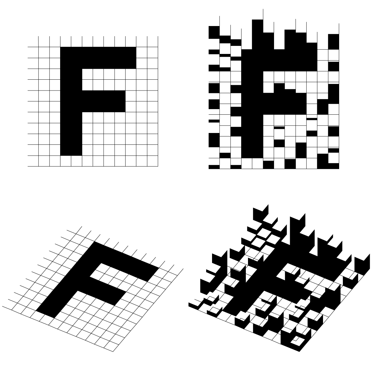
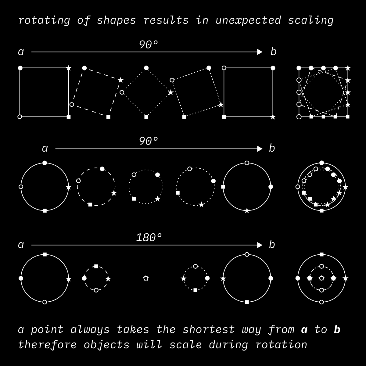
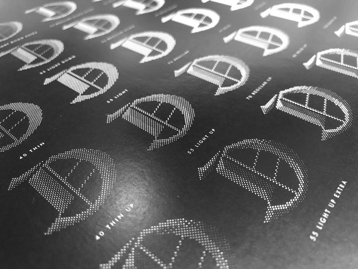
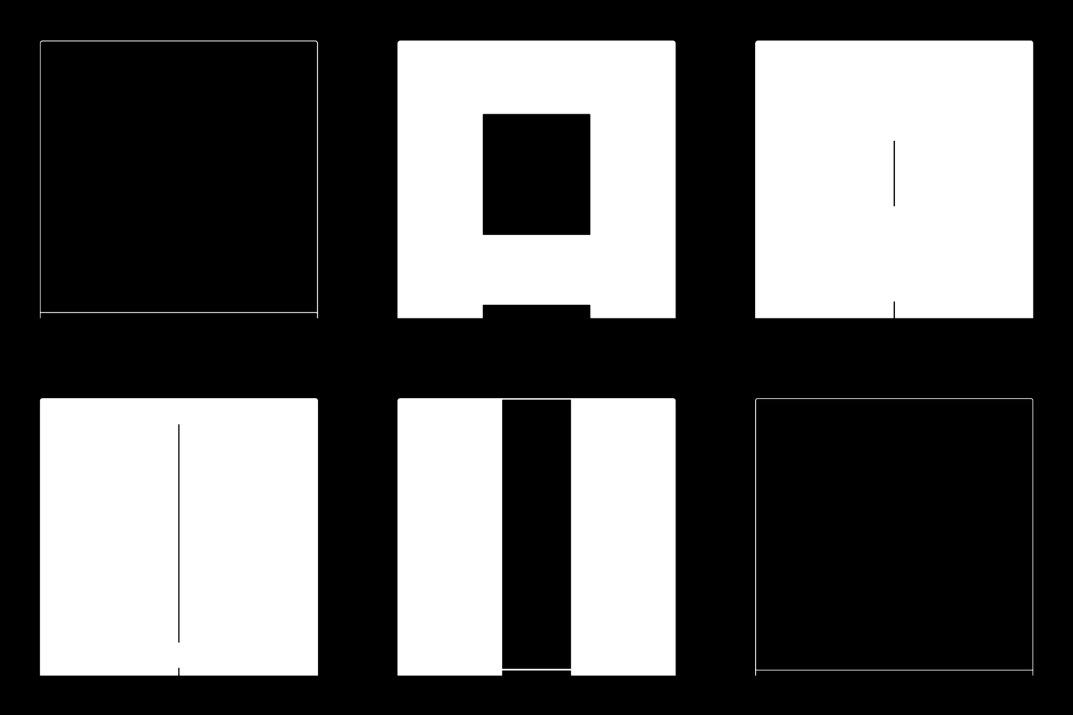
We’re not going to describe each letter in detail, but will instead highlight a few that jump out at us. Donald Roos, one half of VetteLetters, begins the proceedings with an A that starts out by filling its frame and demonstrating all the possibilities of the designspace. The world-famous American designer David Carson, who fell in love with Amsterdam during an artist residency at the Zoku Hotel and never left the city, created the C, which was engineered at letterspace and consists of two seemingly incompatible C’s morphing into each other, revoking the old Flash “tweenings” of the late nineties. This C is no longer just surfing but is now also the wave itself. Several submissions needed a fair bit of work for their transformation into working Variable Font letters. For instance, some initially wouldn’t work on iPhones. The challenges this posed for letterspace’s team revealed how a lot of graphic designers’ thinking is still set around current animation techniques. Even a fairly simple step-by-step animation such as the masonic M by Richard Niessen—the governor of the Palace of Typographic Masonry, another independent venture serving and showcasing the Netherlands’ graphic design community—needed a lot of work to make it a Variable Font. The same goes for the tiny dots that animate Maarten van Disseldorp’s D, which had to be sorted and arranged by Diana Ovezea to fit font software’s limitations. The result is a letter that any number of online newspapers would be wise to snap up.
Fittingly, two pioneers of digital type-design are represented in our showcase. Erik van Blokland, who together with Just van Rossum was responsible for the first dynamically created typeface, FF Beowolf, compiled the L’s of the 34 standard postscript fonts onto a single axis. Van Rossum, for his part, co-contributed the number 1, a futuristic character from an ecstatic set of almost pagan-like symbols that he produced with Hansje van Halem for the Lowlands Festival.
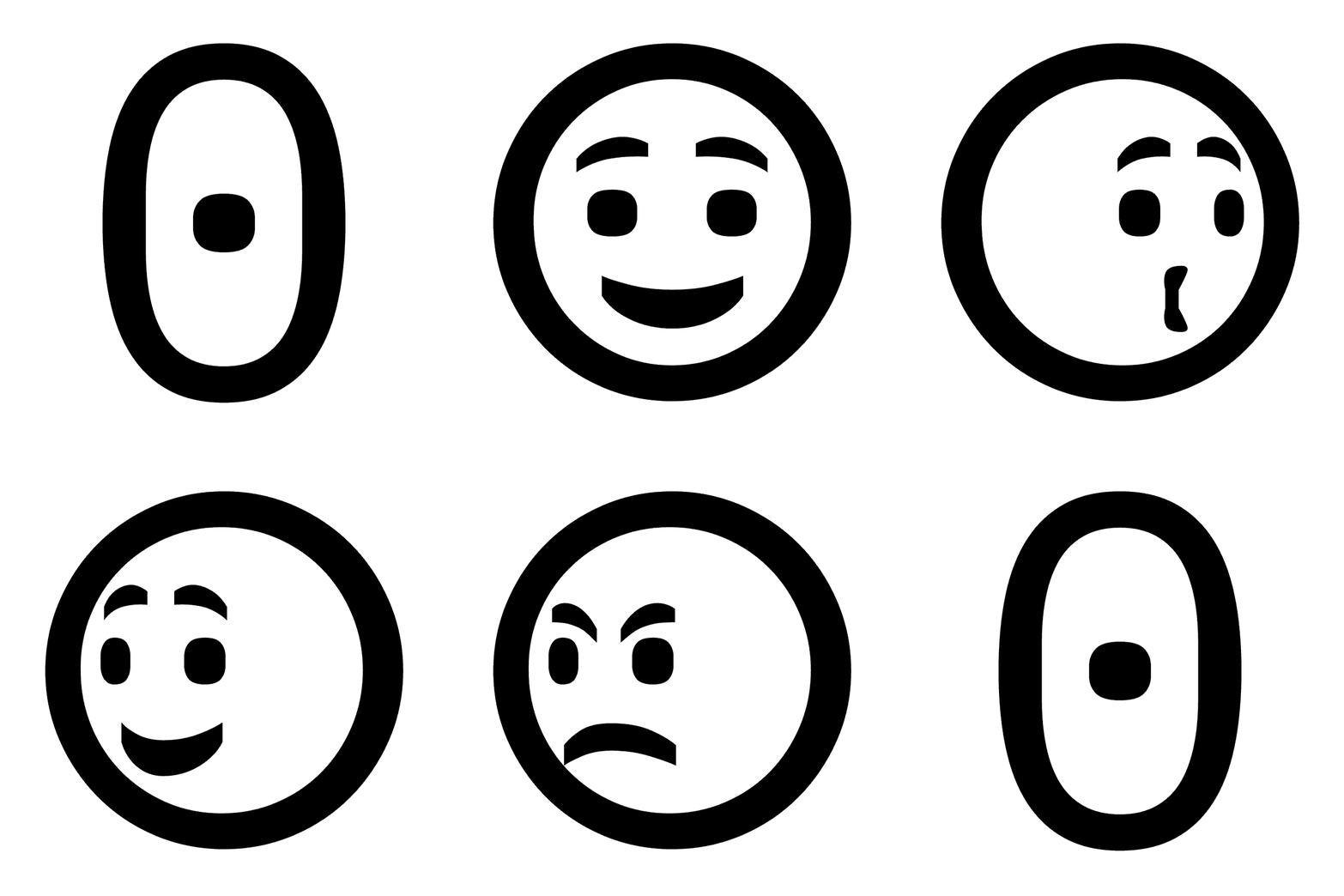
Working from the isolation of his home quarantine, Edgar Walthert fashioned a 0 that mines the rich spectrum of facial expressions. His 0 is not simply a zero, but also an emoticon and an icon that recalls the many icons that make up his Logical typeface. It is perhaps the most vivid example of how much life can be breathed into letters.
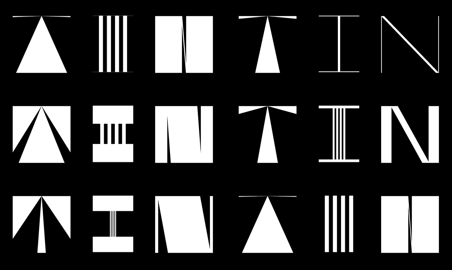
TIN.studio’s letters perform extreme gymnastics within the confines of their frame, Our Polite Society’s X connects software to mysticism and Underware’s U shows rather than leaks the result of a special technique that has been years in the making, called Higher Order Interpolation, and that enables the merging of unstable media with handwriting. The alphabet also features Nick Sherman of v-fonts.com, Arthur Reinders Folmer, who is known as a wizard of variable colour fonts, and Sabina Chipară, whose spiky S offers slider settings that appear to contain entire software suites in themselves, a quality it shares with several others in this alphabet. And finally, Daniel Maarleveld’s 9, a revelation of sheer beauty which shares this distinction with all of his animated typography, which in turn has won him a wide following since last year’s #36daysoftype and resulted in multiple appearances on museum book covers, LED screens and the like.
The amount of work and range of skills required to create this alphabet typically puts fonts like these beyond the reach of almost everyone but highly trained specialists, well-funded institutions and wealthy private practices. However, the letters presented here can be enjoyed by the general public and tweaked by anyone with a desire to enliven them even further. Perhaps the renaissance of the thousand-year-old interplay of language and image will yield a range of electronic documents that level the playing field for designers, coders, typographers and poets. And while this showcase of the alphabet is not intended for direct use, it nonetheless functions as a kind of trailer for the many variable fonts to come. One can almost begin to picture the manifestos that will be written with them, visualize the grand compendiums of extinct species or alien encounters that will be adorned by these letters. The wealth of potential applications might currently exceed our imagination, but for now, to simply behold and appreciate the creativity and beauty captured in these 36 tiny faces is to enjoy the buzz of being alive with them.
Animated Alphabet of Variable Fonts
Curator: letterspace.amsterdam
Author: Dirk Vis
Editor: Siji Jabbar
Twitter: @lttrspc
Instagram: @letterspace.amsterdam
