Arcade Game Typography
The Art of Pixel Type
It’s been a while since I listened to Toshi Omagari’s talk at TYPO Berlin about his research on 8 pixel fonts. Growing up with video games, there are of course many fond memories of the colorful letters flickering animatedly across the screen telling us WON or GAME OVER.
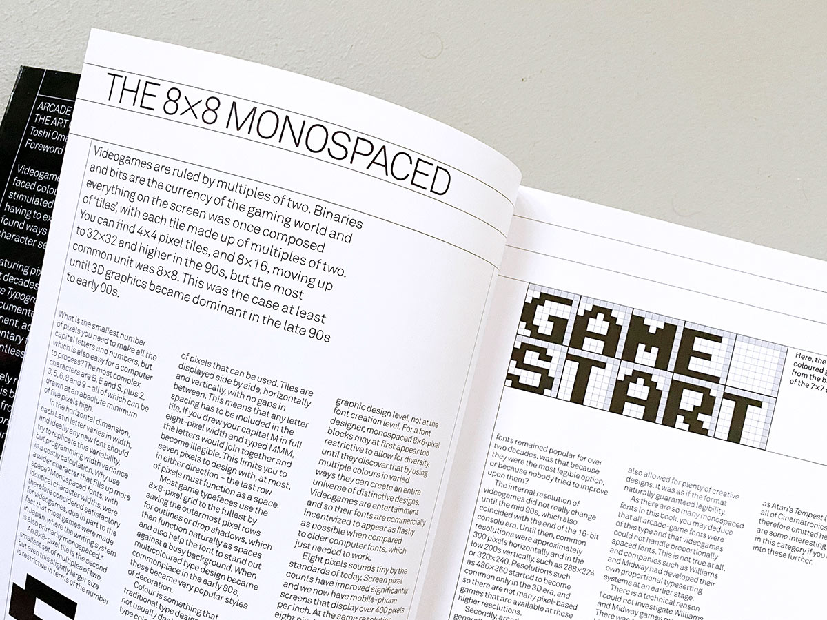
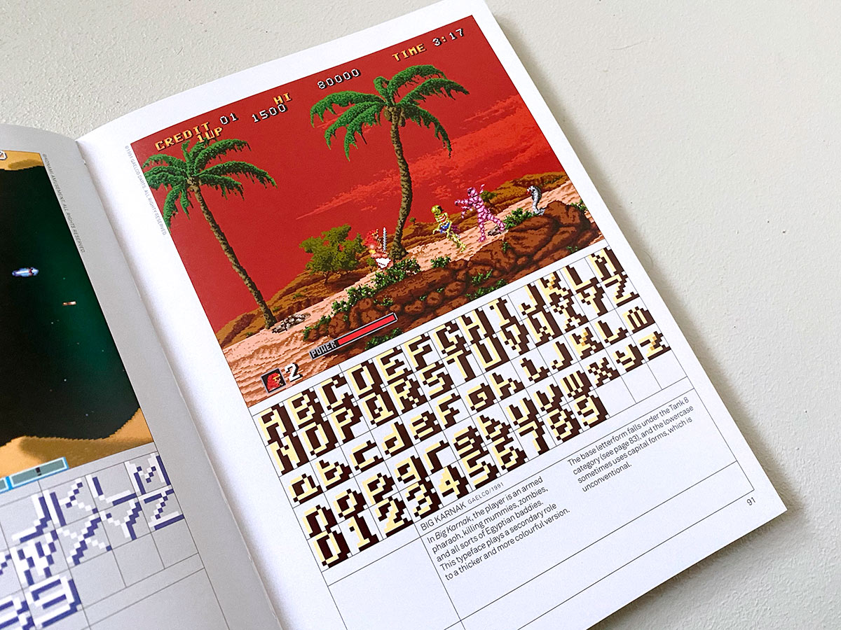
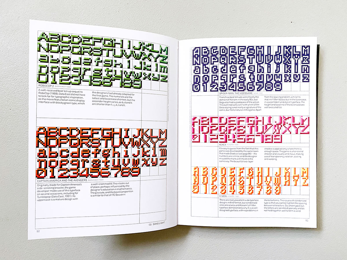
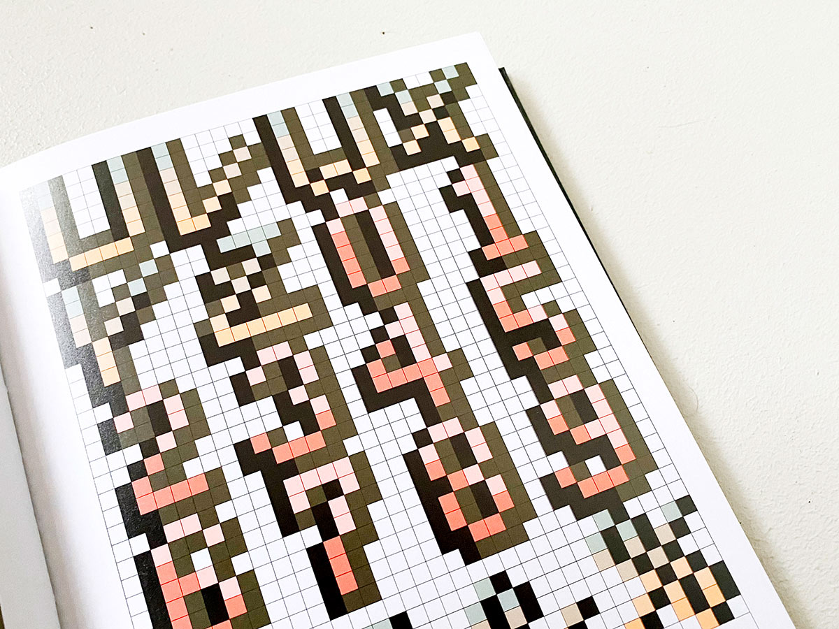
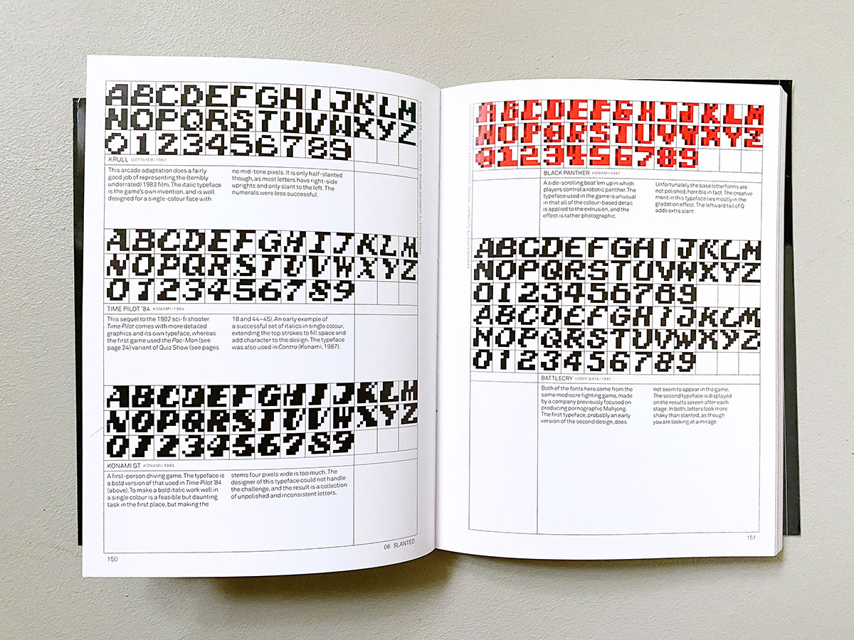
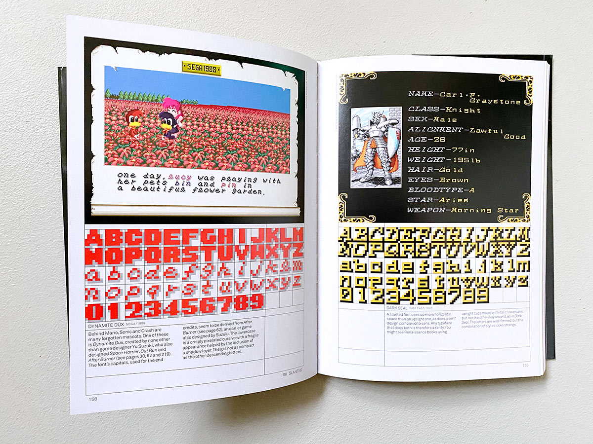
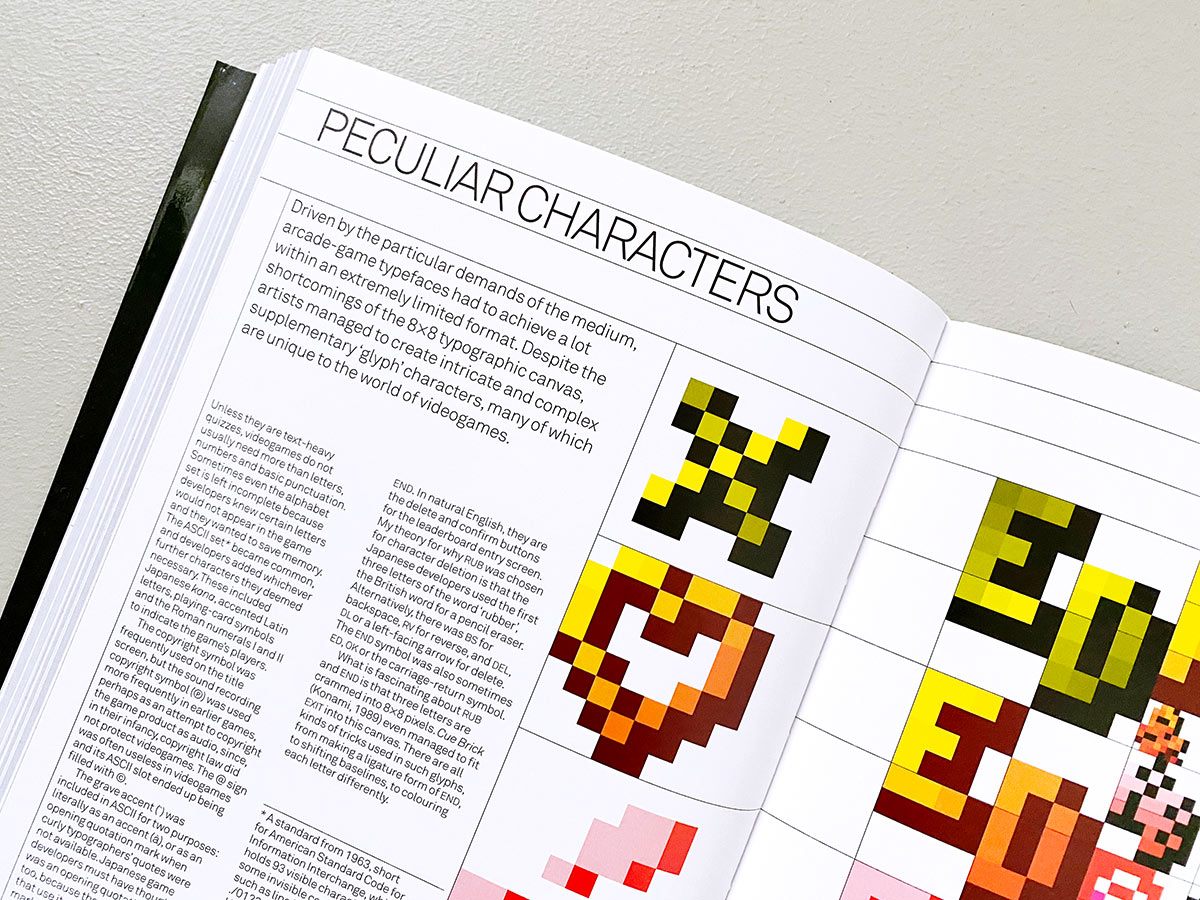
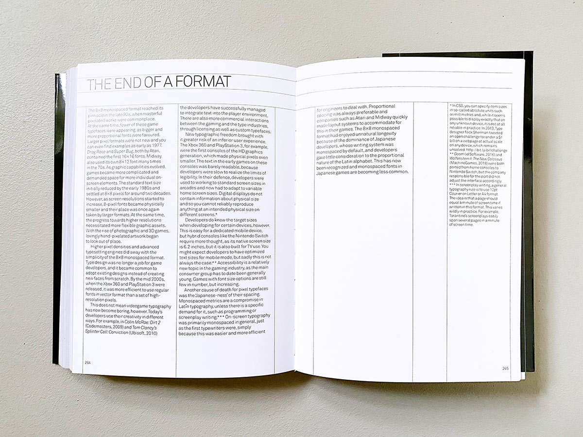
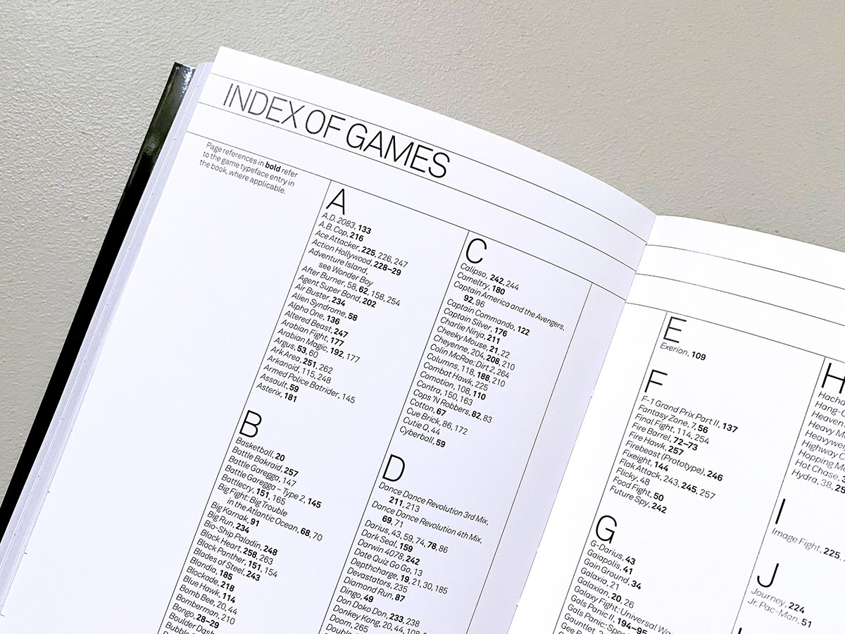
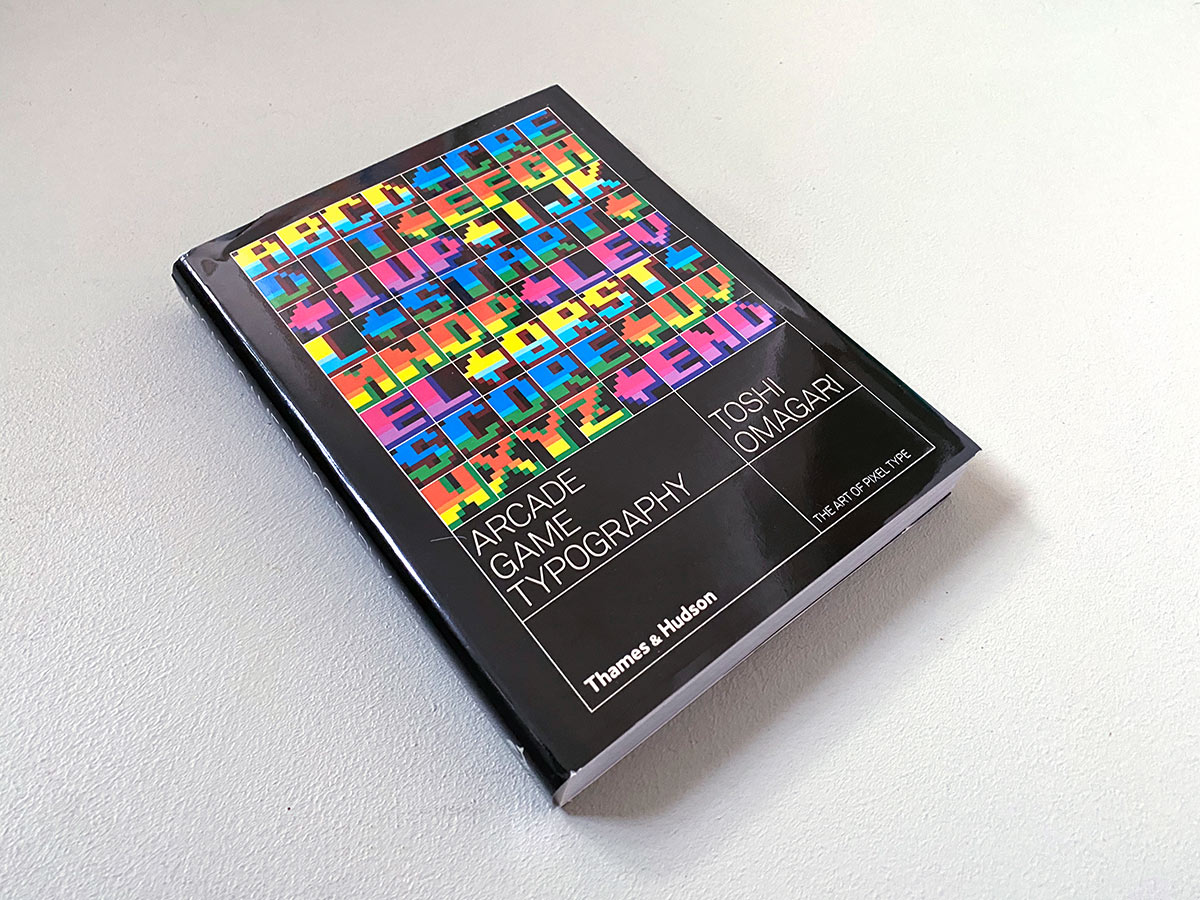
It was only a few years ago that Toshi came across the topic in an issue of the Japanese graphic design magazine Idea about video game graphics and then turned his attention to games from the 70s, 80s and 90s. He was able to identify about 250 fonts, which he then divided into categories for his book Arcade Game Typography —The Art of Pixel Type and presented them in a clearly arranged manner.
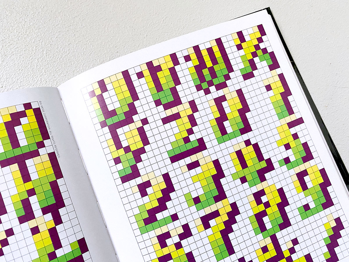
The press release reads: “Exhaustively researched, this book gathers an eclectic typography from hit games such as Super Sprint, Pac-Man, After Burner, Marble Madness, Shinobi, as well as countless lesser- known gems. The book presents its typefaces on a dynamic and decorative grid, taking reference from high-end type specimens while adding a suitably playful twist. Unlike print typefaces, pixel type often has bold color ‘baked in’ to the characters, so Arcade Game Typography looks unlike any other typography book, fizzing with life and color.”
Color and resolution limitations were a new challenge for the typeface designers to create expressive and elegant fonts in a small space. But this is exactly what should inspire the readers of the book to create their own designs.
For all who love video games and typography!
Arcade Game Typography—The Art of Pixel Type
Publishing House: Thames & Hudson
Author: Toshi Omagari
Preface: Kiyonori Muroga
Design: Leo Field
Release: August 2019
Format: 17.5 × 23 cm
Language: English
Scope: 272 pages
Processing: Softcover with dust jacket, adhesive binding
ISBN: 978-0500021743
Price: £ 19.95
BUY regular softcover version
BUY limited hardcover version for £ 35
