Autour
(this was mistakenly sent under the wrong name Droit, resubmitting here...)
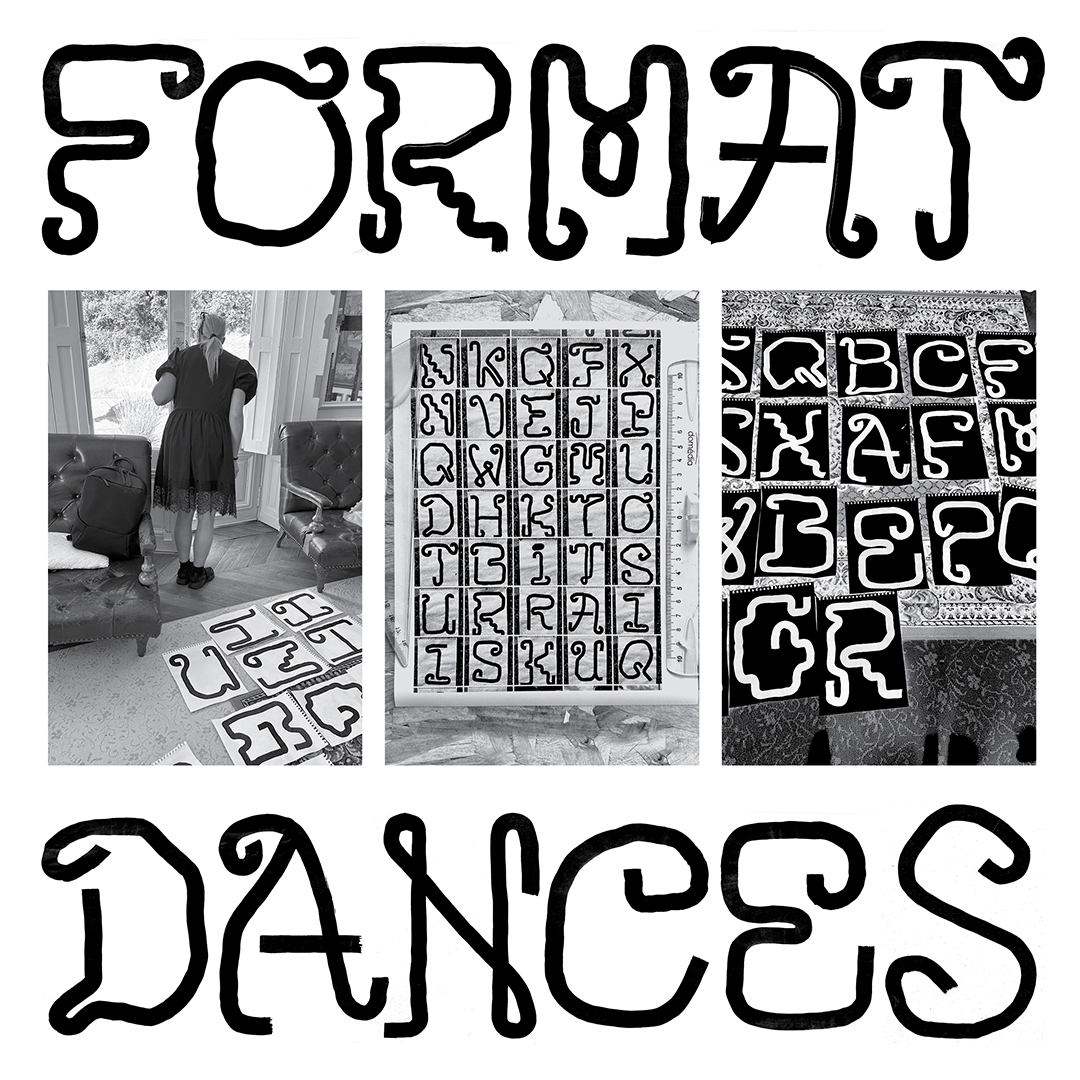
The glyphs in this typeface, comprised of over 100 handprinted monoline characters, were created during a residency in France. The designers were inspired by the many decorated iron gates and fixtures seen in Paris and throughout the northwestern region of France. The forms gesture towards a systematic symmetrical structure but find pathways that are unusual or challenge the legibility of specific letterforms.
