Case and Turbine
Fontwerk’s brand-new typeface launch
Just a few weeks after Fontwerk has launched with ten type families, the foundry is growing fast and surprises again with brand-new content. Another two superfamilies are following: Case by none other than Erik Spiekermann who collaborated with Anja Meiners and Ralph du Carrois to create a modern Neo-Grotesque for the new Twenties and Turbine, a Neo-Grotesque with superelliptical curves designed by Felix Braden.
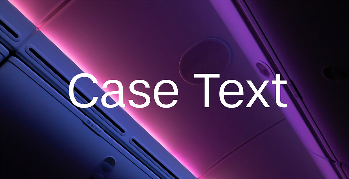
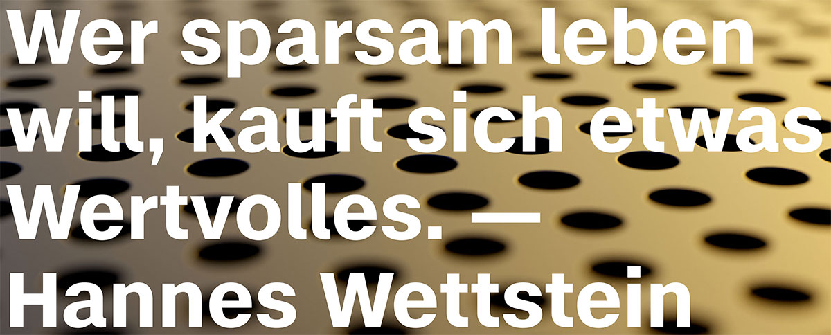
Case is the essence of several corporate type projects the trio collaborated on in the past. They left out everything that they felt was unnecessary in the world’s most popular typeface genre but they made sure to keep all the best bits. Building on that concentrate, they added new ideas and conceptual solutions for a contemporary static grotesque. The result is the missing element in an otherwise strained and bloated genre: A typeface whose clear basic personality looks familiar and creates trust, but at the same time is novel and individual and is therefore perfect for strong brand building.
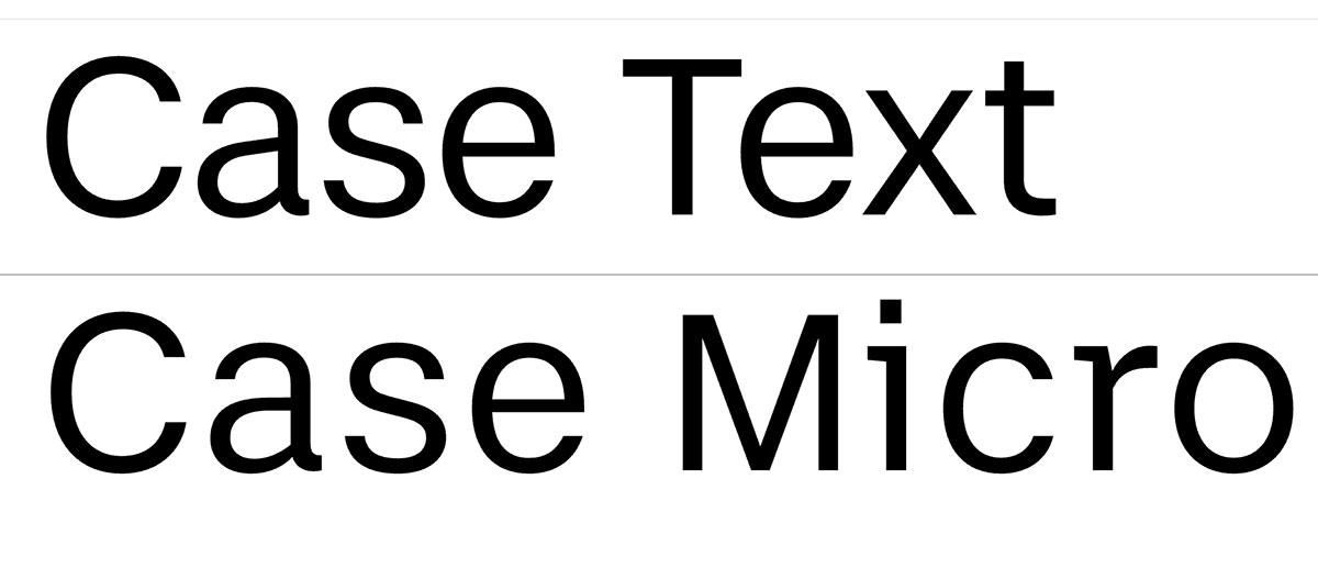
Case is currently available in three optical sizes: the core family is suitable for the vast majority of applications, especially larger applications, the Text family for longer reads and the Micro version for small text. A distinguishing criterion of the family members is their respective spacing, the main family’s spacing is narrow, whereas it is wider on the Text and widest on the Micro. For better readability, both Case Text and Case Micro have a higher x-height and slightly more open shapes than its bigger sister. A unique selling point are the Variable Fonts, which are included in the complete package. At no extra cost. So don’t hesitate to try it out as Fontwerk offers Trial Fonts
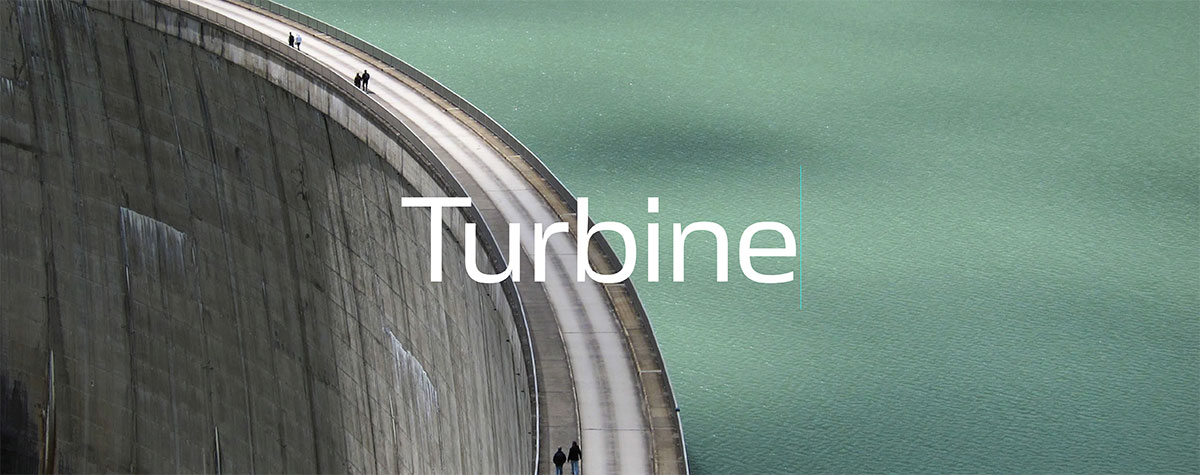
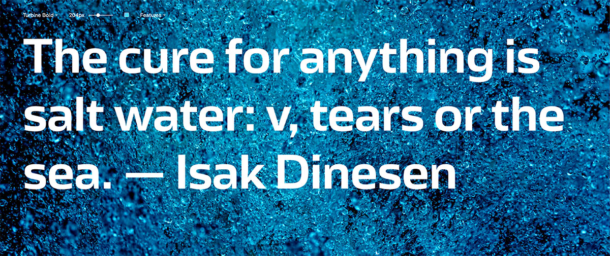
All of Felix Braden’s typefaces have a name that is related to water. Turbine follows the aquatic theme but draws upon the more technical and mechanical aspects associated with water. In naming this typeface, the designer from Cologne emphasizes its technical prowess and properties. The striking curves, the wide proportions and the minimal contrast result in a rational appearance that is highly recognizable. It makes Turbine the perfect fit for corporate design projects and advertising campaigns, especially for clients working in engineering, technological or pharmaceutical industries.
Turbine is a Neo-Grotesque with superelliptical curves. This fine geometric feature—a mixture of ellipse and rectangle, also known as Lamé curve—has often been applied in architecture, urban planning, product and interior design and its application exudes a friendly, approachable appearance. This type of design became particularly popular in the 60s and 70s, and this look and feel spills over into Turbine, giving it a little bit of a retro feel. The open forms of this Neo-Grotesque achieve a significantly higher legibility and elegance compared to older typefaces of this type. Low contrast and angular curves work perfectly on screen and make Turbine an all-rounder also for digital environments.
Case
Foundry: Fontwerk
Designers: Erik Spiekermann, Anja Meiners, Ralph du Carrois
Release: October 12th, 2020
Format: .otf .woff, .woff2 (static fonts); .ttf, .woff, .woff2 (variable fonts)
Styles: Hairline, Thin, ExtraLight, Light, Regular, Medium, Bold, Heavy + corresponding Italics (Case); Light, Regular, Medium, Bold + corresponding Italics (Case Text, Case Micro)
Price family: starting from € 200.–
Price single style: starting from € 50.–
Try or buy
Turbine
Type Foundry: Fontwerk
Designer: Felix Braden
Mastering, Production: Andreas Frohloff and Christoph Koeberlin
Release: August 2020
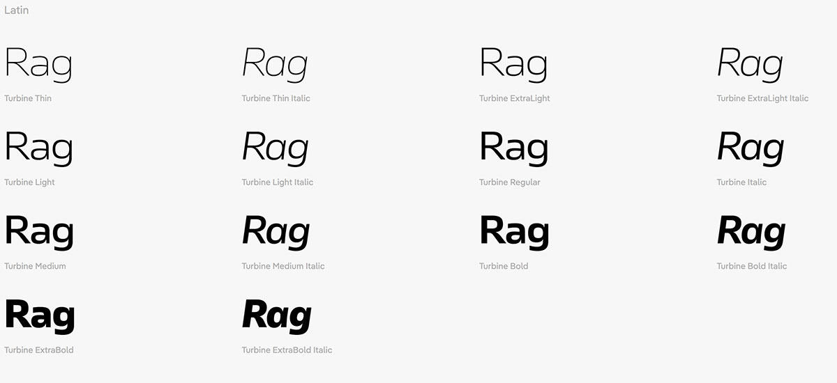
Styles: 14 in total, 7 weights plus Italics
File Formats: otf, web (Further formats available on request)
Price family: starting from € 300.–
Price single style: starting from € 50.–
Try or buy
