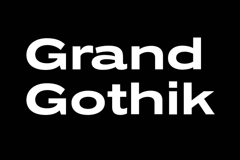
Typeface of the Month: Grand Gothik
by Parachute
Grand Gothik is a postmodern, multiscript, multifaceted and variable type system which pays homage to the development of grotesque (gothic) typefaces over the years. Taking late 19th and early 20th century European and American grotesques as a starting point, it traces this typeface genre up to mid-century movie theater marquees, new wave cinematography, American highway signage and telephone directories, adding some historical references for good measure.
Originally designed in 2017 as a bespoke typeface for a bilingual, black and white magazine on surfers, waves and landscapes, it was later reimagined and redesigned leading to the release of its commercial version. The name reflects Grand Gothik’s versatility as a fully functional variable font and its depiction of a vast array of gothic styles found in American and European grotesques. Designed with 3 stylistic alternates, each variation of Grand Gothik depicts a specific period and style: from the less calculated appearance of late 19th century grotesques all the way to their gracefully-shaped contemporary counterparts.
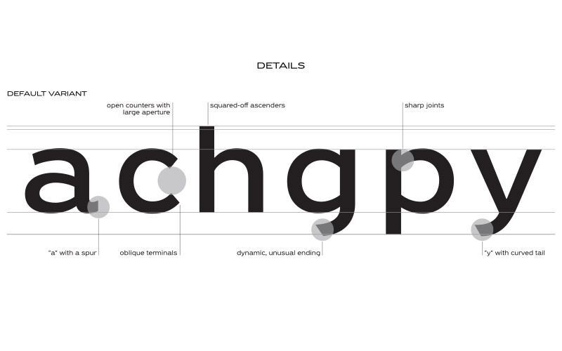
Open counters with enhanced white space and curved strokes with oblique terminals instead of horizontal were used in order to increase clarity of characters at small sizes. The ascenders were extended and the descenders shortened. The contrast was adjusted to reflect Grand Gothik’s personality as a revamped grotesque, the numbers were redesigned according to their historical references and letter “a” was designed with a spur to increase readability. Contrary to most grotesques, Grand Gothik implements sharp joints, as curved strokes and stems merge into each other with a sharp instead of a smooth connection.
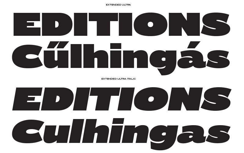
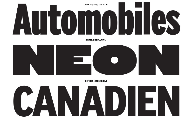
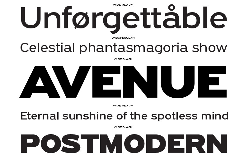
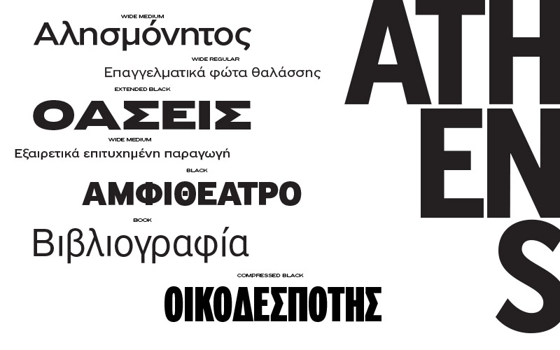
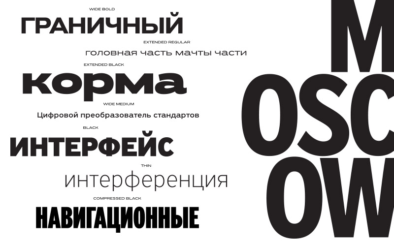
Grand Gothik’s design space includes 3 axes for weight, width and one for italics. It is available as a variable font or as five separate opentype families—compressed, condensed, normal, wide and extended. Each family comes with 9 weights spanning from Extra Thin to Black plus italics. Quite interestingly, the letter “o” in the wide version does not follow the extended form of other characters, taking instead the shape of an almost round circle.
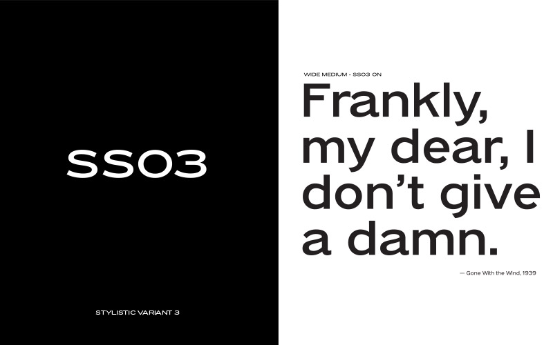
Grand Gothik was designed with a default version and three stylistic variations: The multifunctional default version comes with squared-off stems and letter “a” is designed with a spur. Its first variation (ss01) retains the squared-off stems of the default version, while letter “a” and “G” lose their spur, the curved tail of “y” becomes straight and the crotch of “M” sharp-pointed, altogether imbuing the typeface with a clean corporate texture. The second variation (ss02) is more eclectic, exchanging the squared-off stems for slanted stem endings, ultimately becoming more angular. The third variation (ss03) is vibrant and uncalculated and constitutes a nod to early 20th century European grotesque styles, particularly Venus of the Bauer type foundry or the ATF gothics such as Franklin Gothic or the lesser known Times Gothic and Title Gothic No. 9. The middle stroke on letters such as E, F and H sits higher, pushing the design of other characters such as B, K, P and R, in the same design direction. An alternate version of letter “a” and “k” was designed to reflect that era, along with alternate forms for lowercase letter “t”.
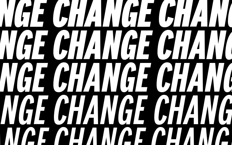
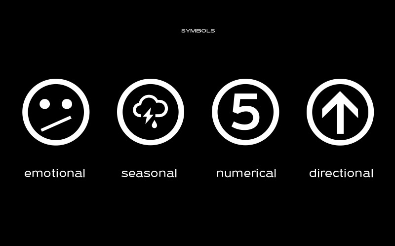
The Grand Gothik type system comes with a wide range of styles/weights and supports an extended array of languages and scripts such as Latin, Greek and Cyrillic. Keeping up with the ever-evolving virtual and digital landscape, Grand Gothik comes with an extended character set of weather icons, numeral symbols, wayfinding arrows, movie rating stars and emojis. Also, a Bitcoin symbol was designed as part of its character set in its newly introduced unicode position, rendering Grand Gothik a truly functional modern typeface. The whole series is complemented by its corresponding italics which are not cursive but rather refined oblique letterforms in sync with their traditional genre. Finally, Grand Gothik’s demanding personality shines at its heavier extended versions with its hip, expressive, almost brutal energy.
Apart from its default state which embodies the temperament and character of several notable grotesque typefaces, Grand Gothik’s multifaceted disposition and stylistic variations can fit a multitude of typographic needs. Firm, robust and legible, its first variation is an exceptional candidate for corporate brands which need to communicate their vision and value to multiple international markets. The second variation, a bit more vibrant and refined in nature, works beautifully with modern publications. The typographic voice of the third variation, characterized by the vibrant and raw texture of 19th century European grotesques hits home with posters, books, signage, magazines and postmodern conceptual art. Altogether, Grand Gothik's variable format brings to web design all the precision, variety and spirit once available only in print media. An essential tool for web designers and developers alike.
Grand Gothik
Foundry: Parachute Typefoundry
Designer: Panos Vassiliou
Release: 2018
Format: otf, ttf, eot, woff, woff2
Weights: 92 (available also as a 3-axis variable multiscript font)
Price: 625,– Euro per family (65,– Euro per weight)