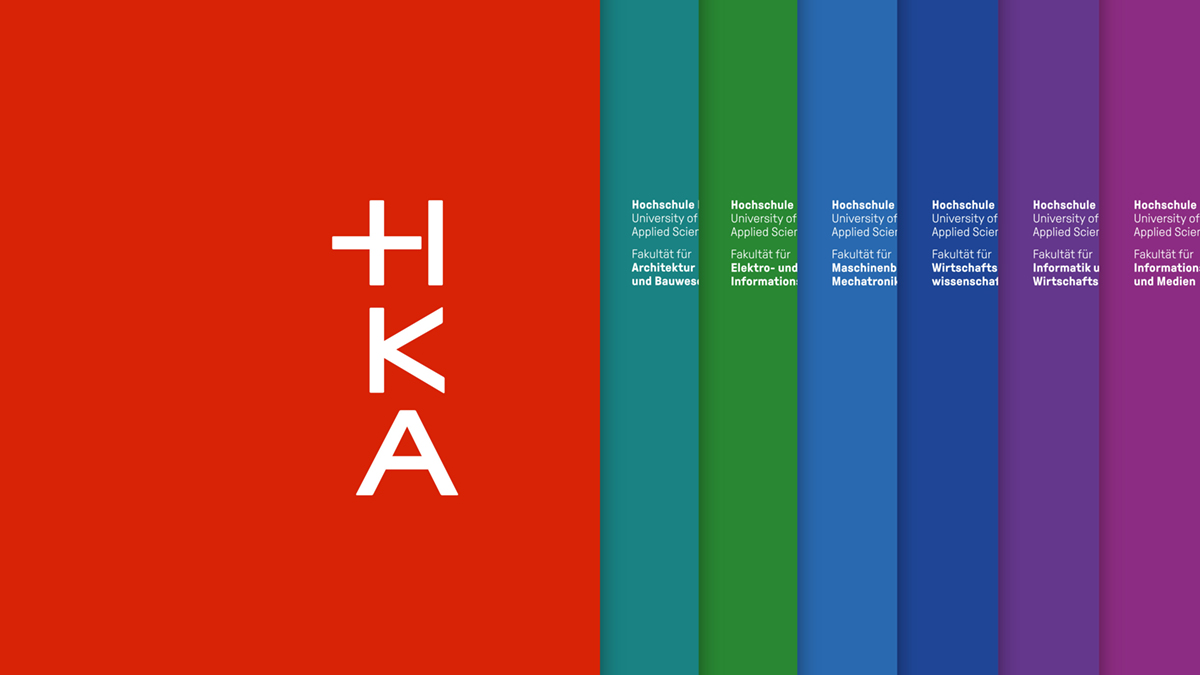
Corporate Design for the Karlsruhe University of Applied Sciences
by Capitale Wien/Berlin
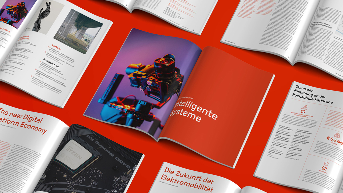
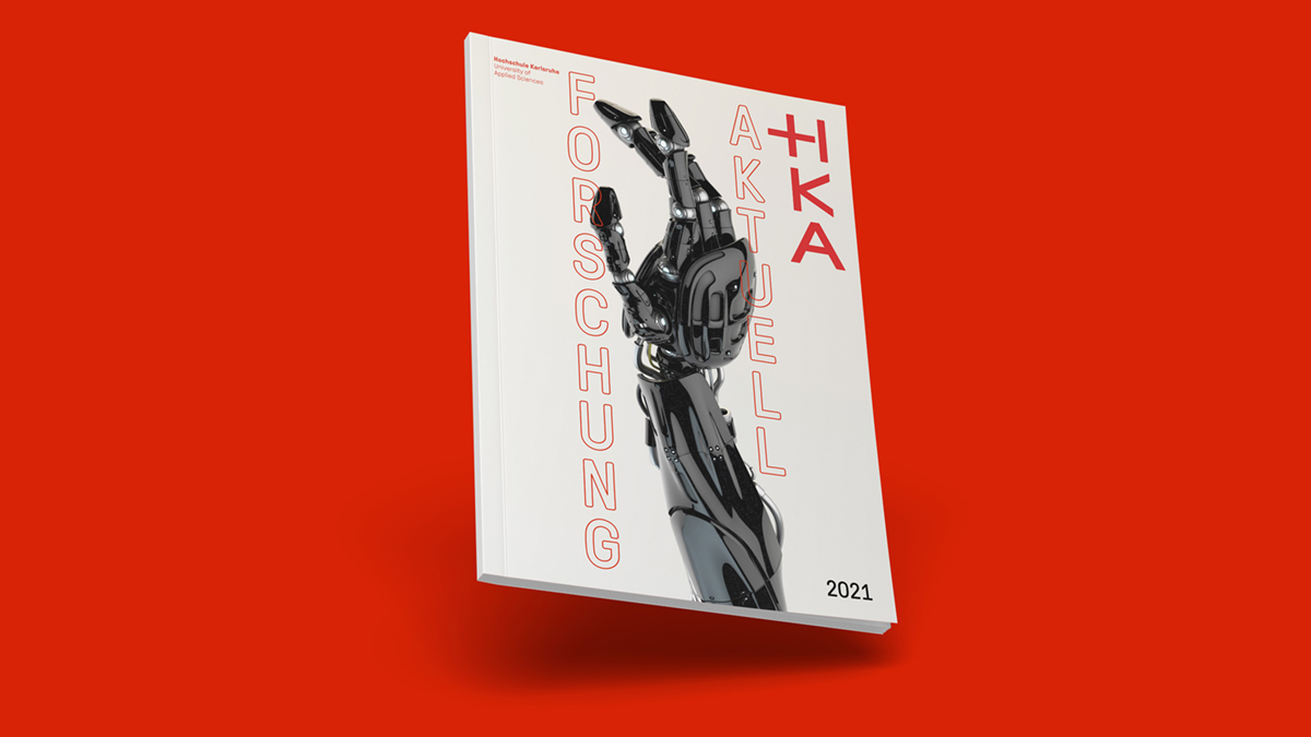
In close cooperation with the Karlsruhe University of Applied Sciences, Studio Capitale Wien/Berlin has worked on a new corporate design that we would like to present to you today: Corporate Design Karlsruhe University of Applied Sciences.
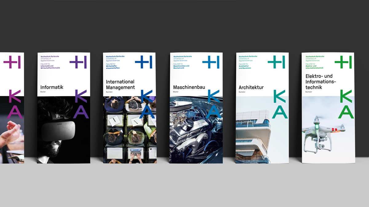
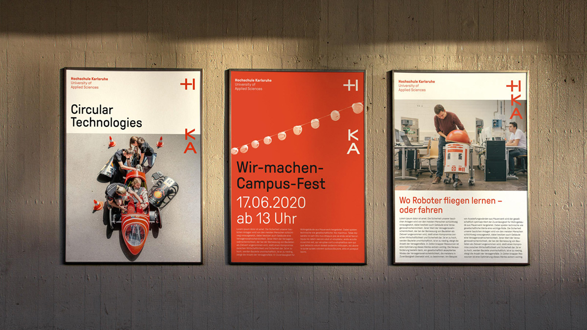
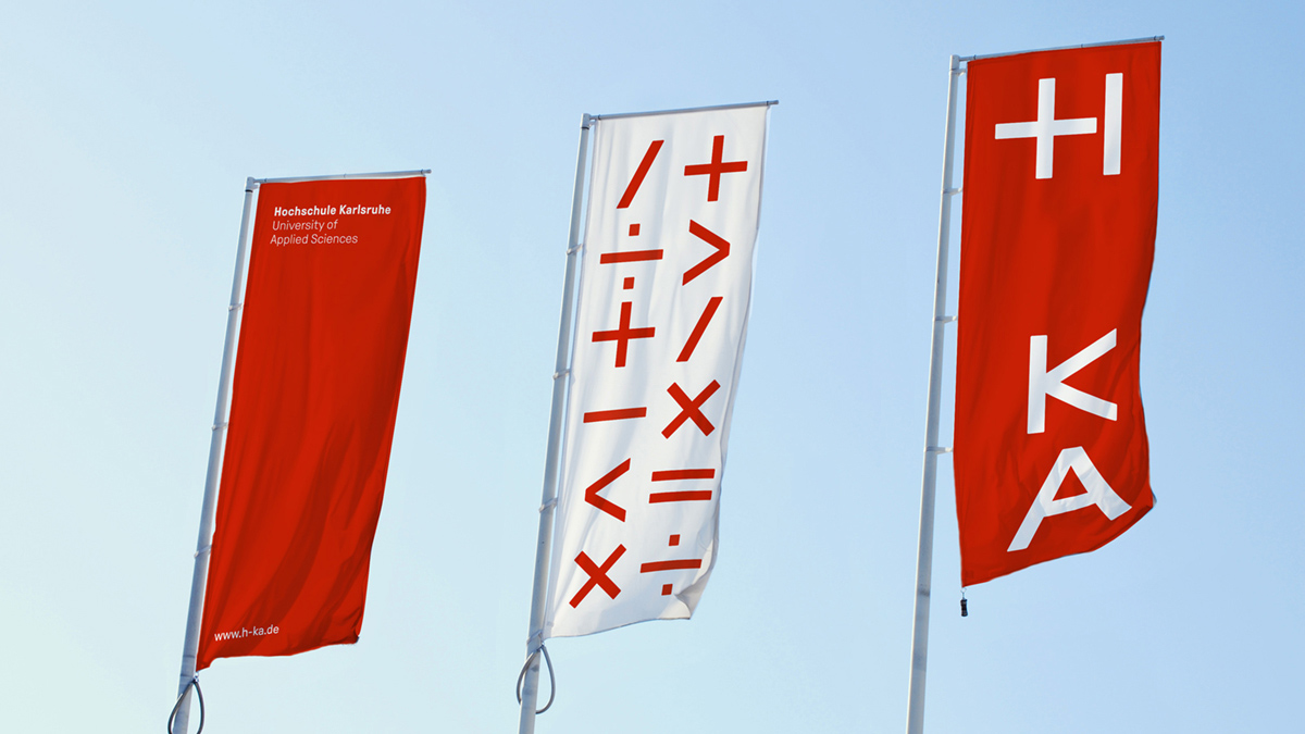
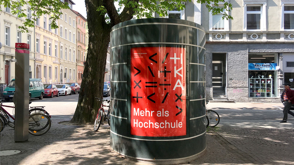
A modular logotype is the core of the new design for HKA. Reflecting the functional positioning of the university, the new logo is based on mathematical operators. Together with the more emotional positioning in the visual language it is the basis of the rebranding.
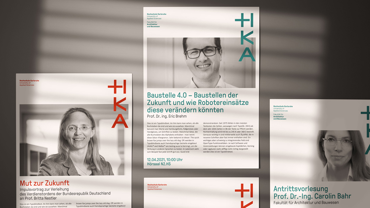
The logotype furthermore defines a grid, in which the whole organizational structure of the university is comprised: faculties, institutions, and facilities. The design system is on the one hand logically composed as well as almost infinitely flexible, as the logotype and the vertical grid are adaptable to almost every format.
To increase public visibility of its faculties the new design of the HKA provides individual colors for each, making it clearly visible as a part of the overall brand but also giving it individuality. The color scheme also puts forward the notion of a “lively” and “colorful” university. GT Pressura by Grilli Type is the new corporate typeface.
The German-Austrian design studio Capitale Wien/Berlin is responsible for the new design. For the past two years Capitale worked closely with the university on their new corporate identity as well as on the corporate design. Dozens of workshops and visits, an online survey, an offsite event helped to form a collective vision of what the new brand should look and feel like: an up-to-date technical university that really cares about it’s students, teachers, and staff.
Karlsruhe University of Applied Sciences
Design: Capitale Wien/Berlin
Client: Karlsruhe University of Applied Sciences
Release: 2021
Typeface: GT Pressura by Grilli Type
Take a look on the corporate identity on the university’s website.
