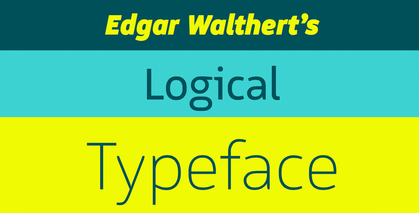
Logical
Bold Monday
When a typeface is called Logical you’re quasi expecting strong underlying principles and repeating design elements. And that is quite the case in Edgar Walthert’s new sans-serif family. But he pairs these rules with affable, soothing details that make for an overall warm and approachable design. While the basic structure of the letterforms is oval and compact, there are circular patterns to discover. Terminals are tapered towards the end, many of them in soft curves, and apertures stay open.
Walthert wanted Logical to be geared to web and screen design so he started out by drawing the letters on a 13 px grid for better rendering on standard resolution displays. Special underlined versions of the glyphs are available for links or other emphasis in interactive environments (Stylistic Set 19 and 20). All eight weights from Thin to Black are accompanied by real italics and an extensive set of pictograms and icons. These are accessible via smart OpenType features that automatically convert words into associated symbols (Stylistic Set 01, 02, 03 and 04 for Englisch, German, Dutch and French respectively). Or simply type the right keyword between two colons like :this: For a complete list of keywords, more info, demos and a full glyph overview check out the logical specimen site. And if all fails, the icons are also accessible via their unicode value.
Logical is a great choice for interactive designs, websites, user interfaces, signage or other text were readability is key. The slightly technical, DIN-like structure paired with a humanist feel will fit a wide range of applications.
Edgar Walthert started designing Logical in 2012 as the leading typeface for his portfolio website. To maintain optimal readability on the web without the need for TrueType hinging, Edgar modeled the font’s basic shapes on a grid of 13 points. The website therefore only used the point-sizes 13, 26 and 52 points. The portfolio used an abundance of revolving links, which guided visitors through Edgar’s interdisciplinary practice. The fact that every browser displayed underlined text differently, and yet there was no CSS solution to style underlines, quickly presented an obstacle. Through discussion with the collaborating web-designer Tijs Gadiot, the idea of a underlined version of the typeface emerged.
Next to his freelance work at LucasFonts in Berlin and graphic design work in Amsterdam, Edgar extended the family to eight weights and added the italic styles and small caps. In conversations with Paul van der Laan of Bold Monday about a release, Edgar decided to add more intelligent functions to the typeface, drawing from research into Otto Neurath completed during his master’s study in TypeMedia. The interest in icon-language goes back to his studies in Lucerne, Switzerland where Edgar got in touch with Genesis by Juli Gudehus and Der Mensch und seine Zeichen by Adrian Frutiger. The icons included in Logical can be easily accessed by typing words the are associated with the different icons—for example :sun: will automatically change into a sun—wherever basic ligatures work. This markup-accts to emojis should be familiar to people working with Slack. For the languages Englisch, German, Dutch and French, there are even stylistic sets, that can be applied to a text and will transfer every word the dictionary recognises into a fitting icon.
When the time came to finish the font family, Edgar had already joined the team at Bold Monday to help in the development of IBM Plex. Here he refined his TrueType hinting skills, which allowed him to hint his own typeface and icons. In the years of development and justification, the typeface left its original grid and moved towards more ergonomic proportions. Therefore the TrueType instructions were needed to fit the lettershapes back onto the grid when used on low-resolutions screens. During this time-intensive labor another obstacle had to be resolved: the extensive dictionary of words in four languages, exceeded OpenType capabilities. Thanks to the help of Frank Grießhammer and Read Roberts at Adobe, who created an exclusive pre-version of the Adobe Font Development Kit, a reduced version of the dictionary was finally compiled for the fonts. Paul van der Laan meanwhile worked to optimise the OpenType features, using his expansive knowledge to make the fonts, especially the web-fonts, as small as possible.
Logical is a highly-readable typeface with recognisable details that makes it perfect for branding purposes. The unusual ‘g’ can easily be replaced with a one-storey-gthrough a OpenType stylistic set. The same goes for the serifed ‘I’. The icons and arrows that fit every weight of the typeface can be helpful for signage or way-finding systems. Together with the underline-function, Logical is a helpful tool in web-development. The attention-grabbing details that appear in larger sizes take a backseat in reading sizes and makes the typeface suitable for display use as well as for copy text.
Edgar Walthert studied Graphic Design in his home-country Switzerland at the Fachklasse Grafik in Luzern. After his studies he worked several years in an interdisciplinary design-studio in Hamburg, working predominantly on packaging design. After TypeMedia at KABK The Hauge in 2007, Edgar worked at LucasFonts Berlin, where he helped in the development of Taz. In 2016 he joined the team at Bold Monday. At the beginning of 2018 Edgar, together with studio colleagues Diana Ovezea and Sabina Chipară, started a monthly lecture series about type and typography in Amsterdam called letterspace. For more information, please click here.
Logical
Foundry: Bold Monday
Designer: Edgar Walthert
Release: 17. Juli 2018
Format: PostScript OpenTupe / TrueType Webfonts
Weights: 8 / + 8 Italics
Price per weight: 49.– EUR
Price full family: 470.40 EUR
Buy
