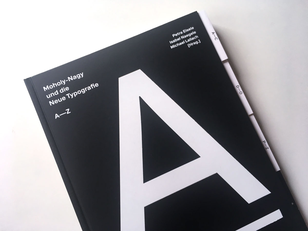
Moholy-Nagy and the New Typography
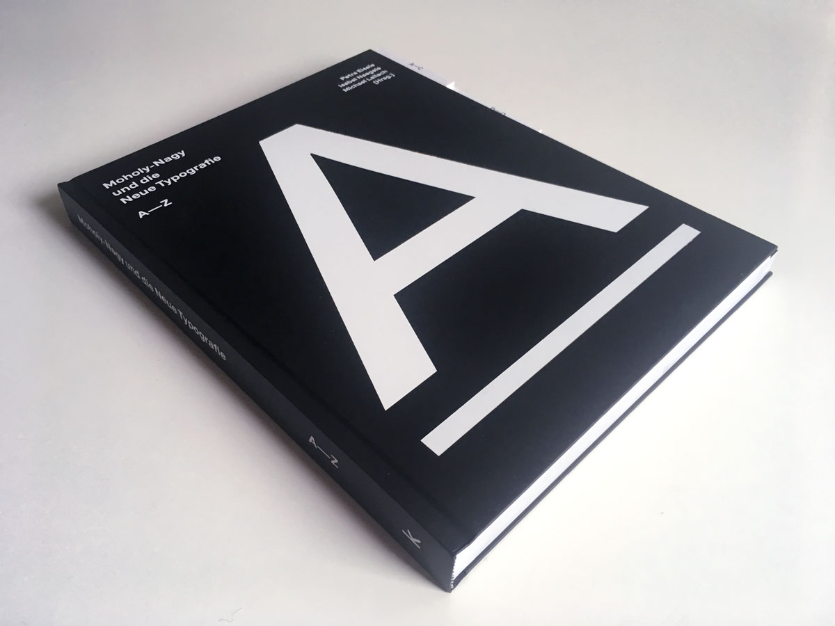
A—Z, a new Bauhaus publication
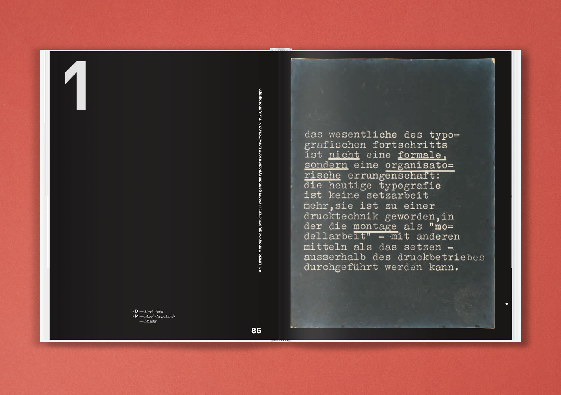
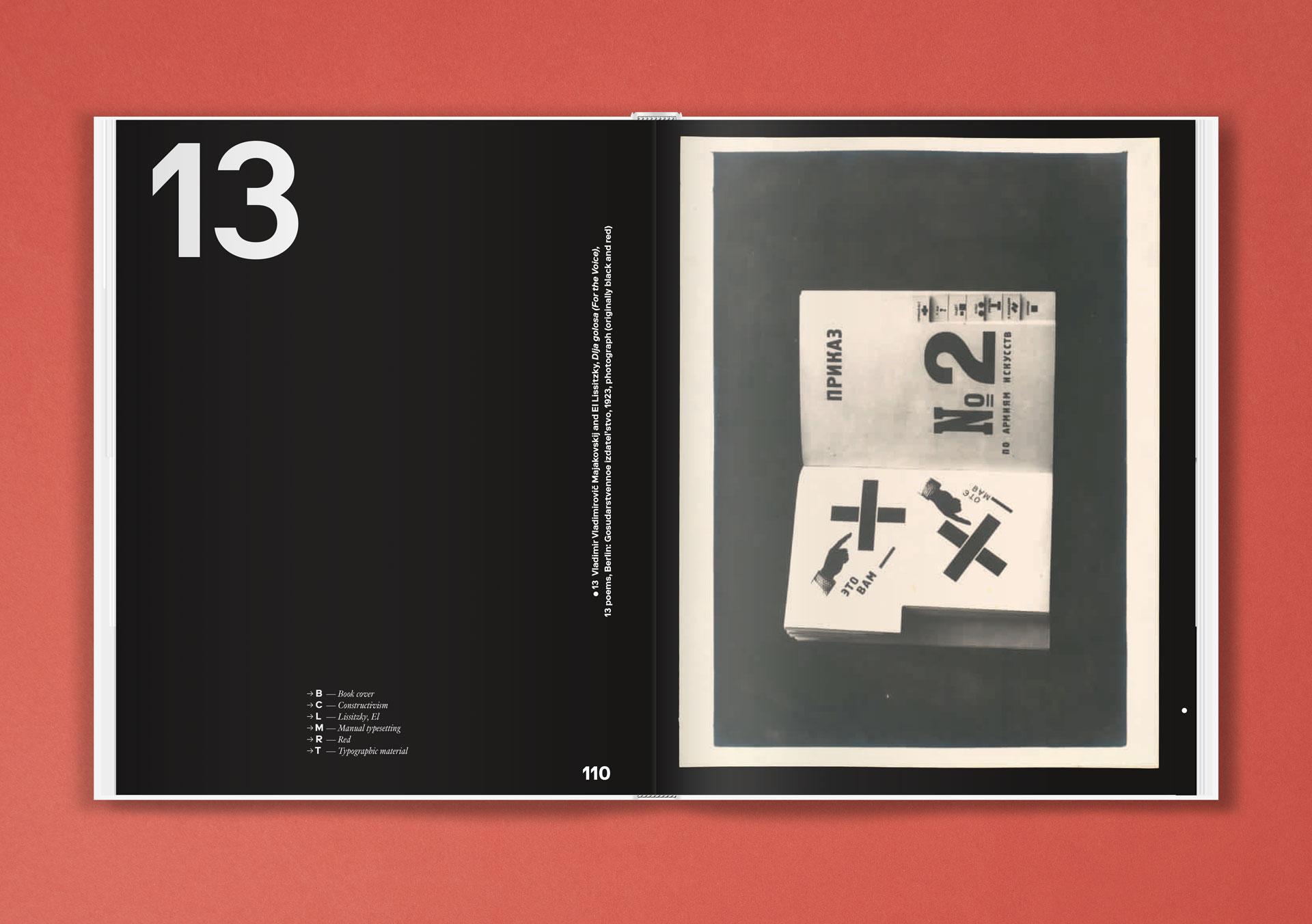
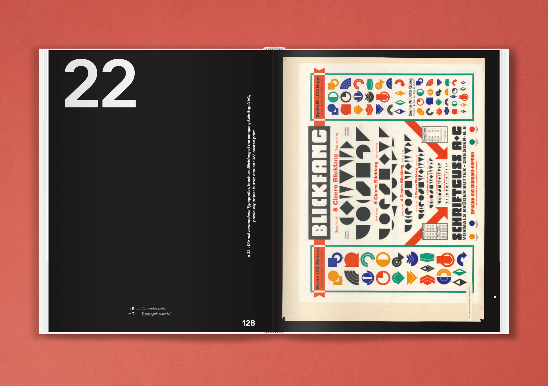
A while ago I heard of a publication that would deal with the recently discovered exhibition panels by Moholy-Nagy, which he originally showed in 1929 in the exhibition “New Typography” in the Martin-Gropius-Bau Berlin. The exciting theme — “Where is the typographic development going?” – Moholy-Nagy depicted on the panels both his own designs and advertising printed matter by colleagues from the Bauhaus environment.
The functional graphic design, initiated by the “New Typography” movement in the 1920s, broke with tradition and established a new advertising design based on artistic criteria. It aimed to achieve a modern look with standardized typefaces, industrial DIN norms, and adherence to such ideals as legibility, lucidity, and straightforwardness, in line with the key principles of constructivist art.
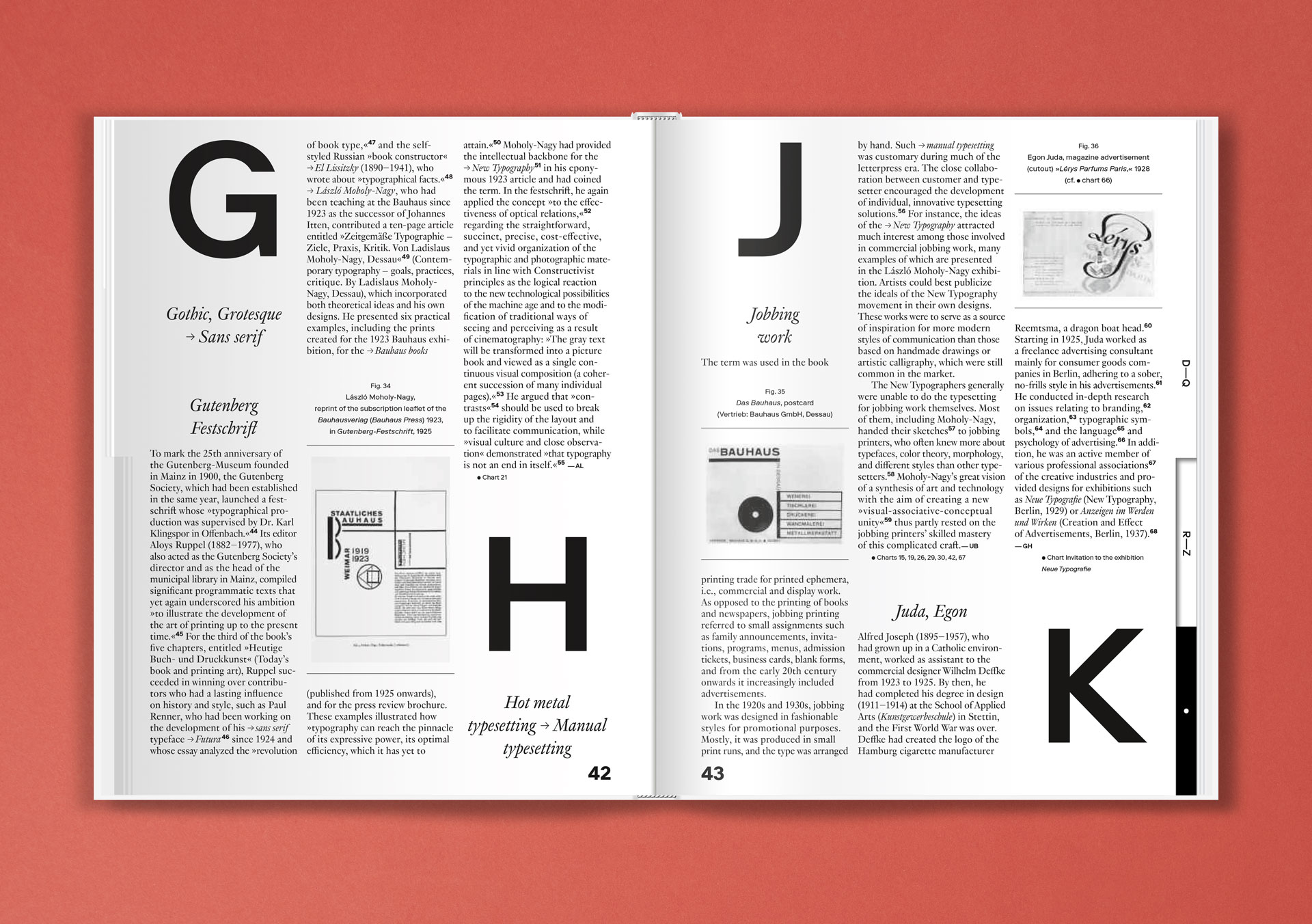
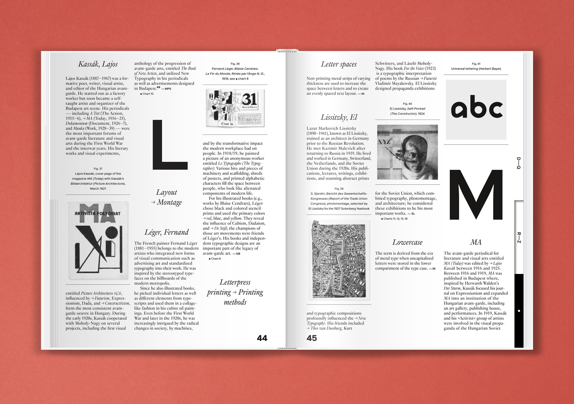
For the first time, this comprehensive publication showcases Moholy-Nagy’s wall charts which have recently been rediscovered in Berlin’s Kunstbibliothek. Renowned authors provide insights into this treasure trove by each contributing to this alphabetized compilation starting with “A” for “Asymmetry” and ending with “Z” for “Zukunftsvision” (“vision of the future”). By perusing through the pages and allowing a free flow of association, the typographical world of ideas of the 1920s avant-garde is once again brought back to life.
A book that you don’t want to put out of hand because it contains so much exciting information and has been designed very appealing!
Moholy-Nagy and the New Typography
Publisher: Verlag Kettler
Editor: Prof. Dr. Petra Eisele, Prof. Dr. Isabel Naegele and Dr. Michael Lailach for the University of Applied Sciences Mainz and the Kunstbibliothek, Staatliche Museen zu Berlin
Release: August 2019
Format: 24 × 30 cm
Volume: 256 pages
Workmanship: Hardcover
Language: English, German
ISBN: 978-3-86206-753-4
Price: 65.– €
Buy
