No. 3 Series
by Road to Venice Type
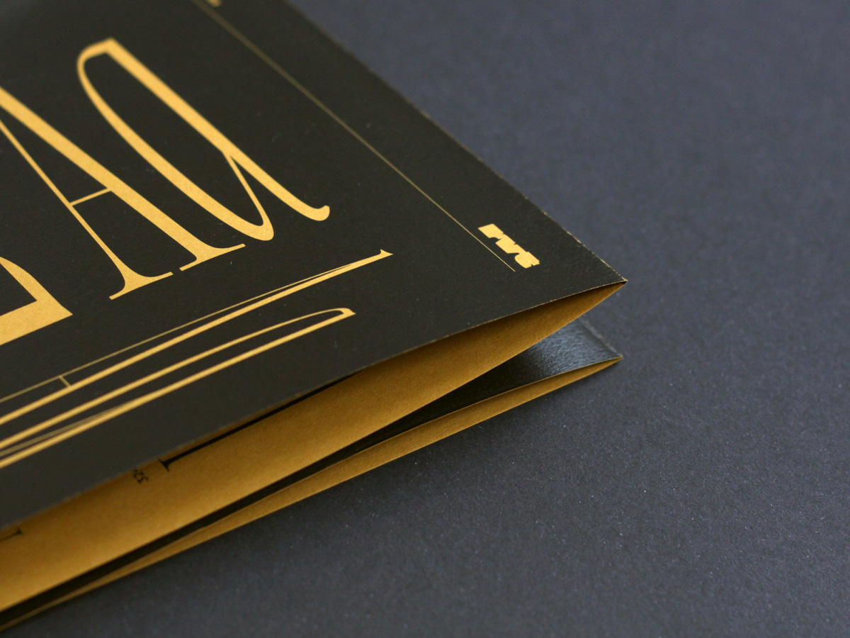
Today we want to introduce you to No. 3 Series—a typeface for a variety of large scale applications by Road to Venice Type.
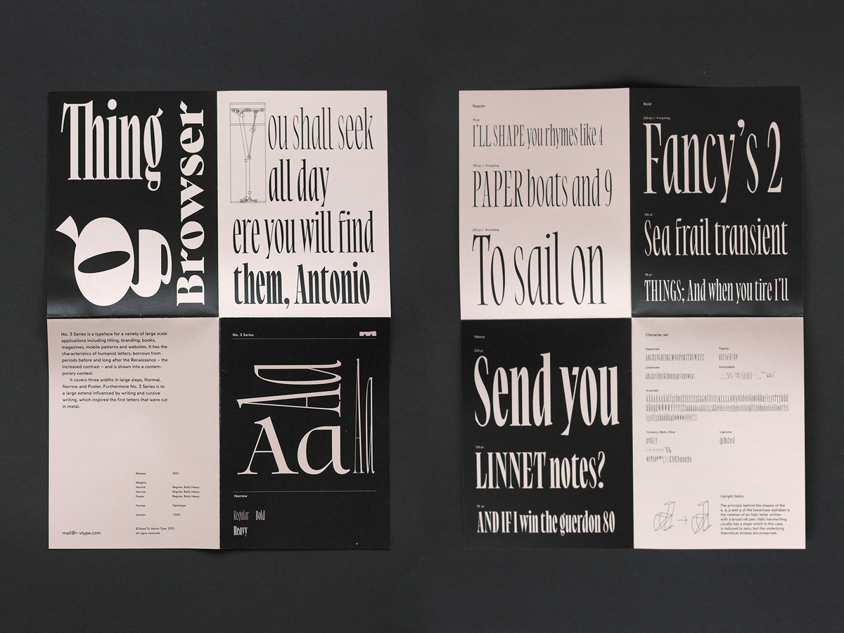
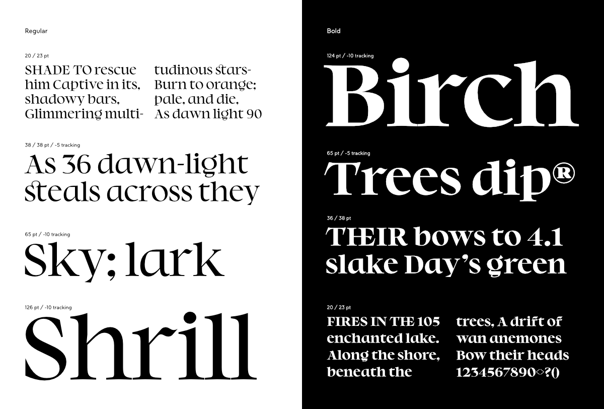
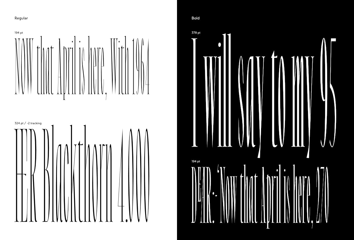
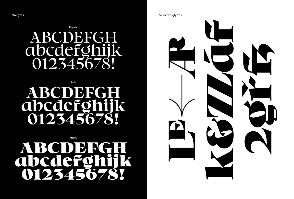
No. 3 Series is created to be used for titling, visual identities, books, magazines, mobile patterns, and websites. It has the characteristics of humanist letters, borrows from periods before and long after the Renaissance—the increased contrast, and is drawn into a contemporary context.
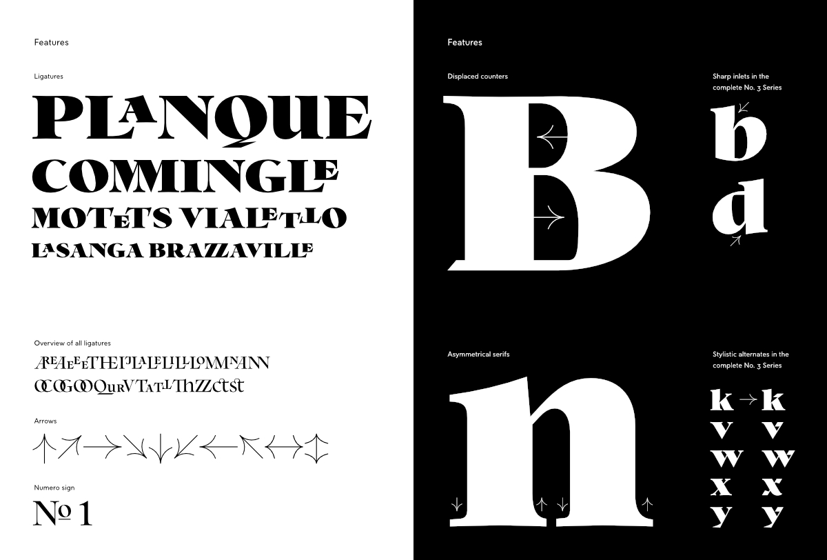
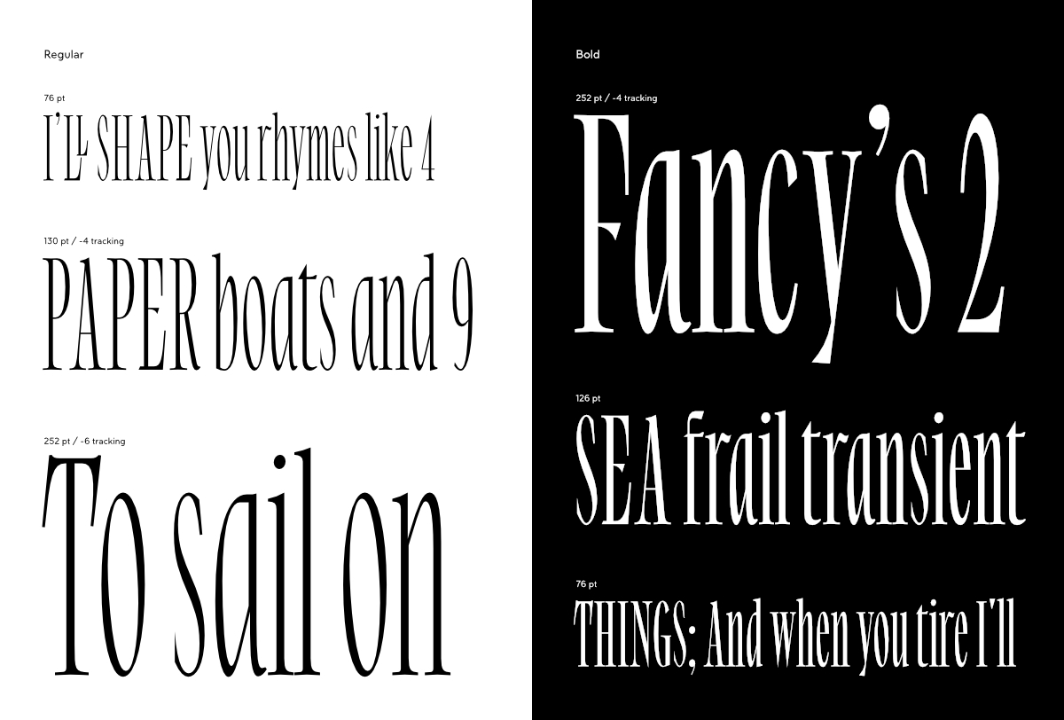
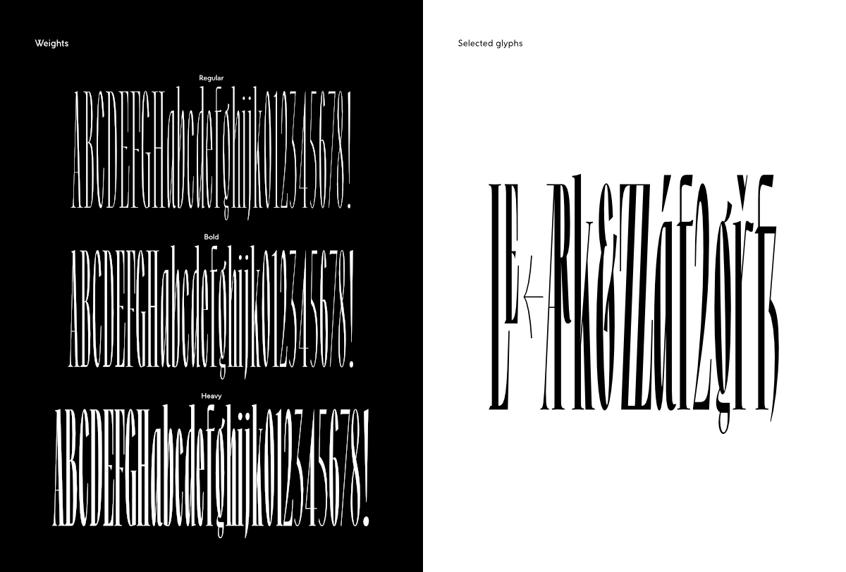
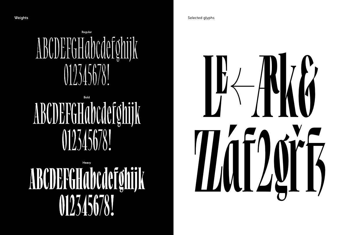
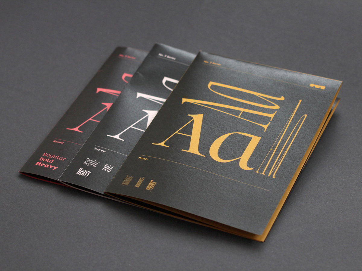
The typeface covers three widths in large steps, Normal, Narrow, and Poster, and has numerous ligatures. Furthermore No. 3 Series is to a large extend influenced by writing and cursive writing. For example the principle behind the shapes of the a, d, p, and q of the lowercase alphabet is the rotation of an italic letter written with a broad-nibbed pen. Italic handwriting usually has a slope which in this case is reduced to zero, but the underlying theoretical strokes are preserved.
Road to Venice Type is a new and independent type foundry that strives for meaningful, yet functional typography.
No. 3 Series
Foundry: Road to Venice Type
Release: October 2021
Styles and Weights: 3 widths from Normal to Poster with 3 weights respectively, Regular to Heavy
File Formats: otf, woff2 + Trial fonts
Price Single Style: € 35.– to € 45.–
Price Each Family: € 75.– to € 95.–
Buy
