Senza
by The Blackmoon Foundry
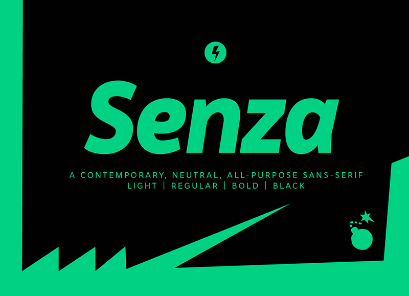
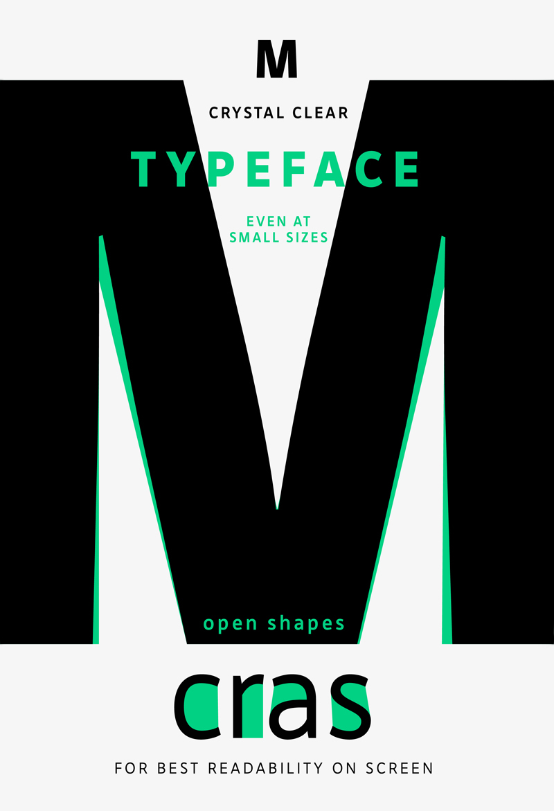
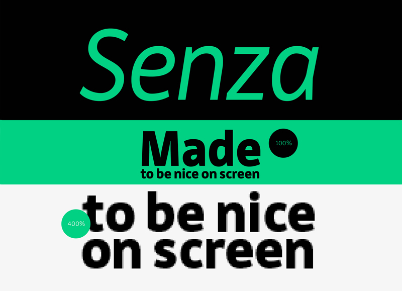
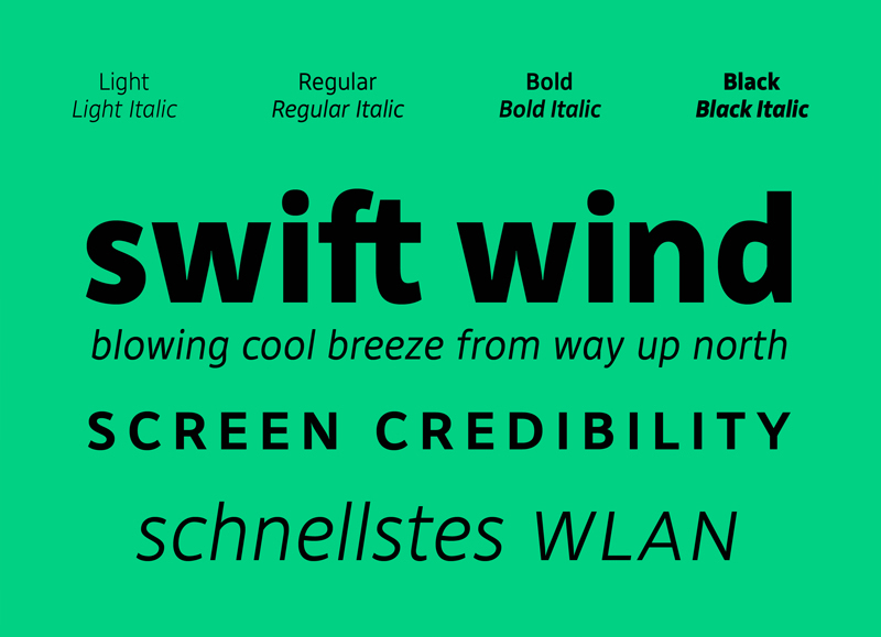
Senza is a contemporary, neutral, all-purpose sans-serif. Its basic and open shapes convey a remarkable sense of clarity and accuracy to the overall design. These features in combination with a large x-height make Senza a very legible and solid text typeface especially on screen.
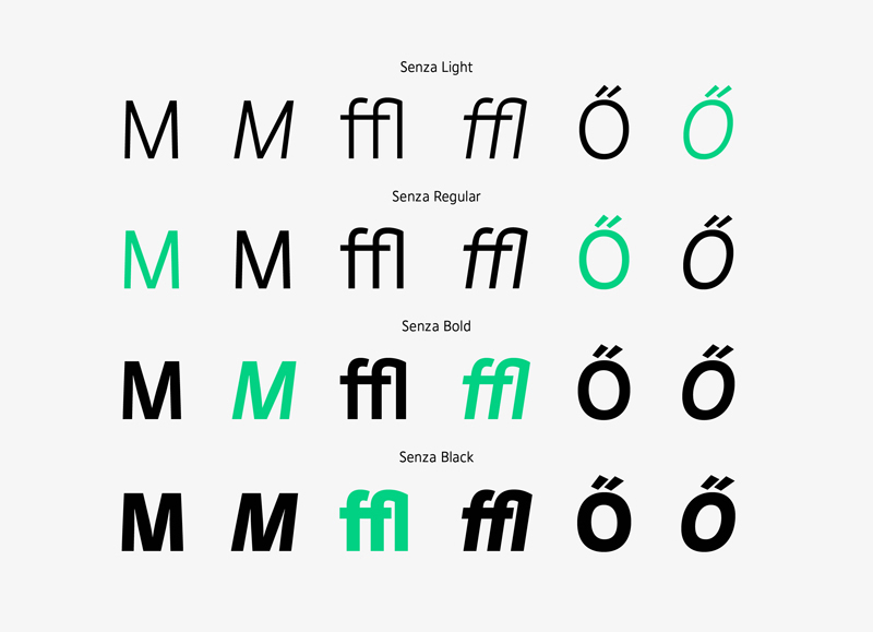
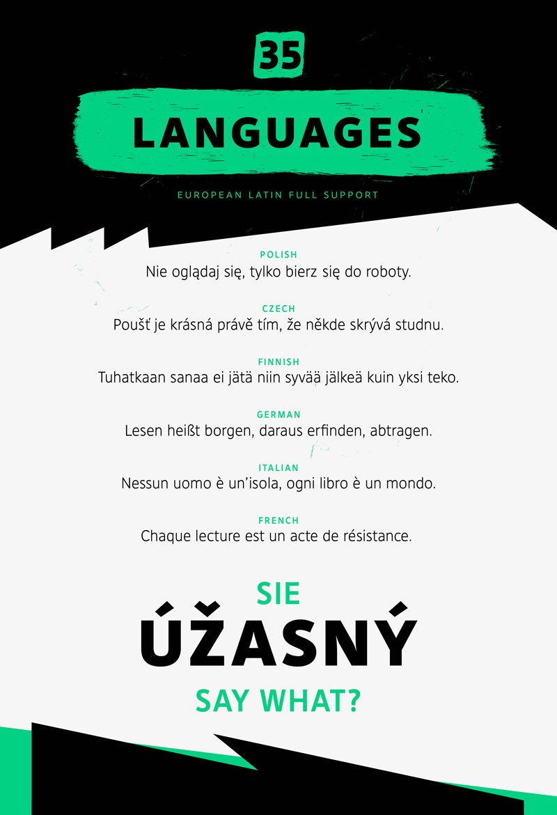
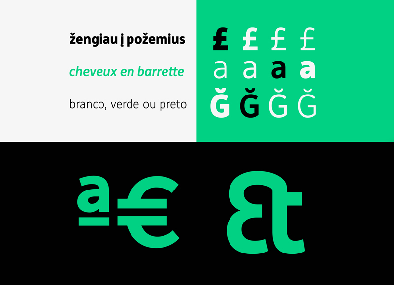
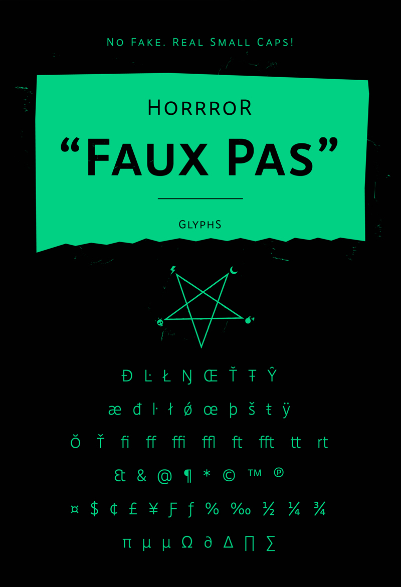
The family of 8 styles offers full European Latin language support and a set of small caps.
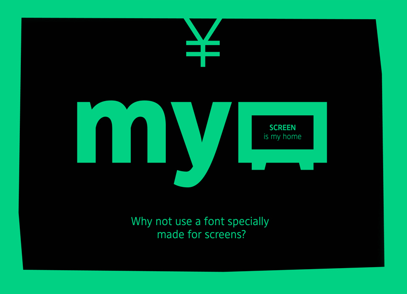
Senza was originally designed for a mobile phone interface. Although it was eventually developed into a much more versatile family, these initial researches on readability on screen are the core of Senza’s design. This development process has been conducted with great attention to details. The letter shapes are well recognizable without being too fancy. Senza’s low contrast and its underlying humanist construction make the reading act very comfortable and natural, without any clutters or distractions.
Corporate designs based on Senza are able to express precision and performance without any ostentation. The shapes and details are special and well recognizable without being too fancy. The family is therefore best suited for high-tech, specialized and modern products or publications. It is a small but strong Family you might say.
An example of that would be the German bicycle brand Bergamont, which uses a custom version of Senza for usage on their bikes. The Blackmoon Foundry did a whole redesign and new concept for the product-graphic identity. We designed a new logo typeface and updated the “b”-icon. We developed a set of icons for technologies and bike categories. And all the fonts used on the bikes are made by the Blackmoon Foundry, a special edition of the Senza and a specially designed font called Kiez, referring to Bergamonts heritage fo being from St. Pauli and nearby amusement district, the so called Kiez. Take a look!
Our design department is dedicated to build a special connection between concept and typography through original type designs and cool graphics. At The Blackmoon Foundry we have a special thing for the sport industry and of course for Typography.
Senza
Type foundry: The Blackmoon Foundry
Designer: Elena Albertoni
Release: January 2019
Format: oft
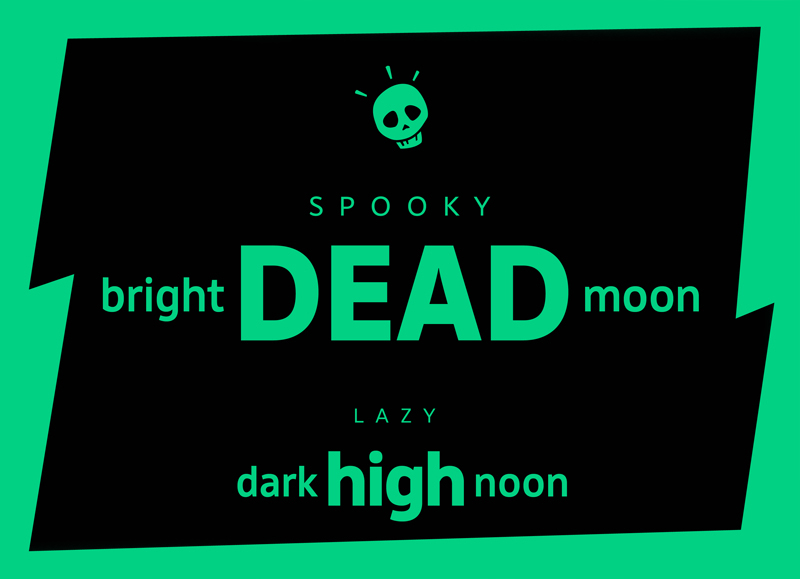
Weights: Light, Light Italic, Regular, Regular Italic, Bold, Bold Italic, Black, Black Italic
At the moment Senza is on 50% introductory sale on FontSpring.
