Space Trash Signs
Visualizing Consequences of Space Pollution
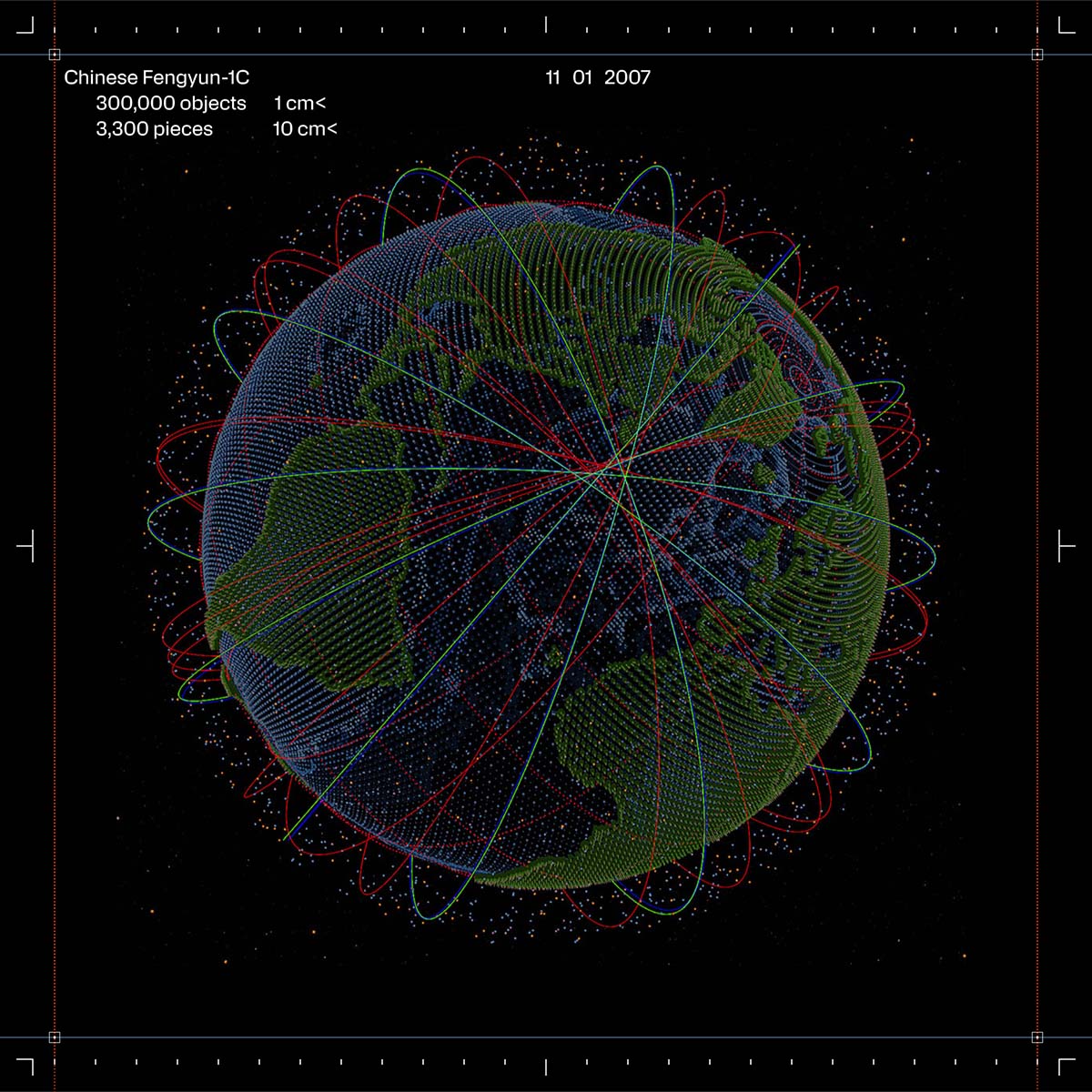
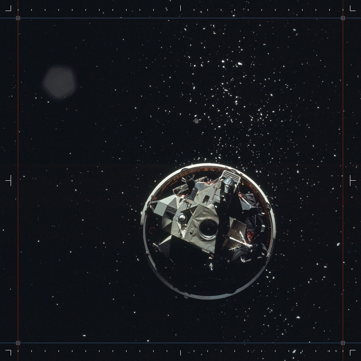
Have you ever thought about space debris? When I stumbled upon the Space Trash Signs project, I became quite intrigued. There are over 160 million pieces of human-made space debris in Earth’s orbit. Traveling at speeds of 15 kilometers per second, even a small piece can cause significant damage. Space pollution threatens to destroy satellites and other crucial space infrastructure vital for life on Earth, including telecommunications, navigation, disaster management, environmental protection, agriculture, financial services, and more.
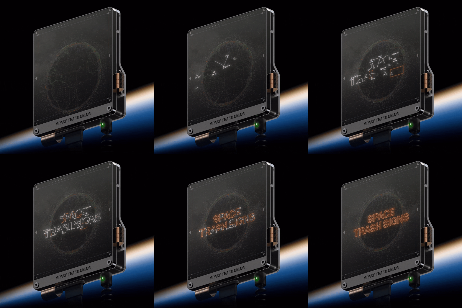
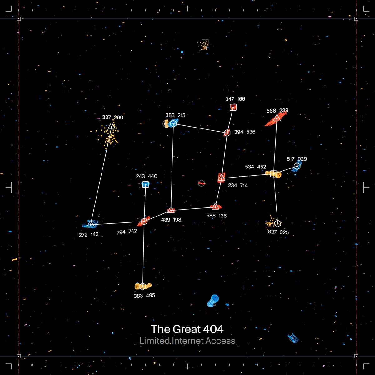
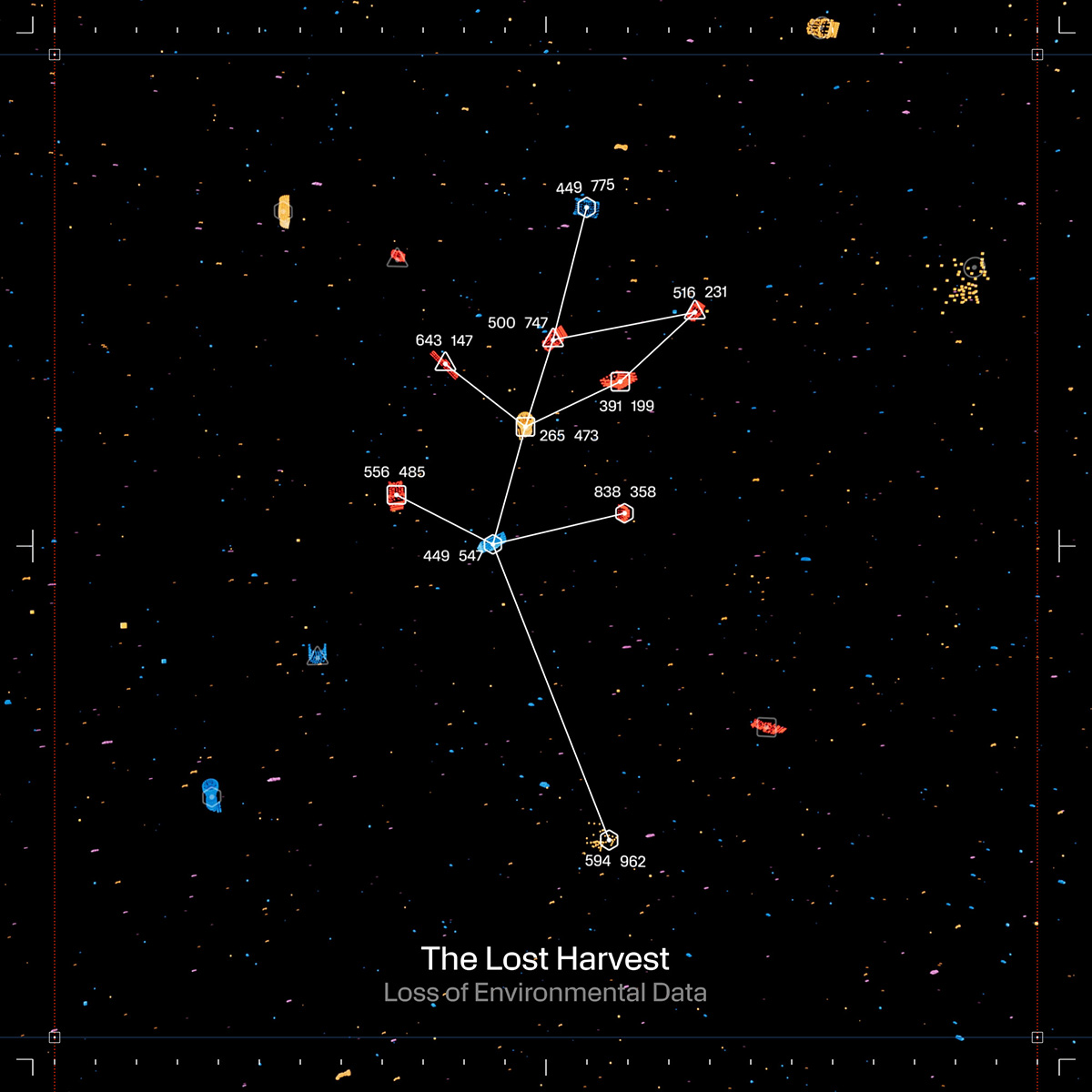
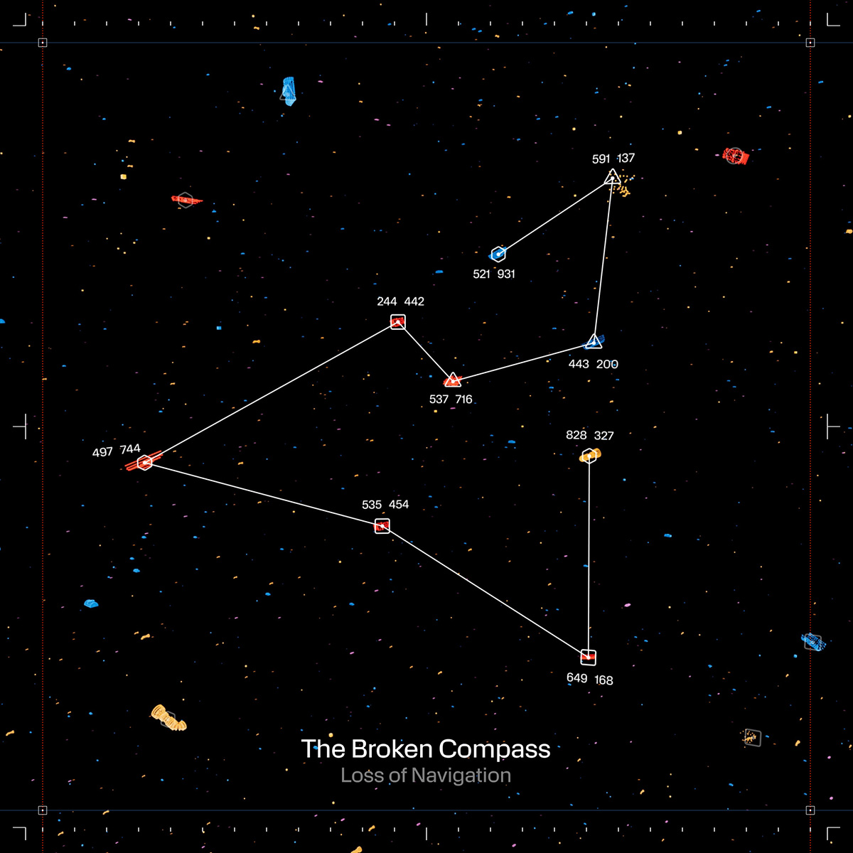
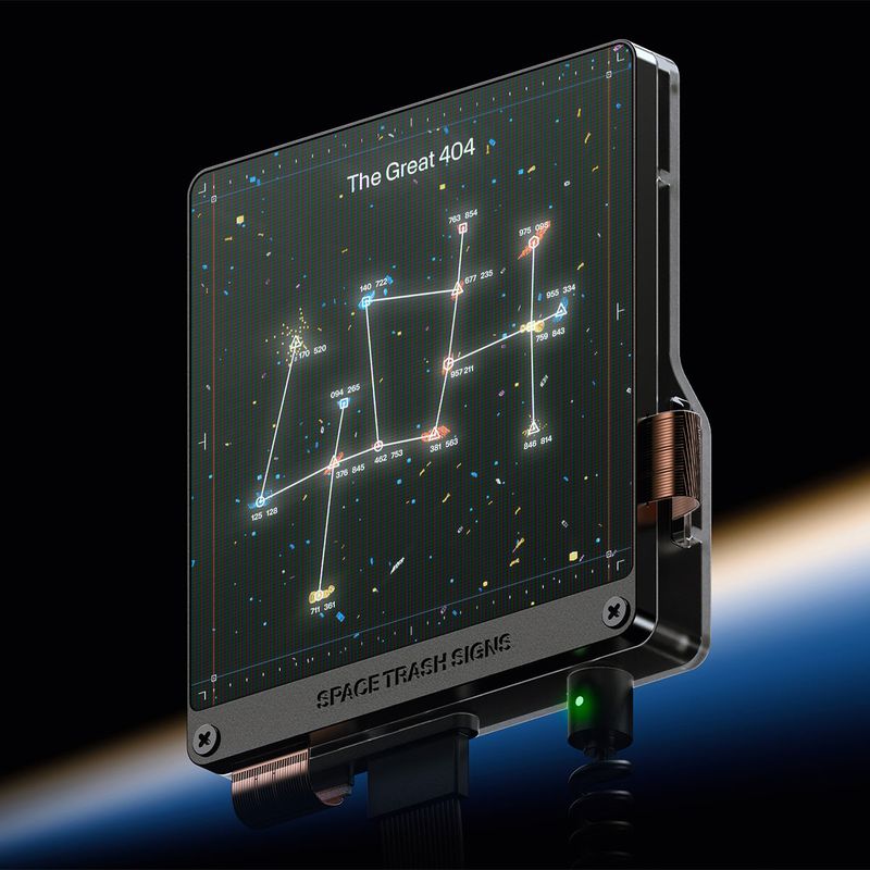
The project, introduced by a coalition of private and public aerospace organizations, created the first astronomical constellations made from space debris to draw public attention to space pollution ahead of a pivotal UN meeting.
We talked to Art director Rohil Borole & Copywriter Shruthi Subramanian from Serviceplan Innovation, to learn a bit more about the project:
Most likely, few people deal with space debris in their everyday lives. Had you ever engaged with the topic before the project? What facts surprised you?
Space debris (a result of space exploration) threatens critical space infrastructure that we need for telecommunication, navigation, food production, monitoring of climate change and so much more. The realization of the direct impact in our daily lives is what led to the project.
What is the general design concept behind the project?
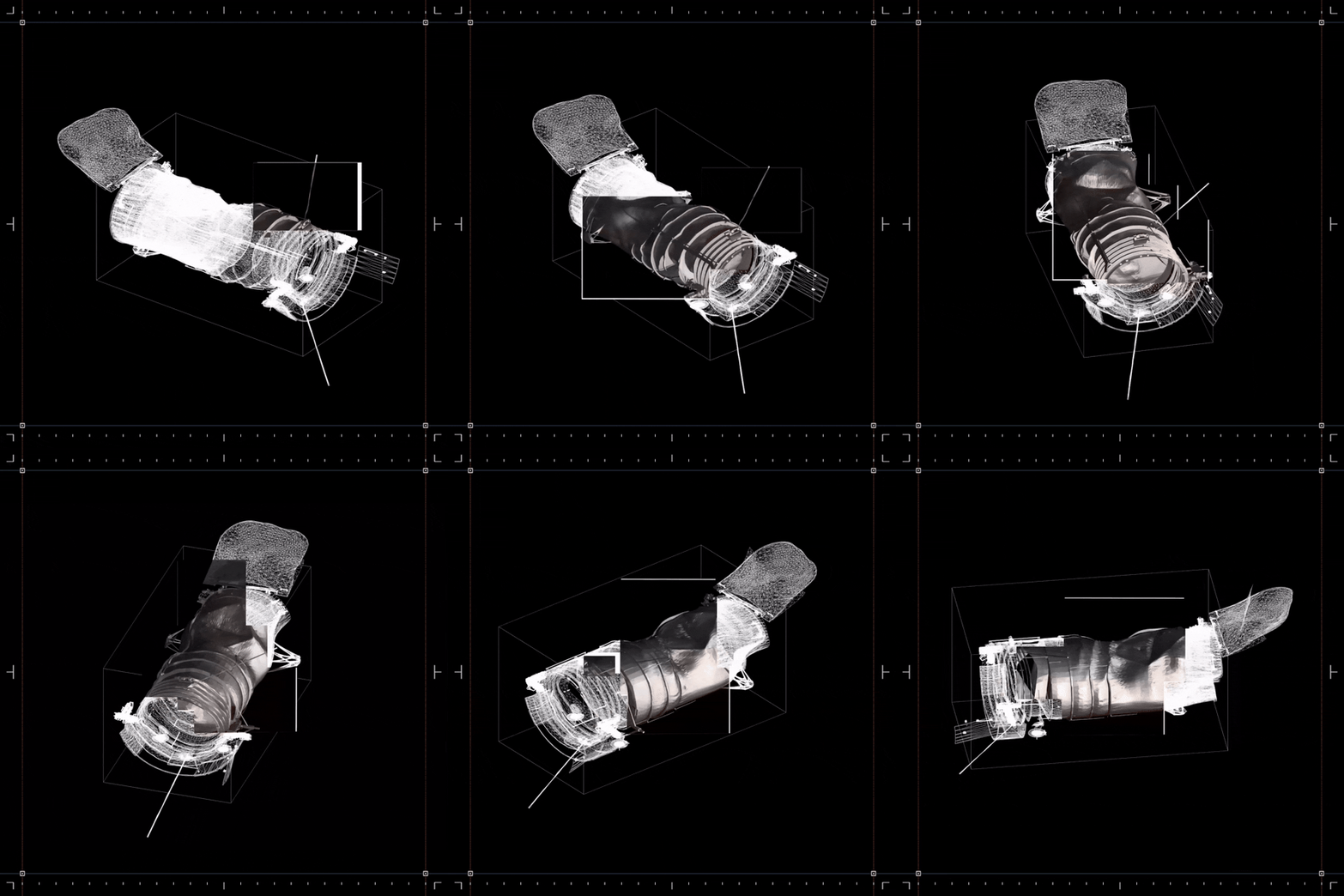
The problem of space debris is invisible. We wanted to create a virtual space observatory, a viewfinder that makes the problem visible. The primary visual device is of course the constellations. These simple icons make all the data behind this complex topic understandable. Due to the scarcity of debris imagery, we utilized point clouds to depict the extensive debris clouds around Earth, mimicking environmental litter. The design also features neumorphic user interfaces reminiscent of space-tech consoles, organized through a margin-based layout system influenced by space monitoring equipment. An accent of orange color highlights the potential danger, while the presentation of graphs, maps, and numbers adopts a textbook-like, factual visual language, allowing users to form their own informed opinions.
The project is based on scientific data. Visualizing this data and making it accessible to the public in an understandable way is no easy task. Have you received feedback on whether this has been successful?
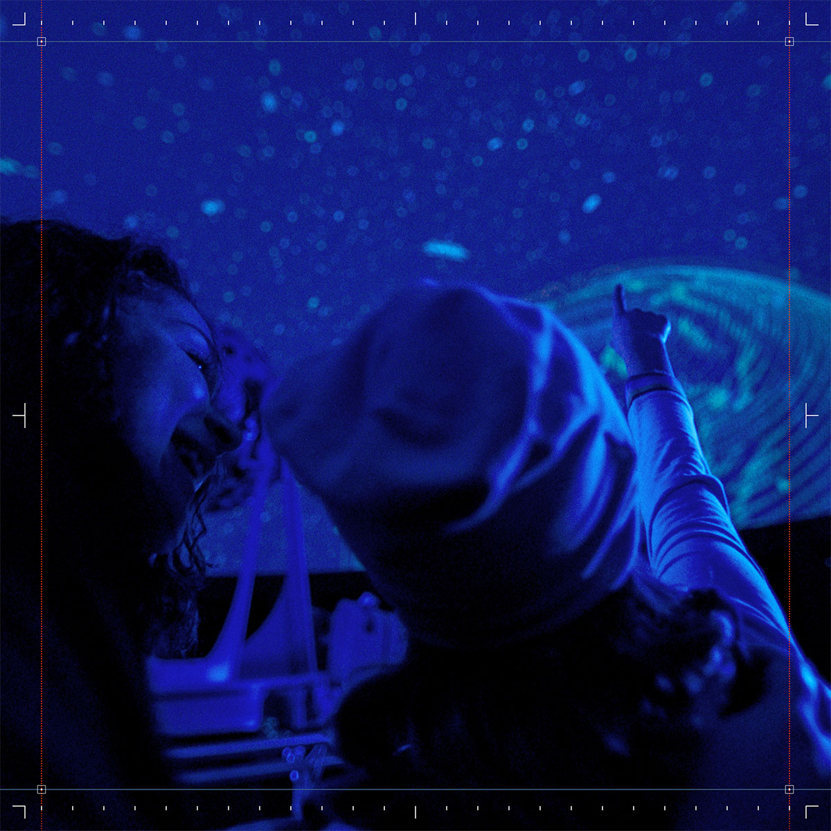
The familiarity of constellations has helped us reach a wide audience, regardless of their technical background or age. We’ve been able to help the public engage with an extremely complex subject. Especially by focusing on student groups and spaces such as planetariums. We hope this initiative leads to the rise of more space environmentalists around the world.
Did anything change for you personally as a result of the project?
We’ve come to understand that all exploration comes with a cost. Space is just like the rest of the environment on Earth, and is shared by all of humankind. It’s not meant for any one nation or party to exploit. It’s high time the international community reached a consensus on this issue.
Thanks a lot for the insights. More projects like this!
Creative Direction: Serviceplan Innovation
Design Studio: Eat, Sleep + Design
Digital Design Studio: Moby Digg
Development Studio: Owls Department
Sound: Jürgen Branz, Christoph Groß
Type Design: Michael Clasen
Production: peoplegrapher
Motion Designer: Hendrik Sommerfeld
CGI Studio: Non Zero
