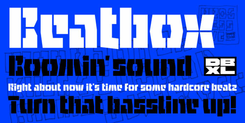
Beatox
Beatbox heißt der Font des Holländers Beekman (Erschienen bei DGV). Wir trafen ihn dieses Jahr auf der Typo Berlin, ein sehr sympatischer Typ. Er lebt auf einem Boot in Amsterdam, macht viel Musik, nimmt Soft-Drogen (Letztes Jahr hatte er einen wunderbaren Vortrag über Drugs and Design gehalten).
Stencil-Fonts sind gefragt, vielleicht ein Thema für die 6. Slanted Ausgabe? Jetzt ist allerdings erst mal Antiqua an der Reihe!
Foto: Lars/Slanted
Donald Beekman has many talents. He runs his own graphic design and music studio DBXL and is also one of the co-founders of Typeradio, an online radio channel dedicated to typography. He designs logos, record and CD jackets, flyers, posters, magazines, packaging and also composes and produces and runs the underground record label Illy Noiz. He’s also the designer of the Breeze font which was released by dgv in 2004.
dgv is proud to present a new font release by Beekman. The Beatbox font is a stencil-like font with character and a bit of a ‘solid tech feel’. The alphabet is composed of both capital and lowercase letters and Beatbox has appeared on many album covers.
dgv spoke with Beekman about his font and his design practice in an interview.
Can you tell us a little about your Beatbox font?
Beatbox is a solid straight stencil-face with a lot of character.
What is the ideal usage for your font?
Logos or headers in a magazine. As a display and headline typeface since it’s got a lot of character. I could also see it painted on the side of a tank.
Did you design the font for a specific project? What was your inspiration?
Beatbox was originally designed as a logo for DJ Markus Schultz, who in the end rejected it… which happens a lot creating fonts for such projects. His management said they couldn't read it, or thought people wouldn’t be able to read it.
I liked the shapes and thought it would be a usable typeface, so I continued working on it and finished it. I’ve used it for a couple of online download album covers, mainly for house and hip hop. I could see it used for drum & bass artwork too. It has a bit of solid tech feel. And I proposed it to the Battle of Amsterdam.
Where does the name come from?
I proposed it for the Battle of Amsterdam project, a talent showcase in beat boxing and other disciplines. I think it's a great competition. There’re six neighborhoods in Amsterdam and each neighborhood first organizes a local competition in the various disciplines (beat boxing, break dancing, rap, street dance, freestyle) and the winners from the neighborhoods compete against each other in the finale. The winner gets the title ‘Amsterdam Battle Master 2007’. Hundreds of kids join to show their skills and the finale is a very big event. The crowd is extremely loud and cheering on their favourites.
I have been doing their design since they started in 2004. They liked the Beatbox font right away and it going be the house font for next year.
