Beatrice
Sharp Type
Eine Reise in unbekannte Schriftgefilde – am Ende dieser Entdeckungsfahrt steht eine Schriftfamilie, die neue Wege in Sachen Kontrasten geht. Die Beatrice Familie von Sharp Type besteht aus dem kontrastreichen Display- und dem kontrastarmen Standardschnitt.
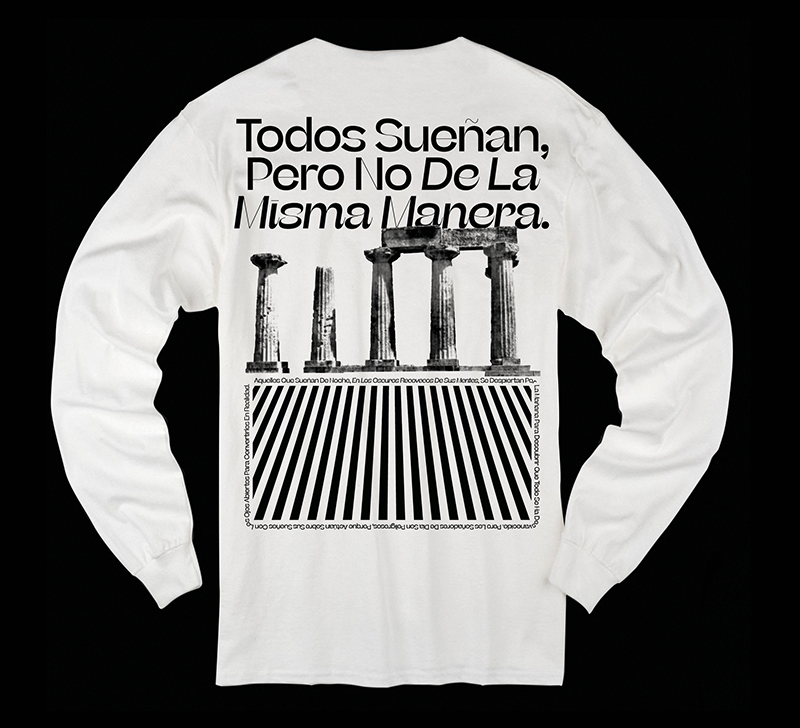
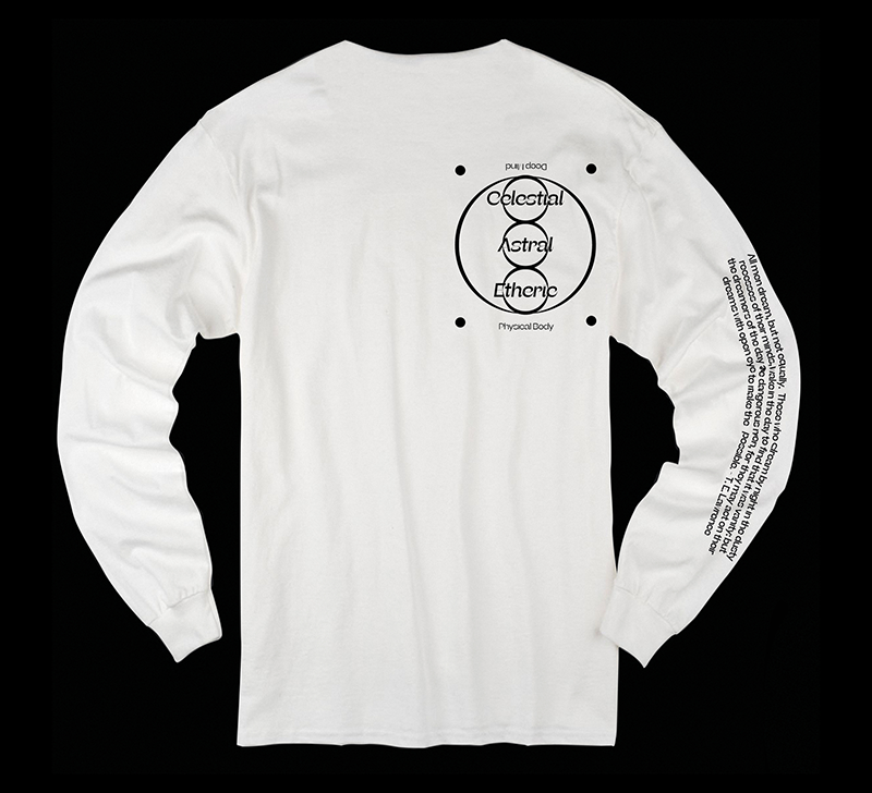
Zur Feier der Veröffentlichung der neuen Superfamilie Beatrice von Sharp Type verlosen wir 5 × 1 wunderschönes Siebdruck-Shirt mit einem Zitat von T. E. Lawrence. Hier geht es zur Verlosung bei Instagram.
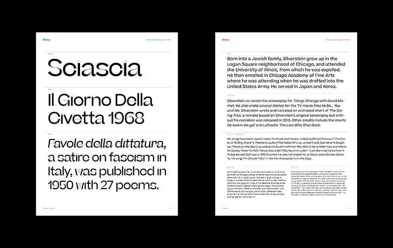
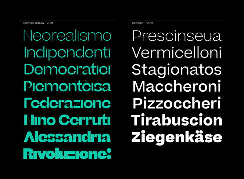
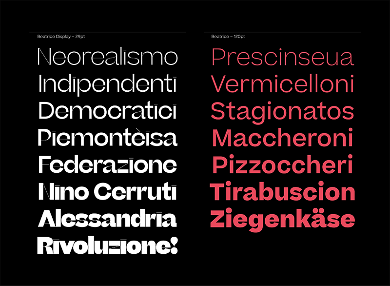
Beatrice-Display is a new kind of typeface. The family is an exploration of contrast methodologies, combining various aspects from the canon expansionist systems, inverted contrast, and the contrast behavior of standard sans-serif grotesks. These methodologies were dissected and used as cornerstones in building our own system, with the final result landing largely in unexplored territory. Built on the foundation of a traditional American Gothic but with tight-as-can-be spacing, the superfamily spans a robust set of weights and includes two optical sizes: a super high-contrast, tightly packed Display cut, as well as a standard low-contrast cut, designed to function beautifully in a wide range of optical sizes.
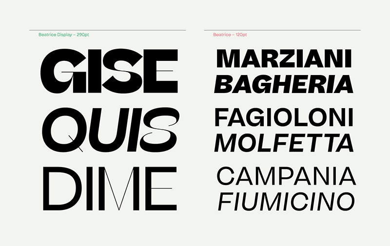
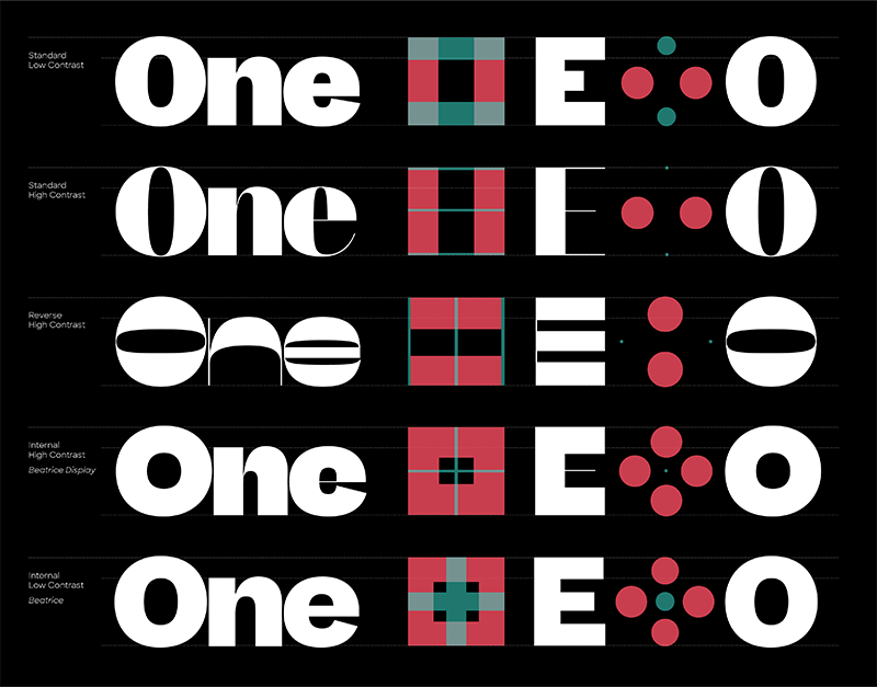
Instead of utilizing contrast purely for the purpose of mitigating the darkening effects of stroke intersections, or based on an implied stroke ductus, the contrast methodology of Beatrice–the system for determining how the thicks and thins are applied to the skeleton–is done by applying a new rationale, a system we are referring to as “internal contrast.”
The idea is simple: every letter has an inside and an outside–Internal contrast is when stroke emphasis is applied to the outside of the letter-shape, with the strokes on the inside of the letter-shape being the hairline. This, combined with the classic sans-serif convention of pinching at the intersections of strokes and bowls creates a texture of thicks and thins that behave functionally in much the same way as a standard high-contrast expansionist sans-serif, even though aesthetically it is wildly different.
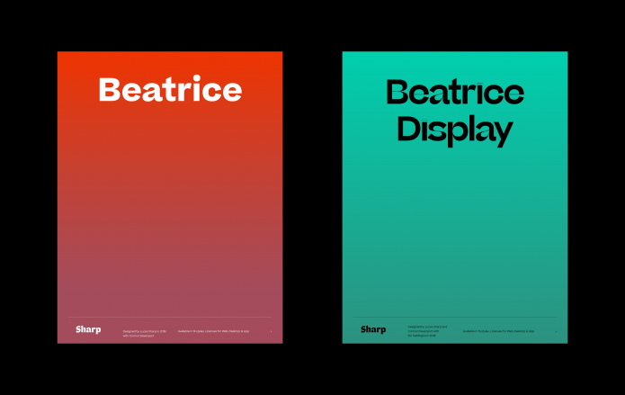
The standard Beatrice family is built from the same skeleton as the roman display, but with much lower contrast, and is designed to work in a wide range of optical sizes.
Although Beatrice and Beatrice-Display share a common skeleton and Internal Contrast style, The visually striking effect of the high contrast Display is almost reminiscent of reverse contrast as a visual oddity, while the standard cut of Beatrice appears very restrained and can easily be mistaken for a more standard grotesk typeface. Beatrice Display is an exuberant and instantly apparent expression of the Internal Contrast method. It is extremely high contrast, unrestrained, and includes tight-as-can-be spacing and apertures, making it unsuitable for use in point sizes below 36 pt.
Beatrice Display is an exuberant and instantly apparent expression of the Internal Contrast method. It is extremely high contrast, unrestrained, and includes tight-as-can-be spacing and apertures, making it unsuitable for use in point sizes below 36 pt. In drawing the initial roman of Beatrice Display, we set out to create a new set of rules. In the italic we bent these rules in new directions and sometimes broke them, adding a hefty dose of translation and rotation. The calligrapher's hand is ever present, but the tools and techniques are constantly abstracted and obscured.
Beatrice
Foundry: Sharp Type
Designer: Lucas Sharp
Release: 2018
Weights / Styles: 2 optical sizes: Beatrice and Beatrice Display, each in Thin, Light, Regular, Medium, Semibold, Bold, Extrabold + Italics
Price: 50,– USD / single style, 75,– USD / pairs, 300,– USD / family, 750,– USD / superfamily
