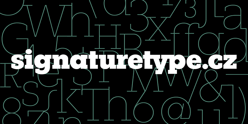
Fenomen Slab
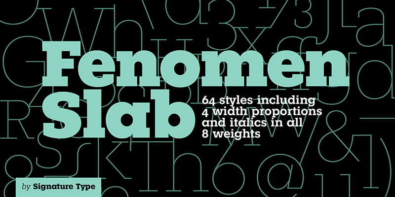
Heute präsentieren wir euch die unglaublich gut ausgebaute Fenomen Slab der Tschechischen Tyefoundry Signature Type. Mit ihrer Schwester Fenomen Sans ist die Familie vielseitig einsetzbar und kann mit ihren vier Schriftweiten und den jeweils acht Schnitten in jedes Extrem gebracht werden. In den drei Jahren der Ausarbeitung von 2014 bis 2017 wurde besonderen Wert darauf gelegt, dass immer wieder Tests zur Lesbarkeit in jedem Schnitt und Schriftgröße durchgeführt wurden. Damit setzten die Gestalter Rostislav Vaněk and Tomáš Nedoma ein Zeichen der Qualität.
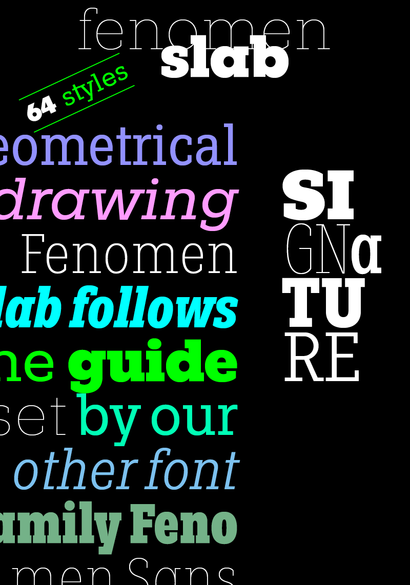
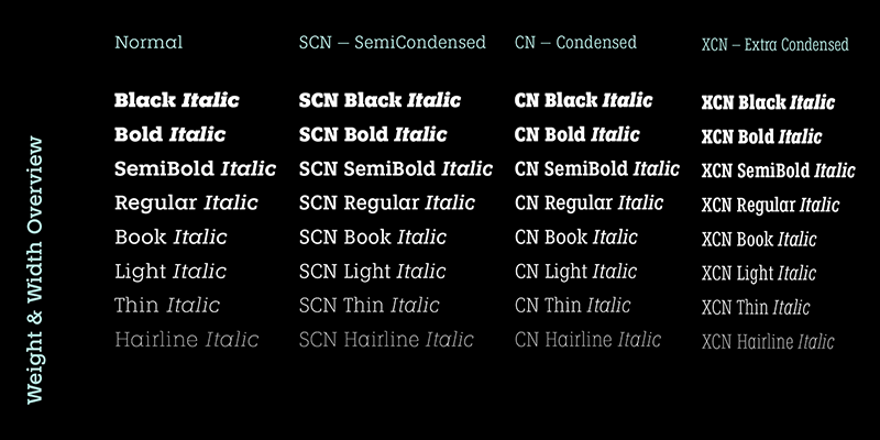
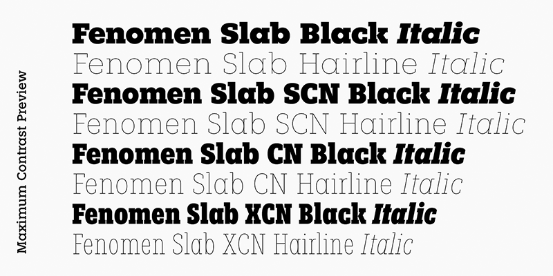
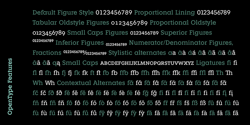
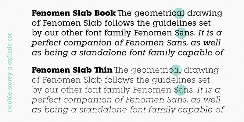
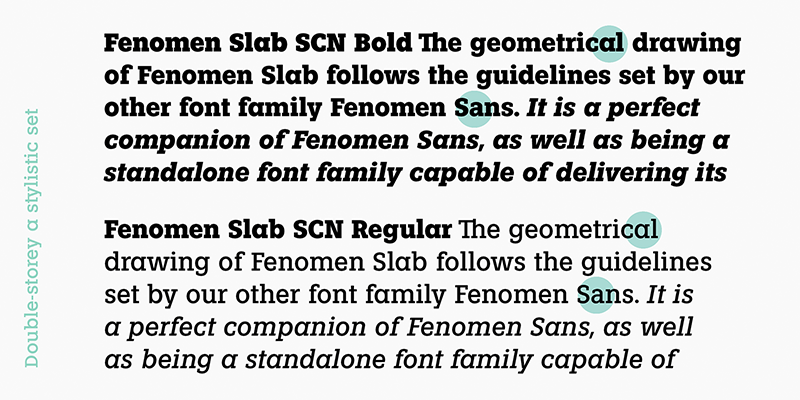
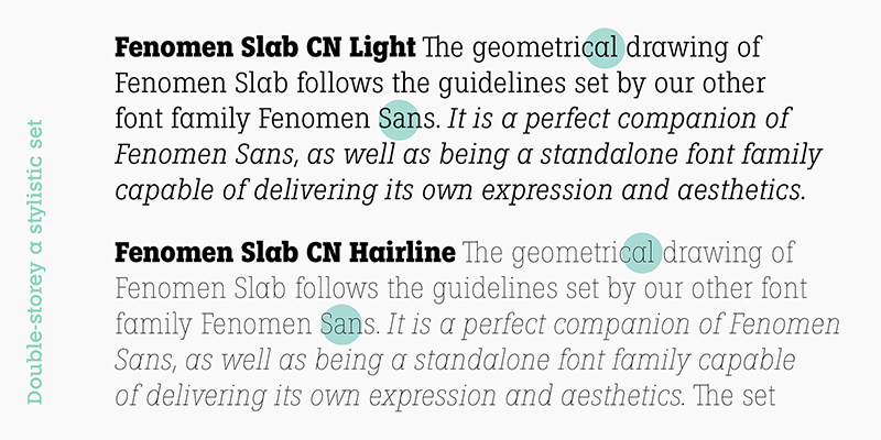
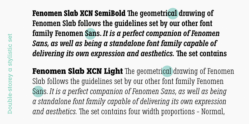
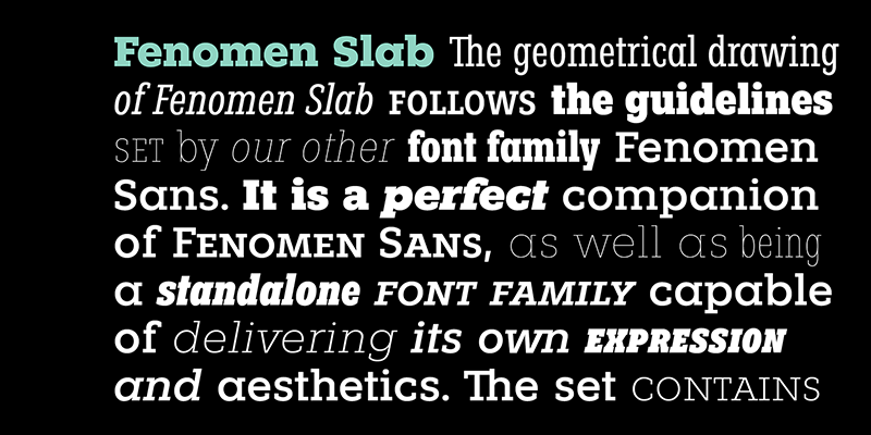
The geometrical drawing of Fenomen Slab follows the guidelines set by our other font family Fenomen Sans. It is a perfect companion of Fenomen Sans, as well as being a standalone font family capable of delivering its own expression and aesthetics. The set contains four width proportions – Normal, SemiCondensed, Condensed and ExtraCondensed in eight weights ranging from Hairline to Black. Every font of the family contains four types of numerals, small caps, ligatures and contextual alternates.
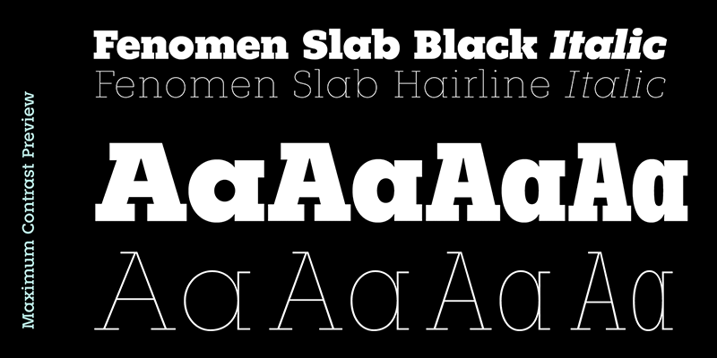
The typeface was developed between the years 2014–2017 and was subjected to a series of tests for the fluent legibility of all fonts even in extreme conditions. Narrow fonts provide this set with the maximum use including newspaper typesetting. The typeface has an elegant, delicate design in thin fonts and sufficient legibility in bold. Mutual contrast produces great creative tension.
Fenomen Slab
Foundry: Signature Type Foundry
Designers: Rostislav Vaněk and Tomáš Nedoma
Publishing date: 2017
Styles and weights: Black, Bold, SemiBold, Regular, Book, Light, Thin, Hairline, SCN Black, SCN Bold, SCN SemiBold, SCN Regular, SCN Book, SCN Light, SCN Thin, SCN Hairline, CN Black, CN Bold, CN SemiBold, CN Regular, CN Book, CN Light, CN Thin, CN Hairline, XCN Black, XCN Bold, XCN SemiBold, XCN Regular, XCN Book, XCN Light, XCN Thin, XCN Hairline + Italics for each weight
Price per weight: USD 35
Price per style: USD 238 (usual discount on myfonts.com for eight styles)
Price whole family: USD 784
Rostislav Vaněk
Born in Prague. In 1969 he graduated from the Academy of Arts, Architecture and Design in Prague (AAAD). He has worked in all fields of graphic design devoting mostly to type design, book design and visual communication. Rostislav Vaněk worked with the Brno Biennial and held solo and group exhibitions with Typo& group in Europe and USA (ITC Centre, New York). He designed many orientation systems (Prague Metro). For 20 years he worked as the head of the Studio of Graphic Design and Visual Communication at the AAAD. In 2010 he founded Signature Type Foundry; over 260 fonts resulted from his drawing experience along with the font making expertise of Tomáš Nedoma since. In 2017, Rostislav Vaněk entered the Czech Grand Design Hall of Fame.
Tomáš Nedoma
Born in Prague. In 2010 he graduated from the Tomas Bata University in Zlín. He digitized the Quodlibet font family as his master’s degree project. In 2010, Tomáš Nedoma co-founded Signature Type Foundry with Rostislav Vaněk. They put emphasis on creating extensive font families of exceptional legibility. In cooperation with František Štorm, Roman Černohous and Marek Pistora they created Clara Sans, Clara Serif, Aktion, Corridor, Meridianus Sans and Meridianus Serif. Tomáš digitized namely Fenomen Sans, Fenomen Slab, Haven, Galaxy and Quodlibet Sans and Serif among other fonts. He is an early adopter of new font technologies always trying to stay ahead of trends willing to both share his knowledge and learn.
