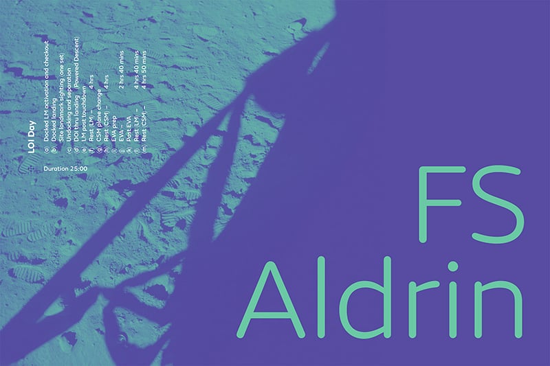
FS Aldrin
Die FS Aldrin von Fontsmith, benannt nach dem Astronauten Buzz Aldrin, ist eine runde, warme und vitale Sans, der es nicht an handwerklicher Präzision fehlt. Mit dem gewissen Extra ausgestattet, ist sie nicht nur sehr charmant, sondern strahlt auch eine gewisse Eleganz aus, die solch eine runde Schrift oft vermissen lässt. Mit ihren sechs Schnitten von Thin bis Heavy plus Italics und einem dazugehörigen Set von Icons ist die Aldrin, gestaltet vom Fontsmith Design Director Phil Garnham, in den dünnen Schnitten technisch elegant und in den dickeren Stärken perfekt schnell erfassbar für große Datenmengen. Die perfekte Kombination für jede Branding Font.
Aus dem Pressetext: FS Aldrin is a new typeface from boutique type foundry Fontsmith, available in 6 weights plus an accompanying suite of icons. Notably, FS Aldrin has even garnered praise from Buzz Aldrin, the second man ever to walk on the Moon and who inspired the font’s name.
Fontsmith Design Director Phil Garnham had for some time harboured a desire to create a rounded font. It needed the warmth and approachability that’s so vital to contemporary brands, but also the craft and precision that a place in Fontsmith’s library demands.
The task wasn’t straightforward, as rounded fonts are tricky beasts to get right. With a few notable exceptions they have plenty of charm, but little in the way of elegance. Their tonal range appears vast but also limited, depending on either design context or era. Common perceptions of sausage-like or jelly sweet letters found on kids packaging run through to the more sincere endeavours of clinical type brilliance displayed in 70’s architectural signage and corporate 80’s brand cool.
What Phil needed was a starting point, a skeleton around which to design the new font. The ideal candidate came along in 2013 with the launch of FS Emeric, with its incredibly robust structure and just the right amount of distinctiveness within its letterforms.
But what began life as FS Emeric Rounded quickly departed from the source material in some pretty fundamental ways. In particular the lower case ‘a’ and ‘g’ are single tier, while the counters have lost their inner definition. As characters were adapted to increase their fluidity, so FS Aldrin came to life.
Phil Garnham, Fontsmith, said: “I wanted to add a fresh interpretation to the rounded font canon and give FS Emeric a sibling, one with a softer, more amiable character while retaining the family’s astuteness and crispness.”
Space travel and exploration was a constant theme throughout FS Aldrin’s development. Phil was on a mission to break new ground and this led him to Buzz Aldrin.
Phil Garnham, Fontsmith, said: “The openness of the circular strokes combined with its more technical, crafted aspects made a voice in my head scream ‘space rocket’! As a self-confessed space geek, the personality of this font presented a great opportunity to honour one of my boyhood heroes.”
Fontsmith contacted Buzz’s management team to make sure there were no intellectual property issues that needed to be addressed. Not only was Buzz happy that the font be named after him, but he also asked if he could use FS Aldrin himself. A member of Buzz’s team said: “Buzz and his team love the fonts and have been using them in his presentations. We hope everyone likes them as much as Team Buzz does!”
With Team Buzz firmly on board, Phil took the opportunity to further enhance FS Aldrin’s versatility by designing a suite of 268 icons covering themes including weather, currency and navigation. 30 of these are ‘Buzz Specials’, featuring rockets, shuttles and lunar modules, as well as the great man himself.
In essence, FS Aldrin takes FS Emeric’s sincerity and adds a joyous smile. The result is a fresh round-stem lettering style, harmonious with the aesthetic principles of rounded typefaces but with a twist of Dutch junctions and modern angularity. A fresh interpretation of the genre.
Phil Garnham, Fontsmith, said: “Every curve and transition has been crafted by hand, and that’s what gives FS Aldrin its unique strength. Unlike the majority of new rounded fonts there are no scripts at work here.”
As a result, FS Aldrin feels equally at home presenting complex data as it does in a bold headline. The thinner weights in particular have a precision and elegance that sets beautifully in a technical environment. The benefit to a brand is greater versatility, as the typeface can adapt easily to a range of different communication tasks.
FS Aldrin
Type Foundry: Fontsmith
Designer: Phil Garnham
Veröffentlichung: 2016
Schnitte: Thin, Thin Italic, Light, Light Italic, Regaular, Italic, Medium, Medium Italic, Bold, Bold Italic, Heavy, Heavy Italic, Icons
Preis pro Schnitt: 80,- Britische Pfund
Preis Familie: 180,- Britische Pfund
Buy


