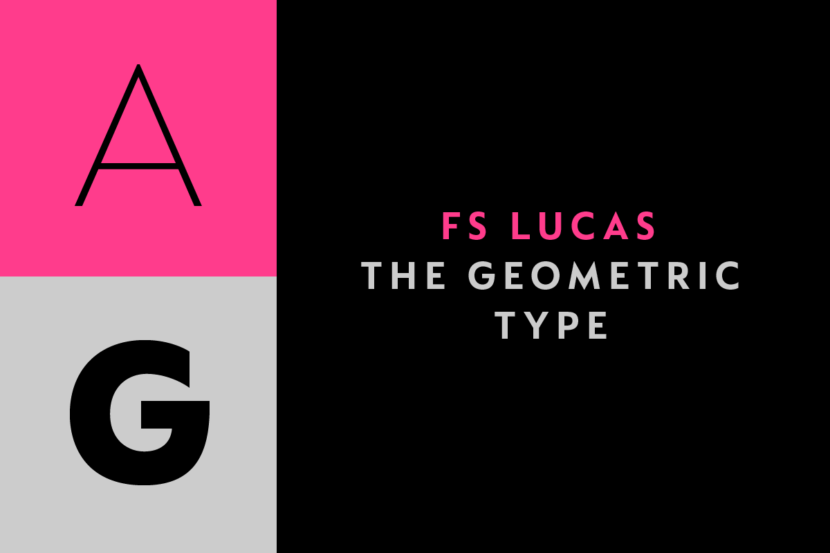
FS Lucas
FS Lucas ist die neue, auf geometrischen Formen basierte Schrift von Stuart de Rozario, veröffentlicht von Fontsmith. Sie besticht durch eine besonders gute Lesbarkeit, auf die im Gestaltungsprozess besonders großen Wert gelegt wurde – klassische, geometrische Formen sollen sich in einer modernen Ästhetik wieder finden, die on- und offline gut leserlich und zugänglich ist.
Aus dem Pressetext: FS Lucas is a new typeface from boutique type foundry Fontsmith. Based on near-perfect circles, triangles and squares, what could be simpler? Geometric typefaces, though, often make for a less-than-simple read, especially on-screen. When Fontsmith founder Jason Smith resolved to develop a modern typeface in the geometric tradition, the challenge was clear: to take classic geo formal qualities and optimise them for the demands of modern brands, of online and offline usage, readability and accessibility. And, somewhere along the line, to incorporate the all-important Fontsmith x-factor. FS Lucas is the bold and deceptively simple result.
Geometric typefaces are more popular than ever among today’s big brands. Maybe it’s their air of plain speaking and transparency that names such as Pepsi, Virgin Atlantic and Addidas feel offers a close fit with their respective personalities. Many of the world’s most recognisable brands in technology, retail, travel, food, manufacturing and other industries continue to be drawn to the straightforward, honest character they convey.
Geometric letterforms look uncomplicated, even though rendering them readable in long passages of text is anything but – something the designers of the first wave of geometric fonts discovered. In the early 20th century, printers, designers and type commissioners were exploring a new philosophy to typography that echoed the modern art movements of the time such as De Stijl, Art Deco and the Bauhaus.
The spirit of invention of these early pioneers, the 1920s art deco poster designs of AM Cassandre, and the sleek modernist architecture of Ludwig Mies van der Rohe were guiding influences for Stuart de Rozario, the designer behind Fontsmith’s award-winning FS Millbank. ‘Our brief was to create a geometric sans typeface that was stripped back, modern and pure, but with added charisma.’
Early geometric typefaces were accused of putting mathematical integrity before readability. FS Lucas achieves the trick of appearing geometric, while taking the edge off elements that make reading difficult. ‘To appear geometric without being perfectly geometric,’ says Stuart, ‘you need a relatively large x-height, which also happens to be great for legibility and accessibility.’
Perfectly circlular shapes don’t read well. The way around that is to slightly thicken the vertical strokes, and pull in the curves at the corners to compensate; the O and o of FS Lucas are optical illusions.
The letterforms of FS Lucas are round and generous, along the lines of Trajan Column lettering stripped of its serifs. But beware their thorns. Stuart wanted a contrast between spiky and soft, giving sharp apexes to the more angular letterforms, such as A, M, N, v, w and z.
Among his inspirations was the triangular cosmic element symbol, which led him to tackle the capital A first, instead of the usual H. The proportions and angles of the triangular form would set the template for many of the other characters. It was this three-pointed shape, and the light-scattering effects of triangular prisms, that lit the path to a name for the typeface: Lucas is derived from lux, the Latin word for light.
Pointed apexes aren’t as sharp as they look, though; the flattened tips are an essential design feature. And distinctive details such as the open terminals of the c, e, f, g, j, r and s, and the x-height bar on the i and j, aid legibility, especially on-screen.
These idiosyncracies, according to Jason, were ‘the product of sketching the letterforms in the first instance by hand rather than mapping them out mechanically by computer. They give FS Lucas the built-in humanity and character that make it a better, easier read all-round.’
‘It’s a huge challenge to design this sort of pure typeface,’ says Stuart. ‘Everything needs to be 100% spot on – there’s nowhere to hide.’ Rigorous testing was needed throughout the design process, in context at different weights, sizes and backgrounds, to make sure it performs across a range of media.
Unlike some of its more buttoned-up geometric bedfellows, FS Lucas can’t contain its natural personality and quirks: the flick of the foot of the l, for example, and the flattish tail on the g and j. The unusual bar on the J improves character recognition, and the G is circular, without a straight stem. There’s a touch of Fontsmith about the t, too, with the curve across the left cross section in the lighter weights, and the ampersand is one of a kind.
There’s a lot to like about Lucas. With its 9 weights, perfect proportions and soft but spiky take on the classic geometric font, it’s a typeface that could light up any brand.
FS Lucas
Foundry: Fontsmith
Designer: Stuart de Rozario
Veröffentlichung: Juni 2016
Schnitte: Thin, ExtraLight, Light, Regular, medium, SemiBold, Bold, ExtraBold, Black mit passenden Italics
Preis pro Schnitt: £80
Preis Familie: £220


