Karloff
Peter Biľaks neue Schrift Karloff ist ein Experiment zwischen einer klassizistischen Antiqua und einer Version mit umgekehrten Kontrast, die in der Summe eine neutrale Slab Serif ergibt.
Pressetext: Karloff explores the idea of irreconcilable differences, how two extremes could be combined into a coherent whole.
At the start we looked at the high-contrast Didone typefaces which are considered by many as some of the most beautiful in existence, and the eccentric “Italian”, reversed-contrast typeface was designed to deliberately attract readers’ attention by defying their expectations. No other style in the history of typography has provoked such negative reactions as the Italian.
[vimeo:50080784]
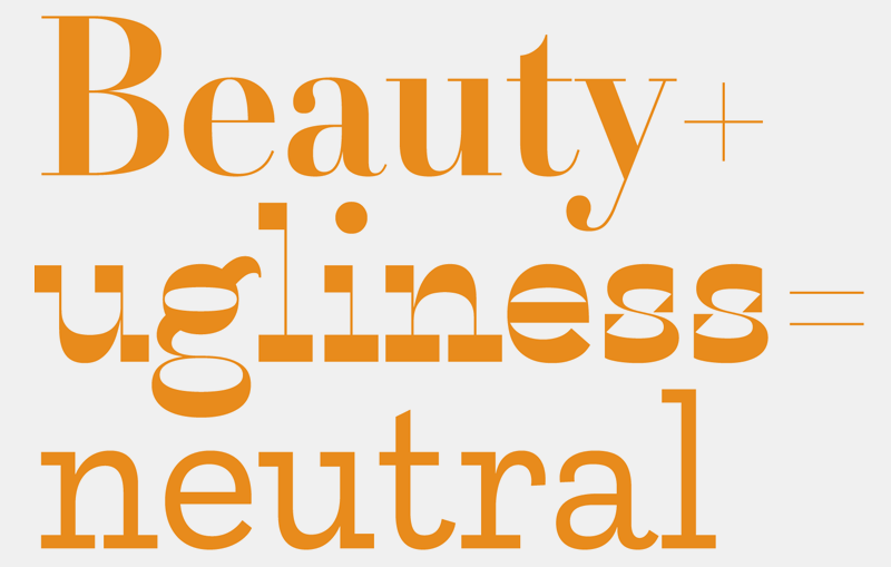
Karloff, the result of this project, connects the high contrast Modern type of Bodoni and Didot with the monstrous Italians. The difference between the attractive and repulsive forms lies in a single design parameter, the contrast between the thick and the thin.
Having designed two diametrically opposite versions, we undertook a genetic experiment with the offspring of the beauty and the beast, interpolation of the two extremes, which produced a surprisingly neutral low contrast version.
Karloff:
Foundry: Typotheque
Designer: Peter Biľak
Veröffentlicht: 2012
Format: Opentype
Schnitte: 14
Preis: pro Schnitt 90 €, Karloff Family 500 €
Artikel zur Entstehung der Karloff auf www.ilovetypography.com
Hier kann man sie kaufen!


