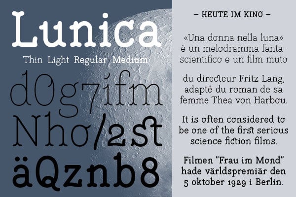
Lunica
Lunica, die neue Schrift von Thomas Hirter ist da. Inspiriert wurde der in Bern lebende Grafikdesigner von den Kino-Untertiteln während seiner Zeit in Stockholm. Die Buchstabenformen dienten ihm als Vorlage für Lunica. Um den schwedischen Stil zu komplettieren, ergänzte er Serifen an die Buchstaben. Die abstrahierten Viertelkreise verleihen der Schrift ihren individuellen und poetischen Charakter. Lunica bietet eine sehr gute Lesbarkeit, auch in kleinen Größen.
Hier ein Teil des Interviews über die Entstehung der Schrift:
Please give us an introduction to yourself and your work.
For nearly 10 years I have been working as an independent graphic designer, after finishing the Schule für Gestaltung in Biel (Biel's school of design). My workspace is located in a small former packaging factory in Bern, where I share with two dozen other self-employers. I am not equipped with plenty of creativity, so I consider myself more of a craftsman than an artist. Type design has always fascinated me, but in the recent years, I have become more serious and passionate, so it was only a question of time until my first typeface was released.
What was your main intention when drawing the typeface Lunica?
I started the project in 2006; it was during my years in Stockholm. The inspiration came from the subtitles at the cinema. At that time they were often set in some kind of sans-serif stencil typeface: basic letterforms, one single line weight, round endings, and no contrast. My intention was to keep this simplicity but add serifs to meet the charm of the Swedish language. Of course this is a contradiction: a serif typeface is somewhat defined by having contrast. I chose to abstract the serifs with a geometric quarter circle. This initial form is attached to most of the line endings and gives the typeface a touch of a handwriting and organic temper.
Is there any historical background which you see Lunica is related to, or are you free from any kind of relation and just following your intuition?
My personal motivation and the background are mentioned above. The name Lunica (which was given at the very end of the process) makes a funny connection to the grotesque classic Unica from 1980. The two are as different as they can be, but yet there is a similarity in their straightforward letterforms.
Das ganze Interview könnt ihr hier lesen.
Lunica
Foundry: Gestalten
Designer: Thomas Hirter
Veröffentlichung: 2014
Format: OpenType
Schnitte: Thin, Light, Regular, Medium
Preis pro Schnitt: 45 Euro
Preis Familie: 144 Euro


