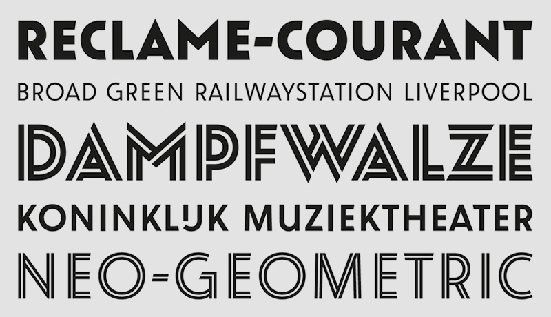
Oskar
Der erste Verwendungszweck der Oskar war 2002 eine Inschrift auf einem Schulgebäude in Den Haag. 11 Jahre später ist die inzwischen in 12 Fonts ausgebaute Majuskelschrift frei lizensierbar. Paul van der Laan zog bei ihrer Gestaltung Inspiration aus niederländischen Schriftzügen für architektonische Anwendungen und Werbung des frühen 20. Jahrhunderts. Der Einführungspreis von 35 Euro pro Schnitt gilt noch bis zum Februar 2014.
Pressetext: Oskar, designed by Paul van der Laan, is a typeface inspired by Dutch architectural and advertising lettering from the early 20th century. Particularly the style of lettering that was painted on walls and shopfronts, or executed in metal on buildings. This kind of typography did not exist as metal printing types, but was instead painted manually by sign painters, or drawn by architects.
The Oskar family comes in two different styles that are modern interpretations of the commercial signpainter style on one side, and the cool sophisticated geometry of Bauhaus on the other hand.
Six meticulously drawn “split inline” styles are part of the family as well, which enhances its unique quality.
Initially the typeface was designed in 2002 for the lettering of a monumental school in The Hague, designed by architect Jan Duiker in 1929. Since this first application, the Oskar family has been slowly expanded into multiple weights, and supports all common European languages.
Another application of Oskar is for an ambitious water development project called “Noordwaard” in The Netherlands. Until 2015 a series of bridges and water pumping stations, designed by architects of IPV Delft and West 8, are being built and get steel lettering in Oskar.
Oskar
Foundry: Bold Monday
Designer: Paul van der Laan
Veröffentlichung: Dezember 2013
Format: OpenType
Schnitte: 12 Schnitte, Oskar One/Two in Light, Regular, Bold, je mit Inline
Preis pro Schnitt: 35 €
Preis pro Familie: kein Familienpreis, Rabatt wird mit jeder Schrift im Warenkorb größer


