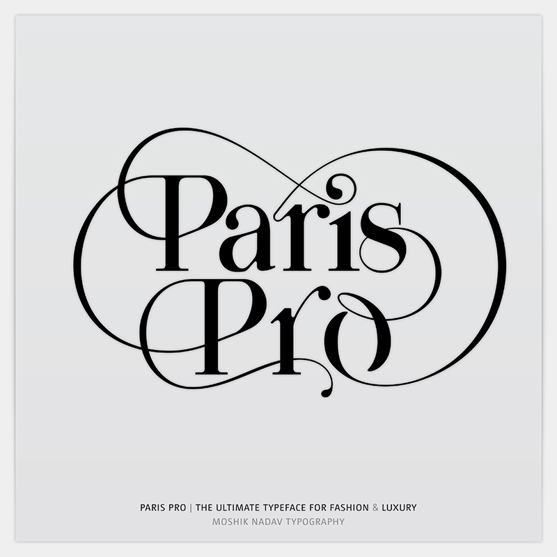
Paris Pro
Moshik Nadav Typography
Israeli type designer Moshik Nadav publishes his new typeface Paris Pro, a revised version of Paris with newly drawn glyphs and even more outstanding ligatures and swashes. Moshik answers three questions about his new font in the Slanted Interview.
What is special about Paris Pro?
Paris Pro, inspired by the Fashion world, is the new and improved version of the popular Paris Typeface. Paris Pro provides many more exciting ligatures than the first version, including amazing swashes, super cool open type features, fashionable custom ready-made words for sexy headlines, multiple glyphs for letters along with many options for writing the same word in different manners. Paris Pro Designs are geared towards upscale international Fashion Magazines, promoting the ideal combination of Typography and Fashion, taking Fashion magazines to the next level. Paris Pro consists of 13 styles: Paris Pro regular, Paris Pro regular exit, Paris Pro regular strip, Paris Pro regular white, Paris Pro bold, Paris Pro bold exit, Paris Pro bold strip, Paris Pro bold white, Paris Pro hairline, Paris Pro ultra extra light, Paris Pro ultra light, Paris Pro light & Paris Pro light book. With Paris Pro designers can create unique logos, combined with a contemporary and a luxurious look and touch. I definitely think that Paris Pro is the ultimate typeface for Fashion and Luxury today.
Why did you name it like that? Some story behind?
Paris Typeface was inspired by the world of Fashion. While I was working on the design I always thought about Fashion magazines, Fashion designers and Fashion shows, and tried to figure out how I can take what exists now in the world of Typography for the Fashion industry and create something new, modern, and unique. The name was an issue; There was so many other names from the Fashion world. However, right after I finished the design, there was a song on the radio called Paris and BOOM! I saw this is a sign! This is why Paris Typeface called Paris. As for Paris Pro Typeface—the name stemmed from the fact that it’s a much better, completely re-designed version. As an added bonus, by combining the first Paris Typeface and this Paris Pro version designers and users have many options and glyphs allowing designers to create a professional look in just a few seconds.
How do you promote your typefaces? Can you make a living of it?
For promoting my typefaces, I am using the power of social media with my own website, Facebook page, and my blogs. Yet, I am not doing anything special to over-promote my typefaces. Designing a typeface can take months and even years. I seriously worked extremely hard for the last 11 months; 24 hours, 7 days a week for the design of Paris Pro. I can definitely make a living of it, but I also have a passion for logotype design and branding and I enjoy mixing everything together.
Paris Pro
Foundry: Moshik Nadav Typography
Release: November 2012
Designer: Moshik Nadav
Format: OpenType
Styles: regular, regular exit, regular strip, regular white, bold, bold exit, bold strip, bold white, hairline, ultra extra light, ultra light, light & light book
Price: from 55$ per style, packages up to 200$, discounts for students
Here you can buy the font.
