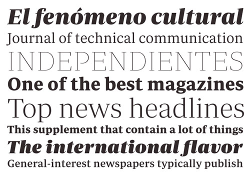
Periódico
Ursprünglich von der spanische Tageszeitung «ABC» in Auftrag gegeben, setzt sich die Periódico (spanisch für Zeitung) aus Besonderheiten der spanischen Typografie zusammen. Eine markante Schrift mit viel Tradition, die besonders an den Buchstaben »J« und »G« ersichtlich wird. Dreißig verschiedene Schnitte, die es ermöglichen sollen alle Bedürfnisse einer großen Publikation zu stillen. Und hier noch ein kurzes Video zur Schrift.
Pressetext:
'Periódico' (Newspaper in spanish), was originally commissioned by the spanish daily newspaper 'ABC'. Inspired by old spanish typographic engravings, mostly from the second half of the XVIII century, we picked out the most relevant details of 'spanish typography' as the source of that inspiration, and instead of making a revival or an interpretation of these models, we started from scratch to create a truly original font family. The goal was to achieve a very distinctive family, functional and versatile at the same time and with the reminiscences of 'old spanish typography'.
Although we have borrowed many details from the 'old spanish typography', like the nail, present in the letters 'U', 'G' or 'J', which we worked and evolved in order to be applied on other letters, we have also left behind several others. One example is the tilde of the 'ñ' engraved by Gerónimo Gil, a very distinctive element of 'spanish typography' that was intentionally omitted for being to 'atypical' to be used in a contemporary font.
The letters 'a' and 'g' are probably the most distinctive of the 'Periódico' family. The shape of the bowl in the letter 'a', with the top arch in diagonal position is very characteristic of old spanish types. In 'Periódico' we emphasise this detail by applying it to many other letters (like the 'g', 'j', 't'…) up to a point that it became the 'leitmotiv' of this family.
The formal finish of serifs and terminals is something that gives great personality to any typeface, so we came up with plenty of alternatives in order to find the exact shape we wanted; sober elegant and contemporary. Even doe the serifs are geometric, the upper terminals have a curve with a dynamic very similar to the arch in the 'a' or the notch in the 'j'. The terminals in the capitals follow the same style but in this case the inspiration comes from Pradell's Missal, which on the other hand has been influenced by the types engraved by Johann Michael Fleischman in the Netherlands.
Eighteenth-century types were mostly used for printing books therefor having very generous proportions (large ascendents and descendants) and high contrast, but today these characteristics do not work well on newspapers for the 'news world' demand more 'space saving' fonts. The adaptation of the type's proportions to be used for a newspaper, was one of the most interesting parts of the project, specially the time taken to find the perfect balance between the 'x height' and legibility.
'Periódico' is presented in 30 different styles, in a total of 30 fonts, 10 for text (from Light to Bold) and 20 for display sizes (from Thin to Ultra Black); this family results in an extensive system capable of solving all the needs of a large publication.


