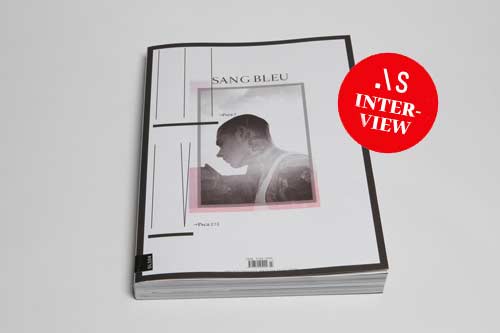
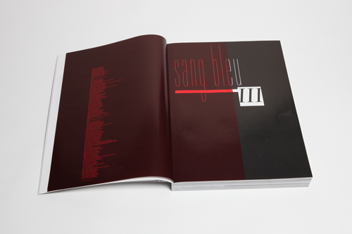
SANG BLEU von Maxime Buechi
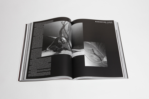
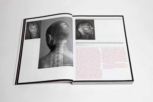
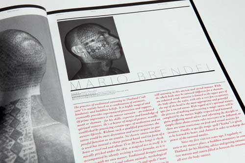
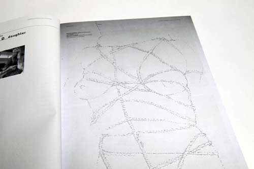
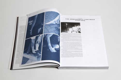
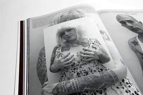
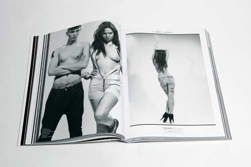
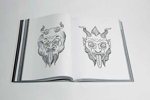
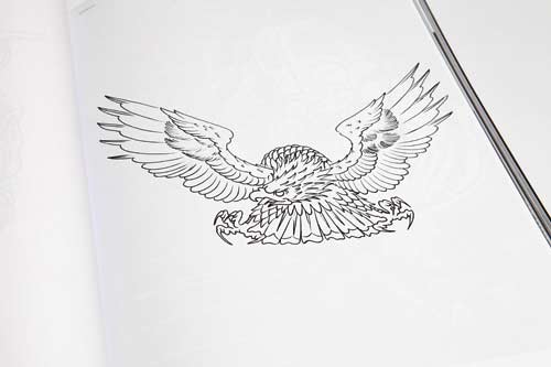
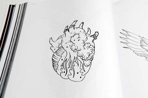
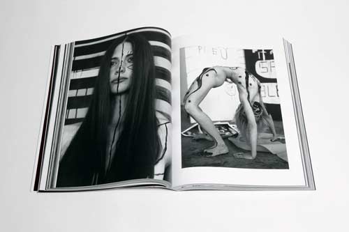
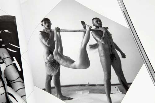
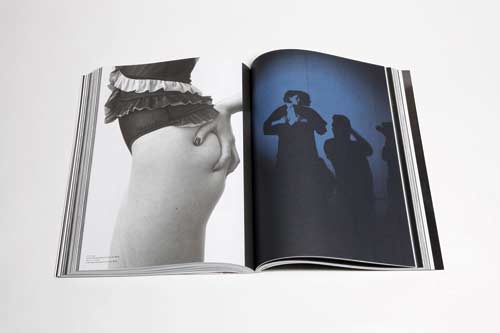
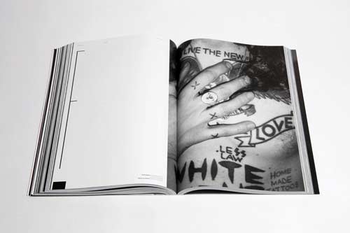
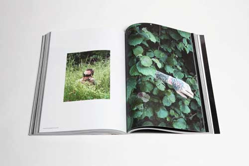
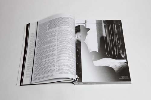
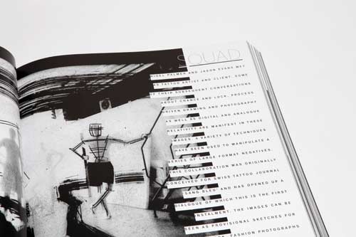
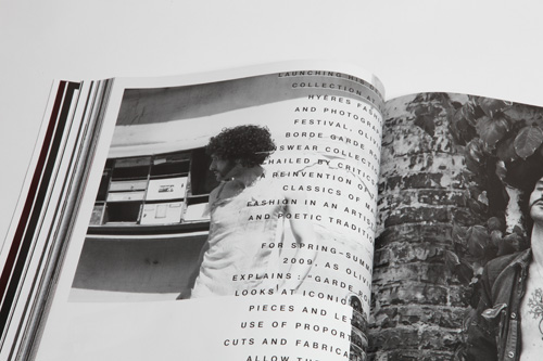
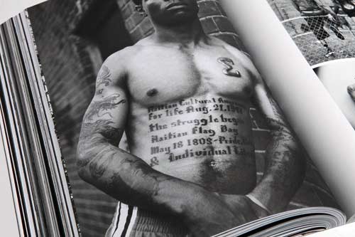
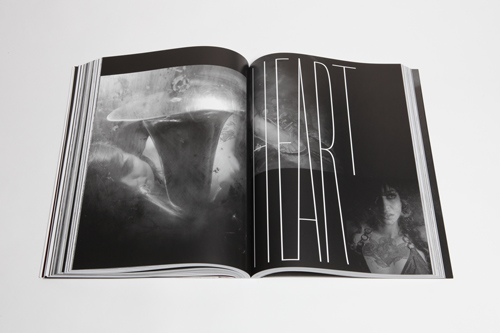
Selten, wirklich selten dass ich ein Magazin gesehen habe dass so opulent, so misterriös, so düster, so heiter und so emotional gestaltet wurde. SANG BLEU von Maxime Buechi erzeugt eine Stimmung, die unter die Haut geht. Alles wirkt echt, ehrlich, gelebt, geatmet, tättooviert. Jedes Foto entstand, so wirkt es zumindest, weil eine innige Beziehung zwischen Fotograf und Person existiert. Die Grafik bewegt sich mit einer ganz eigenen, losgelösten Sprache. Frei, hemmungslos, kontrovers und eigen. Maxime ist der Carson 09. 032 visuelle Sprache wirkt dagegen vertrocknet und erzwungen.
Auch der Blog ist eine Augenweide. Die überwiegend in sw gehaltenen Fotos sind meisterlich ausgesucht. Ich mag auch die unterschiedlichen Foto-Formate welche eine schöne Unruhe bringen. Gute, schlichte Typo und Micro Typo. Und viel Inhalt.
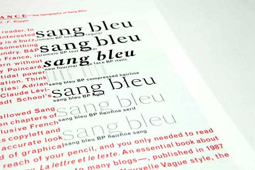
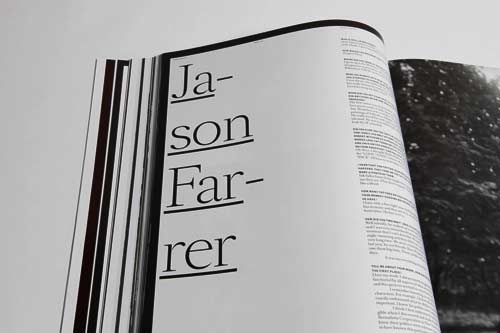
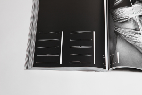
Im Magazin (oder muss man es bei 544 Seiten schon Buch nennen?) kommen die Fonts von Ian Party /B&P Typefoundry zum Einsatz. Die wunderschöne LA POLICE (z.Zt als free trial Version erhältlich) hatten wir schon vorgestellt: sie schmückt den Titel der Slanted Ausgabe #5. Damals schon hat das kleine "L" mit seinem Angelhaken meinen Blick gefangen. Als ich jetzt SANG BLEU in den Händen hielt wurde mir alles klar: das ist kein Angelhaken, das ist eine Nadel, die Stiche in die Haut versetzt.
1. what is the concept of the magazine?
Sang Bleu was initiated in 2004 in London as an attempt to create a publication proposing a contemporary and experimental vision of modern culture and style. Rejecting the usual categorizations and segmentations, Sang Bleu’s statement is to use Art, Fashion, Sociology, Literature, but also—more unexpectedly—Tattooing, Body Modification, Fetish and other subcultures to create a carefully composed image of modern urban societies and individuals.
2. how often is it published, where is it distributed?
Theoretically, 2ce a year, but practically, when possible…
It is distributed worldwide via internet (the B&P Typefoundry website).
And widely in Europe and the USA in bookshops.
3. who is behind this project, how did it happen?
I am the founder and publisher of SB. It all started in London in 2004. I Already had a confused desire for something that'd break certain boundaries, but still belong to the world of paper publishing that I like. But I was in Switzerland, where people generally stick to boundaries and are completely comfortable with that. When I arrived in London to work, I suddenly understood it was possible. Boundaries- breaking totally is in the vernacular culture. Than, as the project started to take form, people of all kind started to get involved. like my long-time friend Ian Party with whom I was already working on B&P or Jeann-Salomé Rochat, Adrian Wilson, Lotta Volkova… Sang Bleu is a very flexible and multi-faceted project in which collaborators really can take a lot of freedon. provided that they respect the initial vision.
4. is the little hook in the letter "L" of the font "La Police" a link to tattoo-art?
Not at all. It is the historical signature of the french "Imprimerie Nationale", the owner of the Romain du Roi on which the Romain BP, as well as the LaPolice BP are based.
5. who are you, where did you learn what you are doing?
Born in Lausanne, Switzerland in 1978.
Studied psychology at the university of Lausanne, then Visual Communication at the ECAL. After graduating in 2004, lived in Zurich, Paris, London, worked for people like NORM, SELF SERVICE, NORTH DESIGN, ARENA HOMME +. Teaches at the ECAL (University of Arts & Design, Lausanne). Founder of B&P Typefoundry and Sang Bleu. Currently lives and works in Lausanne and London as graphic designer, ar directer, publisher & tattoo artist.
This is where I got acquainted to publishing, but the editorial part comes more from a pre-existing taste for art and theory. I also worked in a political party for a couple of years, then belonged to all kind of "alternative" and activist associations, to the Zulu Nation, etc. and more generally always liked organizing things and making things happen…
And for all the fashion-direction etc, i learned in the process, watching other people and following my intuition and my tastes.
------------------------------------------------------
Pressetext von Sang Bleu
Sang Bleu was initiated in 2004 in London as an attempt to create a publication proposing a contemporary and experimental vision of modern culture and style. Rejecting the usual categorizations and segmentations, Sang Bleu’s statement is to use Art, Fashion, Sociology, Literature, but also—more unexpectedly—Tattooing, Body Modification, Fetish and other subcultures to create a carefully composed image of modern urban societies and individuals. Whatever their background is, Sang Bleu will reach those with a poetic mind and a sensitivity for beauty and take them to countries they never knew about.
Format: 24×33 cm
Content: 544 pages + luxury 8 page cover + two 16 page supplements + 1 music CD
Distribution: import/export press (dir(at)exportpress.com)
Cover price: 33 Pounds, 44€, 66chf
General requests: info(at)sangbleu.com
Requests regarding advertising with Sang Bleu: advertising(at)sangbleu.com
ISSN 1752-1955
