Sanserata
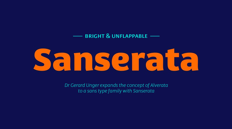
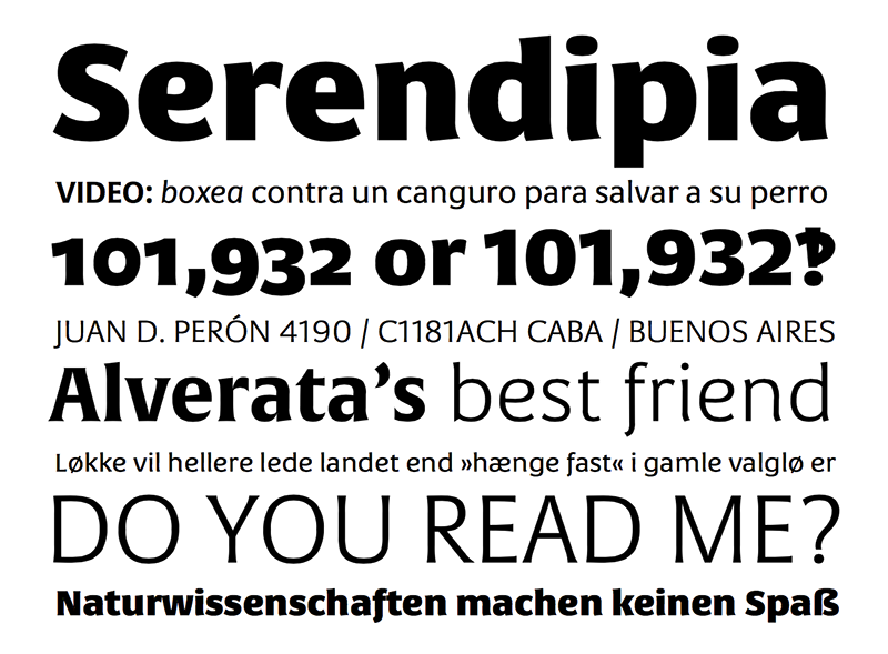
Sanserata ist die neue Schrift von Gerard Unger, welche kürzlich bei TypeTogether erschienen ist. Sie ist das glatte serifenlose Gegenstück zur Alverata. Sanserata ist gut lesbar und eignet sich zudem hervorragend für Webanwendungen aufgrund ihrer großen x-Höhen und geringen Überlängen. Sie ist ab 422,- Euro bei TypeTogether erhältlich.
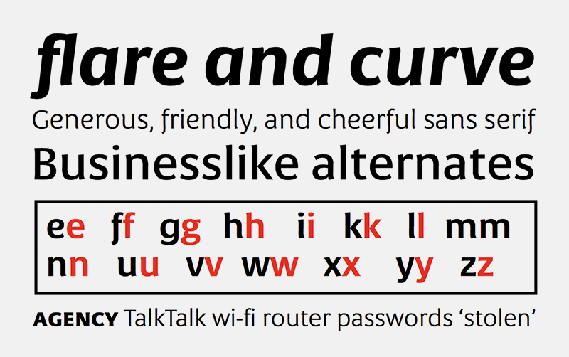
Gerard Unger expands the concept of Alverata to a sans type family with Sanserata, adding particular characteristics which improve reading. Sanserata’s originality does not overtly present itself at text sizes. Rather, at those sizes, it draws upon its enormous x-height, short extenders, and articulated terminals to improve readability, especially on screens. Characters flare and curve as they come to their articulated end, but a reader likely wouldn’t notice. What they would notice is that their ability to take in more content in a line of text is improved because the lettershapes are more defined. Articulation also helps to get clearer text from digital sources, where rectangular endings tend to get rounded by the emission of light from the screen.
Lately there seems a whispered discontent with the lack of progress in the sans serif category. Designs can either stretch too far beyond what is accepted or be too bland to be considered new. Sanserata’s strength is in being vivid and unique without being off-putting. This bodes well for designers of paragraphs and of styles & scripts branding schemes since, with Sanserata’s two flavors, it is well able to capture attention or simply set the tone. Sanserata’s first voice is a generous, friendly, and even cheerful sans serif. But when using the alternate letterforms its voice becomes more businesslike, though still with nice curves, generous proportions, and a pleasant character.
Sanserata
Designer: Gerard Unger
Foundry: Typetogether
Veröffentlichung: Dezember 2016
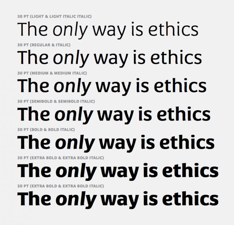
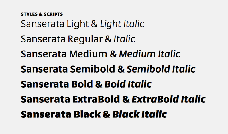
Schnitte: Light, Regular, Medium, Semibold, Bold, Extrabold, Black plus Italics
Preis Schriftfamilie ab 422,- Euro
Buy
