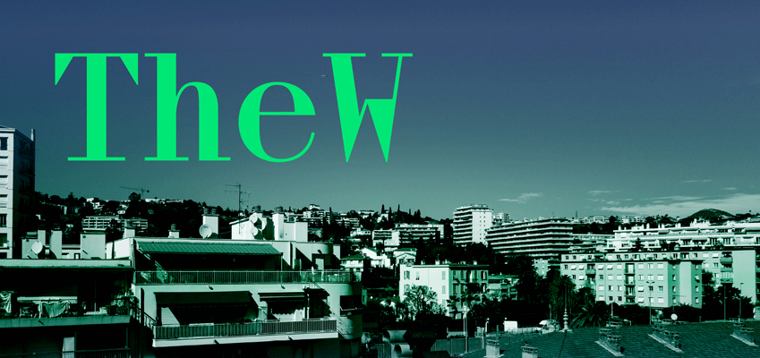
TheW
Swiss Typefaces präsentiert den ersten Schnitt ihrer neuen TheW Clan Familie. Diese Headline-Monospace Schrift gesellt sich zu den bereits existierenden Regular und Italic Schnitten der TheW NYC, einer gebändigten Version mit proportionalem Spacing und guter Lesbarkeit. Die TheW ist eine einzigartige, revitalisierende Interpretation des Didot-Genres. Schaut sie euch doch hier gleich mal an.
TheW Clan RZA
Foundry: Swiss Typefaces
Veröffentlicht: Mai 2017
Styles and weights: TheW Clan RZA
Preis: 50 CHF
Preis Familie: 110 CHF
Buy
TheW Clan RZA is the first style in an upcoming series of various TheW Clan (Headline fonts). This monospaced font is accompanied by TheW NYC (Regular and Italic), a slightly tamed-down pair with standard proportional spacing for greater readability.
TheW is an unique interpretation of the Didot genre. It revitalizes the conventional model with highly novel elements. Letters such as ‘C’, ‘O’ and ‘N’ follow the logic of a traditional Didot with straight serifs. Even the triangular top serif on the lowercase ‘l’ doesn’t deviate much from the historic rounded Didot. While the middle bar of ‘E’ is typically designed as a fine line with a triangular terminal, we transformed the black values of this letter part into a bare bold line. The ampersand (&) is designed completely outside a pen-derived logic of thick and thin strokes. It generates a contrast of its own, with an undogmatic weight distribution that simply works. ‘G’ is drawn in a rather brutalist fashion. Its pointed beard has just the right amount of black. The high center of ‘M’ is derived from monospaced typefaces and introduces a very special temper.
TheW NYC (text styles) were initially developed for Sport&Style magazine under the creative direction of designers Régis Tosetti and Simon Palmieri. We responded to their needs by creating a Didot variation that is very flexible — a conventional one would have been too mechanical. The condensed proportion as well as most serif endings of the uppercase letters were retained. For the use in text, it was crucial to establish the right rhythm within the lowercase. The ‘e’ became asymmetrical, breaking the verticality of a traditional Didot.
We kept the straight-line serifs at the bottom of the letters. For the top, however, we opted for triangular serifs. This further disrupts the linear effect of an old-school Didot. Some letters like ‘f’ were adjusted for greater readability. Simon and Régis asked for an italic, too, so we drew it. The outcome is a hybrid Didot-styled italic.
As a typeface for text, one might expect that TheW NYC featured a ‘g’ with a more conventional weight distribution. We preferred to maintain the unique placement of the black as seen in the monospaced style, though. Once this design decision was made, this maverick ‘g’ allowed us to apply a similar treatment to the figures ‘3’ and ‘5’, among other glyphs. Some letters in TheW were shaped solely by playfully pursuing a certain black value. This playfulness was integrated into the design logic of the typeface.


