Type Essentials for Graphic Designers – part II
This essay about the early days of digital type design was produced by Pixartprinting and written by Borys Kosmynka. We are going to release this awesome story in three parts. Please check the third part next Tuesday here on our blog at Facebook.
Ikarus system—the beginning of curves
The software that made it possible for encoding drawings as strings of ones and zeros, instead of manually turning on and off every pixel was named Ikarus. It was developed by the URW company in Germany in the early 1970s. Dr Peter Karow, co-founder of the company, was one with tremendous contribution of allowing the system to work with mathematical calculations of splines definitions. This meant that type was defined as curve shapes rather than just pixels which addressed the problem of bigger sizes. Ikarus was used to create digital typefaces as well as logos and signage. Three main problems to make type design widely available were the price of software and hardware and the complexity of use. Despite having a rather short moment of glory, Ikarus development left us with the interpolation. It was a base for later Multiple Masters technology as well as Variable fonts. The first public reveal of the Ikarus project took place in Warsaw during the 1975 ATypI conference.
Matthew Carter—Bitstream was when it started getting serious
Digiset and its variations were used until the introduction of the first Apple Macintosh in 1984, which brought typesetting to desktop publishing. The introduction of digital typography created a whole new range of possibilities and, of course, a tremendous need for the type design community to fill the void in the new market. In 1981, the first independent type foundry was established by Matthew Carter and his colleague Mike Parker. That startup, Bitstream, aimed to liberate designers from the realm of monopoly by machine industry corporations such as Monotype and Linotype. It was a turning point in typographic history, as the corporate approach to the digital realm revolved around the rapid delivery of familiar type solutions to the desktop platform in great numbers. This resulted in poor quality digital designs and repeated problems in further type design in general—we’ll come back to that a little later.
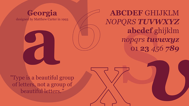
Matthew Carter, studied punchutting, made letters for a variety of different medium and is a designer that is very much complete in terms of his skills and career, Georgia is a classical typeface created with the new technology prepared for screen display.
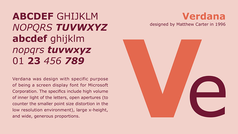
Bitstream digitally reproduced a wide range of classical, well known typefaces and released them under different names. Although not illegal, this practice caused a lot of controversy. Famously, Matthew Carter is one of the few type designers that has participated in the process of design using a wide range of technology. He studied punchcutting and produced his own punches, created typefaces for phototypesetting machines, designed type to be cut in wood, and pioneered digital type design for desktop computers. His designs include two of the most widely used typefaces in the world—Verdana and Georgia.
Verdana is one of the most widely used typeface on the planet. The reason is the language coverage. The concept was to design a screen typeface with maximum character legibility, that would survive extremely low resolution screens.
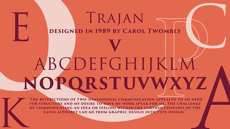
Trajan is a project that celebrates and honours one of the best achievement of our era—the Roman Capitals. It was sketched and designed by Carol Twombly—a type designer of brief, but amazing career.
Sumner Stone, Robert Slimbach, and Carol Twombly—type design in its prime
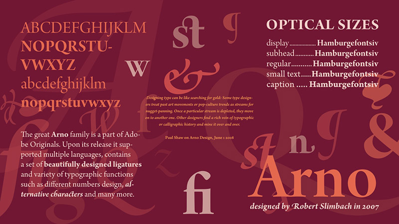
In the early 1990s, type design became more available to designers. Software tools accompanying hardware allowed for a wide range of possibilities and offered accessibility to those wanting to create their own designs. The number of solutions on the market grew exponentially. There are three more important names to mention at this point: Sumner Stone, Robert Slimbach, and Carol Twombly. Stone was the first director of typography at Adobe. He started the Adobe Originals “To create typefaces of extraordinary technical and aesthetic quality”) while hiring Robert Slimbach and Carol Twombly in 1989. The program aimed to create timeless designs of the utmost quality both technical and aesthetic. Another major contribution of Sumner Stone was the Multiple Master technology). It was based on the interpolation algorithm created by Dr. Peter Karow and built on it to interpret the interpolation onto the desktop publishing. Few of the designs from the initial period include: Caslon (Twombly), Myriad with its serif counterpart Minion (Twombly and Slimbach), Trajan (Twombly), Arno (Slimbach). It is important to add that Slimbach and Twombly were not the only designers that contributed their work to the program and that it is still ongoing to produce a legacy of beautiful lettershapes.
Arno Pro family by Robert Slimbach is a very modern yet classical desing. It has multiple extra features such as a set of optical sizes, a huge ligature collection and multiple options for numbers edition.
Font Wars—the dark side of the industry
To fully understand the transition from those early years in digital lettershapes to the abundance of typefaces today, one must be aware of the standards that changed over the years in what the industry called the “Font Wars.” Adobe based their releases on the adapted PostScript system. It defines typefaces and images as objects on a page. Adobe used the system to introduce PostScript Type 1. The significance of the standard is that it defines the lettershapes as outlines calculated as Bézier curves. Since Adobe had exclusive rights to this technology, Apple and Microsoft had to pay high licensing fees for the application and struggled to come up with an alternative of their own. In September 1989, TrueType (.TTF) was released. Meanwhile, Adobe offered a tool called Adobe Type Manager (.ATM) that had its own font format. While TrueType was created by Apple in collaboration with Microsoft, Apple independently developed the technology further and came up with QuickDraw GX. In response, Microsoft sided with Adobe to develop the OpenType font format (OTF). OpenType fonts began being released around the year 2000. As TrueType required advanced and detailed work to release a good quality product, it resulted in numerous examples of poorly designed typefaces and a reluctance to use it the format. Between 2005 and 2007, OpenType was adopted as a standard by the International Organization for Standardization (ISO). OpenType consists of four elements that come together as a font: outline description, hinting instructions (the way that the outline is pixelated on the screen in various sizes), tables for character classification, and extra features like substitution with alternate glyphs (including ligatures and numerous other possibilities).
