Typeface of the Month: Folha Grafico / Folha Texto
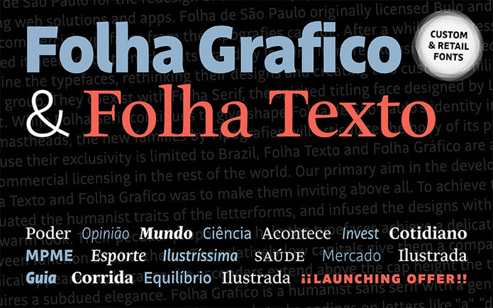
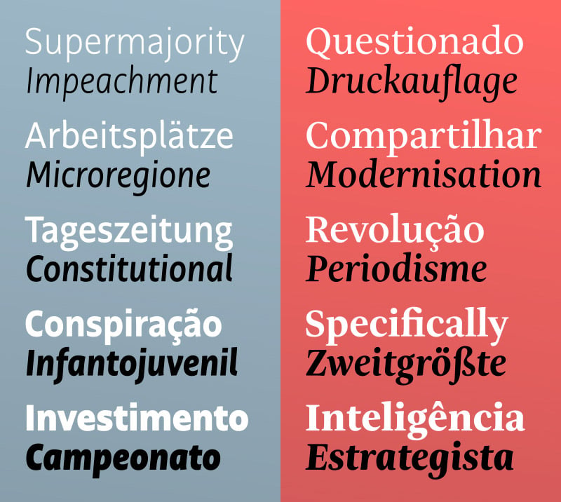
Folha Texto und Folha Grafico sind zwei neue Schriften, die exklusiv für die brasilische Presse-Gruppe Folha de São Paulo entwickelt wurden. Im Doppelpack werden jetzt die Sans Serif und die Serif für das Redesign ihrer Zeitungen, Magazine und anderen Medien sowie in Web- und App-Anwendungen eingesetzt. Gestaltet wurden die beiden Schriften vom spanischen Schriftdesigner Jordi Embodas, der seine Schriften unter dem Namen Tipografies vertreibt.
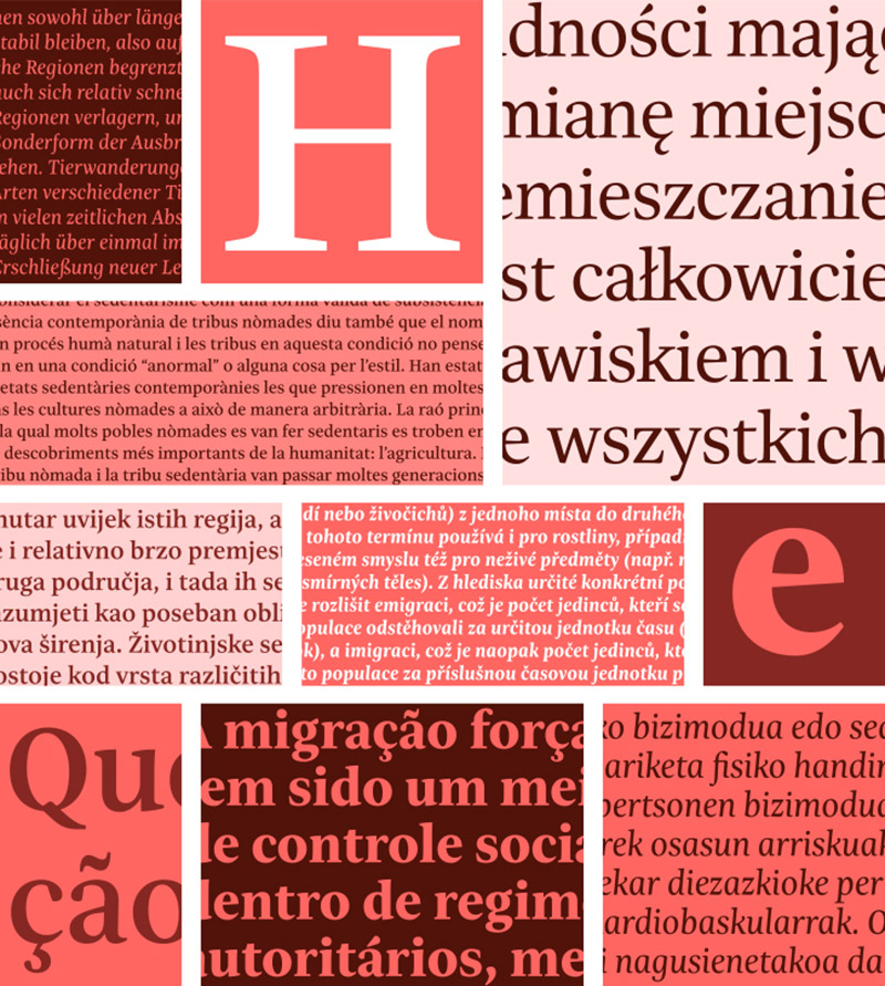
Folha Texto and Folha Grafico arbeiten als perfektes Team für den Einsatz in textlastigen Bereichen zusammen und sind durch die aufwendig durchdachten x-Höhen auch für den Einsatz in kleinen Punktgrößen angepasst.
In Brasilien dürfen sie nur exklusiv von der Presse-Gruppe Folha de São Paulo genutzt werden, können aber ab jetzt auf der restlichen Welt frei eingesetzt werden. Habt ihr also endlich die passenden Arbeitstiere für eure neue Veröffentlichung gefunden?
The serif and sans serif companions Folha Texto and Folha Grafico are two new co-ordinated type families from Tipografies. They were commissioned by the Brazilian press group Folha de São Paulo for the redesign of their newspapers, magazines, and other media, including web solutions and apps. Folha de São Paulo originally licensed Bulo and Trola Text, both commercial typefaces from the Tipografies catalog. After a while, the press group realised it needed to strengthen its brand by lending it more exclusivity. This led us to examine the typefaces, rethinking their designs and creating two custom families for the press group. They coexist with FolhaSerif, the spirited titling face designed by Luc(as) de Groot. While FolhaSerif continues to give shape Folha de São Paulo’s identity in headlines and mastheads, the new families by Tipografies will articulate the body of its publications. Because their exclusivity is limited to Brazil, Folha Texto and Folha Grafico are available for commercial licensing in the rest of the world.
Our primary aim in the development of Folha Texto and Folha Grafico was to make them inviting above all. To achieve this, we accentuated the humanist traits of the letterforms, and infused the designs with a friendly and warm look. Their peculiar proportions help the typefaces achieve a delicate balance between function and aesthetic. The relatively low capitals give them a compact and economical appearance; because the ascenders extend above the cap height the type design acquires a subdued elegance.
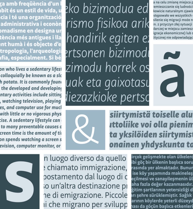
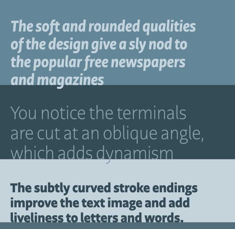
Folha Grafico is a humanist sans serif with a generous x-height and open apertures. The subtly curved stroke endings on letters like “a”, “d”, and “k”, and the little flick at the bottom of the “l” improve the text image and add liveliness to letters and words. When examining the design in detail, you notice the terminals are cut at an oblique angle, which adds dynamism to the typeface. Moderate ascenders and descenders and a narrow width allow for a maximum amount of text on a limited surface, a much sought-after quality in editorial design. Together with the very low contrast, it helps the design maintain its balanced, airy appearance. The true italics have a moderate slope, with condensed features that recall classic mid-century English and Dutch type designs. They complement the upright styles with just the right amount of differentiation. The combination of these characteristics turn Folha Grafico into a workhorse sans serif that is economical and highly legible at the same time.
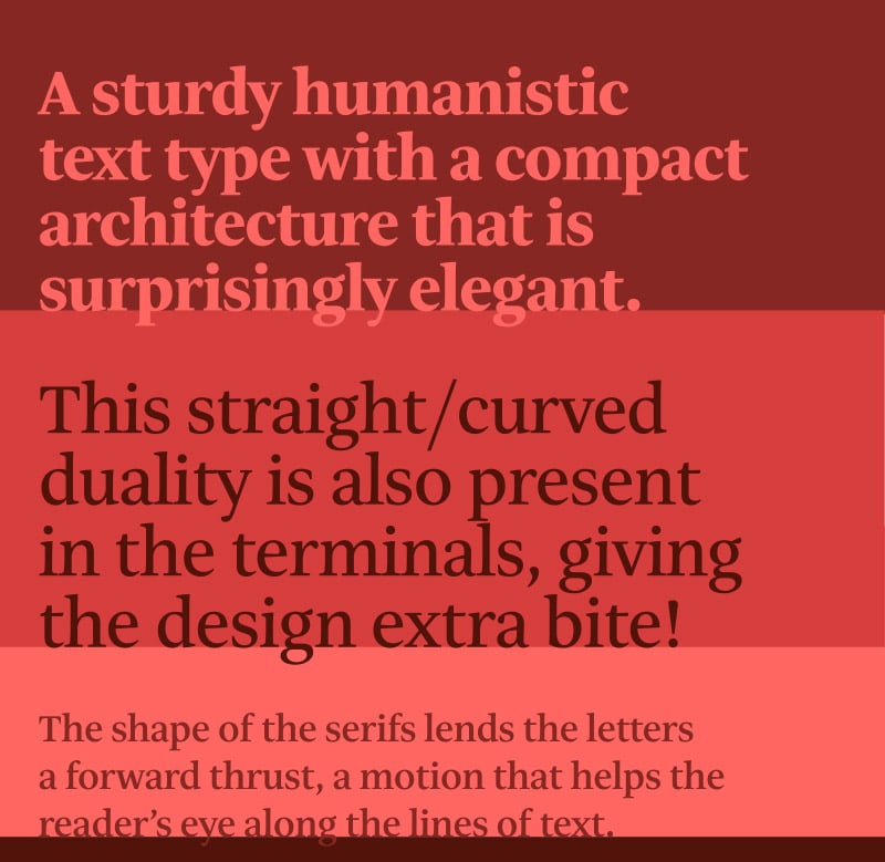
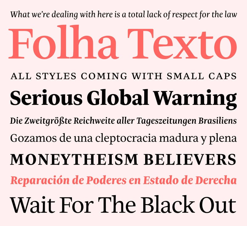
Folha Texto is a true news face, a sturdy humanistic text type with a compact architecture that is surprisingly elegant. Similar to Folha Grafico, it has moderately sized capitals and a large x-height that make tight typesetting possible. The typical structure of the serifs—curved on the outside and straight on the inside—serves a dual purpose. It introduces a gentle calligraphic elegance to the design, while freeing up the open counters even more. The shape of the serifs lends the letters a forward thrust, a motion that helps the reader’s eye along the lines of text. This straight/curved duality is also present in the terminals, giving the design extra bite. The italics have a lovely flow, and are spirited counterparts to the upright styles. The markedly calligraphic nature of characters such as the “k”, “v”, “w”, “y”, and “&” add a liveliness to the italics that is reinforced by the barely noticeable downwards kick in the bottom arm of the “E”, “L”, and “Z”, as well as the characteristic tail of the “Q”. All these factors, combined with the low, barely sloped contrast, make Folha Text a multi-purpose serif face that shines in medium to small sizes.
Folha Grafico and Folha Texto offer a singular blend of classic and contemporary style. The soft, rounded qualities of the design give a sly nod to the popular free newspapers and magazines. Both families offer an alternate single-storey “a” and “g” for a more convivial, almost schoolbook-like look. The typefaces come in five weights from Light to Black, all with matching italics. Those weights were harmonised for optimal compatibility between the serif and the sans serif families. All the fonts are outfitted with small caps. The extended character sets cover Latin Extended, and include alternate characters, several sets of numerals, and additional ligatures.
Folha Grafico / Folha Texto
Foundry: Tipografies
Designer: Jordi Embodas
Release: March 2018
Format: otf, eot, svg, woff, woff2
Weights: Light, Regular, Medium, Bold, Black plus Italics
Price: 35,– Euro/Style, 175,– Euro/Family
Buy
