Typeface of the Month: Rektorat
Nouvelle Noire
Every day numerous, interesting fonts are published—as Slanted editors we welcome this variety very much, however, would like to pronounce our readers from now on also a monthly recommendation. With the font Rektorat by Nouvelle Noire we start our new series “Typeface of the Month,” in which we present you at the beginning of each month a new release, which we like very much. Here we go!
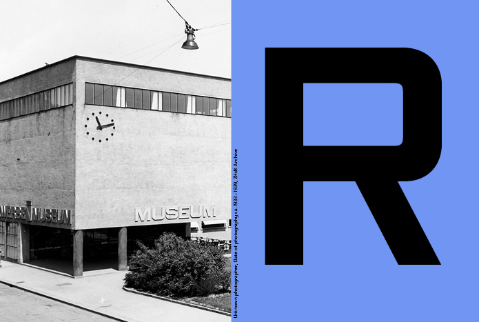
The font family Rektorat is inspired by the early modern age. The forms of Rektorat are based on the lettering drawn after 1933 for the building of the Kunstgewerbeschule Zürich (now ZHdK) and the Museum für Gestaltung.
Before the completion of the renovation (2001) of the school of arts and crafts (a building from the time of the New Building), Rudolf Barmettler, lecturer for typography and writing, was asked whether he could derive any inscriptions such as “toilet ladies,” “toilet gentlemen,” “changing table,” “gallery,” “smoking zone,” “delivery,” “no passage,” etc. from the few existing information boards from earlier, which were attached in the main building, and supplement them to the existing ones: This request was a welcome challenge for the typography classes.
Barmettler worked with students from the Visual Design Department to create a reconstruction based on fragments that came to light during the renovation of the wallpaper. First, the remaining letters were traced in pencil on transparent paper. A selection was transferred with opaque paint and ink.
The aim was to design an alphabet in capitals, common letters, numerals and punctuation for use in the building. In 2002, a further development of this typeface took place in his lessons at the F+F design school. One year later he developed a lean, a normal and a bold typeface in three different widths together with students.
Reinhard Haus, with whom he operated the font module at F+F, later helped him to expand the students’ final artwork with “Fontographer.”
The result was two variants—one was called “Text Font,” the other “Display Font”—from which they created nine weights each. In the phase of the first digitalization their working title was “Square.” Unfortunately, the 18 cuts could never be finalized.
Since 2014 Rudolf Barmettler, together with Anton Studer, has been fundamentally reworking this typeface, which had never been finally realized before. All signs were redrawn, the proportions redefined, the inner forms fresher aligned and the radii in the curves refined. Many characters have been completely modified, punctuations and accent symbols newly developed. In addition, the character set was supplemented by various ligatures, some alternative characters and a tabular number set.
Thus the font family “Rektorat” was created with seven strengths in two style variants. These fourteen weights form the beginning of a planned clan.
Rektorat
Foundry: Nouvelle Noire
Designer: Prof. Rudolf Barmettler, Anton Studer
Release date: March 2018
Format: otf, woff, woff2, eot
Cuts: Cuts: Hairline, Hairline Re, Thin, Thin Re, Light, Light Re, Regular, Regular Re, Medium, Medium Re, Bold, Bold Re, Heavy, Heavy Re
Trial fonts can be found here.
