tat*
Inspirational Graphic Ephemera
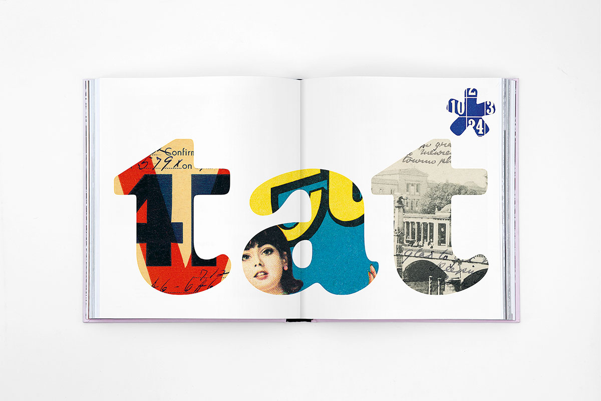
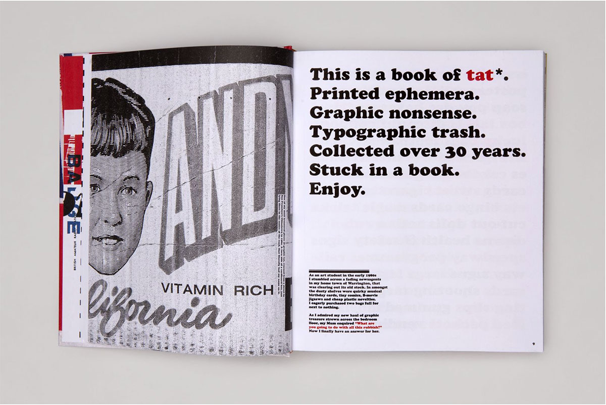
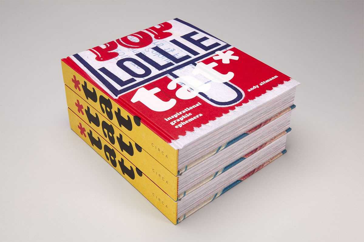
tat* — Inspirational Graphic Ephemera is a bit of a graphic designer’s curse. Walk into any design studio and you’ll see bits and pieces of graphic ephemera pinned to the walls or taped to a computer screen. Even the purist will have a secret cache hidden away somewhere. Designer Andy Altmann has been collecting tat for more than 30 years. He finds inspiration in the ordinary, and magic in the mundane. Finally he has decided to share his collection with the world. Conceived and edited by Andy, this is the apotheosis of tat. A visual treasure trove, full of surprises, it should find a place on every graphic designer’s desk.
Andy Altmann is a founding partner at Why Not Associates, one of the UK’s leading multi-disciplinary design companies. Although he trained as a graphic designer, Andy’s work typically blurs the boundary between design and art. His projects range from exhibition design to postage stamps, via advertising, publishing, television titles, commercials, corporate identity, and large-scale public art. The common thread is a fundamental love of typography, research, and experimentation.
As a student, a decision to present a scrapbook instead of a sketchbook for his interview to St. Martin’s School of Art, was the catalyst for starting his collection of tat: “I rummaged through the drawers at home and found some football cards from the 60s / 70s (plenty of Georgie Best), an instruction leaflet from an old Hoover, Christmas cracker jokes … Then I started on the magazines, cutting out images of anything that interested me … and photocopied things from books before reaching for the scissors and glue.”
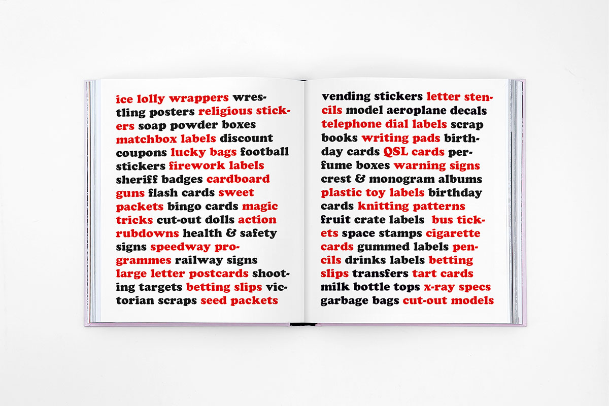
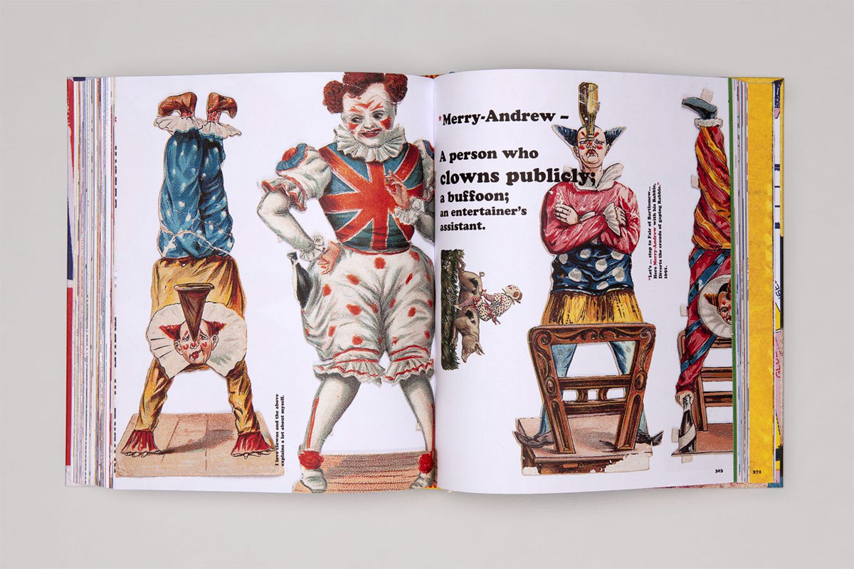
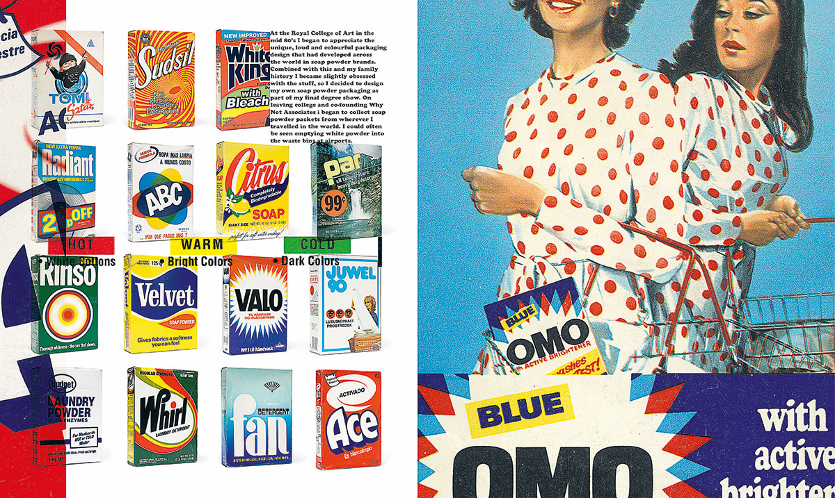
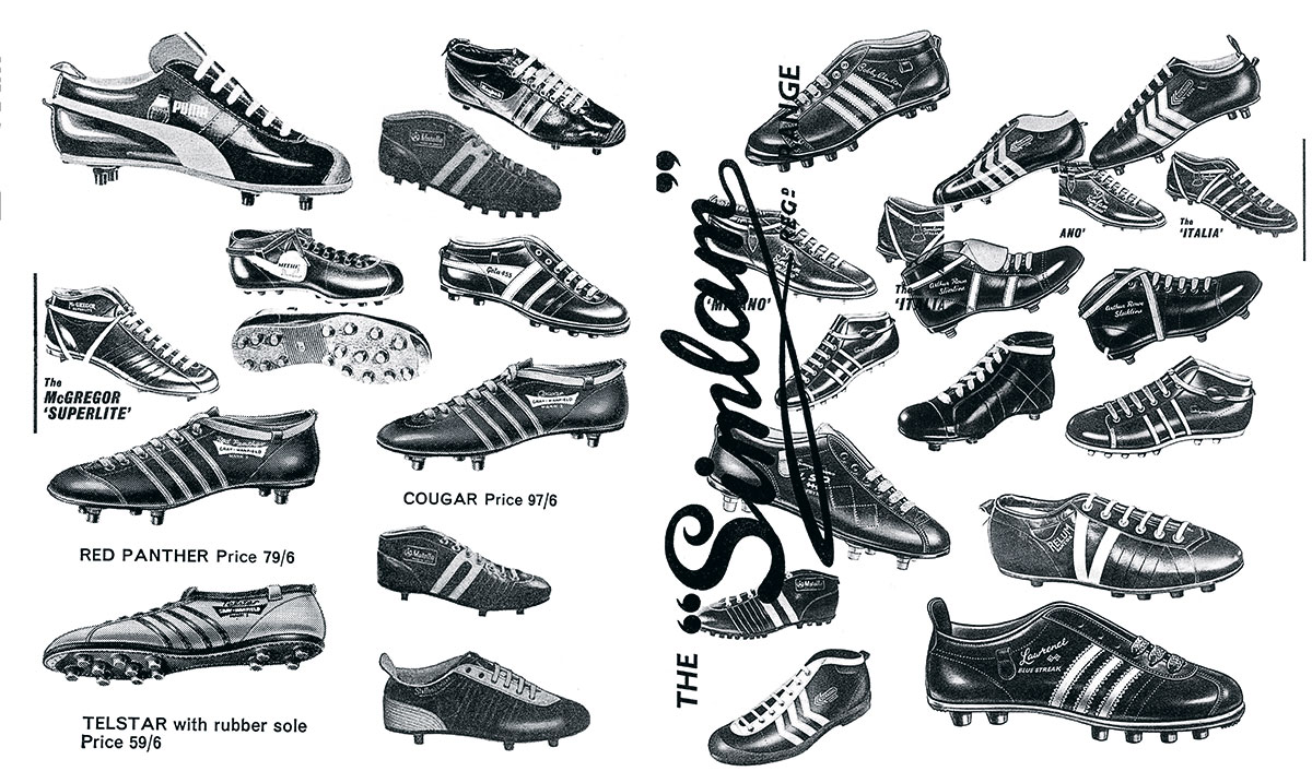
It was the beginning of a significant collecting habit that he has maintained ever since. So what is it that makes a piece of graphic tat interesting? Is it the ‘retro’ thing—a fascination with a bygone age, the primitive printing techniques, naivety of the design or use of color? All of the above of course, but it’s never quite that simple. It has to have that indefinable element of magic. To a graphic designer, most of this book could safely be regarded as ‘bad’ design. But there is something special in each and every piece that made Andy pick it up off the street, trawl online or enter a dodgy looking shop on the other side of the world to snap up. You’ll find everything from sweet wrappers to flash cards, soap powder boxes to speedway flyers, wrestling programs to bus tickets. More tat than you can shake a stick at. Taken together, it represents a lifetime of gleeful hunting and gathering.
tat* (noun)—anything that looks cheap, is of low quality, or in poor condition; junk, rubbish, debris, detritus, crap, etc.
tat* — Inspirational Graphic Ephemera
Publisher: CIRCA PRESS
Release: April 2021
Author & Designer: Andy Altmann
Volume: 400 pages
Format: 25 × 21 cm
Language: English
ISBN: 978-1-911422-27-3
Price: £ 45.–
Buy
