Zeitgeist is an independent coffee bean manufacturer. They adopted a vertical sales concept and directly packaged and mailed coffee beans from the…
The Zeitgeist Coffee Factory Coffee Flavor Museum adopts a minimalist design concept, with typography as the main focus. In terms of packaging…
THE TEA TIPS hopes to help consumers maintain their daily tea drinking habits, using "THE" to emphasize products, every bag of tea…
A clean, modern and timeless design that challenges the norms of traditional chocolate brands. Break the convention of old pictures to express…
The back of the calendar tends to face the wall. When trees grow, everything turns inward, and so do human beings. Trees…
To ensure easy recognition and understanding for diverse language groups, the brand has adopted a multi-language design strategy incorporating Japanese, Chinese, and…
Digital art is rapidly transforming how we perceive the world and reshaping our interaction with art itself. The design's core, built from…
At the core of the design lies a letter of interconnected dots, each rendered in a bold and vibrant hue. These dots,…
This design for the Congress presents a vibrant and playful reimagining of the alphabet, inviting us to explore a world where communication,…
Each dots representing a distinct voice, a unique perspective, and a different language. These dots, scattered across the canvas, symbolize the unity…
Drawing inspiration from late Art-Nouveau typefaces, the likes of De Vinne and Louis Jou (alongside a healthy dash of alien goo), Jérémy…
These lines, symbolize the interconnectedness of art and design, the collaborative spirit of the festival, and the web of creativity that binds…
In life (and in font design), we are confronted with a choice our survival depends on. NaN Tresor’s designer, Christoph Koeberlin, for…
Visual identity for the 11th edition of the LGBTQIA+ community festival "Równe Prawa do Miłości" (Equal Rights for Love) held in 2017…
Artificial Type Design explores the possibilities and impacts of AI in typography. Will algorithms soon take over the work of creative professionals?…
I`m attaching a poster on which I show my sharp font, which I tried to convey the pain, anger and rage that…
The font conveys the idea of fireworks. Just like fireworks that spread out from a central point and become more detailed as…
This font was created with a self-made tool. Take an unbalanced motor // Glue it to the cap of a spray can…
Slusalke is one of four experimental typefaces that were created with typographic apparatuses. Typographic apparatuses are experimental objects with movable parts that…
Chelas nha Kau, means: Chelas my place. The entire visual identity for the film, communication supports and title design was taken from…
Typeface made with collages of pieces of glasses created in Ai. The poem composed with drawn letters is part of a poster…
Out.fest is an Exploratory Music Festival that takes place in the city of Barreiro. This year's edition is based on typographic exploration…
Vinyl edition by artists who recorded music on magnetic tape under the Iron Curtain between 1979 and 1990. The typographic work for…
Title for an exhibition at Works/San José, an experimental community art space, depicting the stresses on ecosystems. Fresh (green) and dried dead…
Upcoming Events
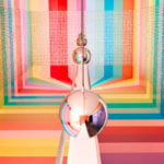
26.09.2024 –
31.12.2025
RÅW
Trapholt Museum of Modern Art, Kolding, Denkmark
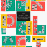
22.02.2025 –
11.05.2025
Der Palast des typografischen Mauerwerks
Museum für Angewandte Kunst, Frankfurt am Main

01.03.2025 –
30.04.2025
Mut zur Wut 2025
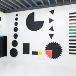
09.04.2025 –
29.04.2025
Collective Cosmo: SET v.26
Gallery of the HBKsaar, Keplerstraße 3-5, 66117 Saarbrücken
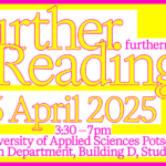
25.04.2025 –
25.04.2025
Further Reading Symposium
University of Applied Sciences Potsdam, Potsdam, Germany
01.05.2025 –
04.05.2025
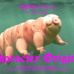
21st Pictoplasma Conference
silent green Kulturquartier, Gerichtstraße 35, 13347 Berlin
08.05.2025 –
10.05.2025
DIVE’25
Fat Cat in Munich, Germany
08.05.2025 –
10.05.2025
OFFF Festival 2025
Disseny Hub, Barcelona, Spain
09.05.2025 –
01.06.2025
Design Month Graz 2025
Graz, Austria
10.05.2025 –
18.05.2025
munich creative business week 2025
Munich, Germany
31.05.2025 –
31.05.2025
TypeParis Now 25
Novotel Paris Vaugirard Montparnasse 257 rue de Vaugirard , Paris
06.06.2025 –
06.06.2025
CXI Conference 2025
Bielefeld, Germany