This work is my typographic experiment. I searched for a balance between decorative and functional typography. The current look was an accidental…
We are exposed to a flood of information. Constant sharing and copying takes this information out of context and changes it. This…
Split Flap is a charismatic, variable Grotesk with sweeping terminals, a high x-height and minimal descenders. It’s the result of research into…
During this summersemester I designed a pixelfont called "Mosaik". Inspired by my trip to Morocco and Portugal I wanted to create a…
Every day, we read hundreds and thousands of characters from the Latin alphabet. But when do we ever take a closer look?…
My experimental typography series deals with different feelings. Each feeling shows its weight, its interweaving and its strength. The typography is created…
The author analyzes how the distinctive, uniform structure of monospaced typefaces shapes the visual and communicative impact of selected posters. By exploring…
An ongoing series of type posters announcing the 6 guests for the annual communication design workshops and talks of the design department…
Schlegel Kultur Club, located in the basement of the former Schlegel Brewery, hosts regional and international artists in Bochum. Through concerts, listening…
The font “Type Treasury” was created in a dialog between Fanny Liebhardt and Tessa Darimont. Using a sticker set of simple geometric…
Radio (z)Onderdak is a creative workspace and radio show in Antwerp for homeless and undocumented people. Independent and focused on connection, they…
Propaganda, media censorship, and literature played the central role in the Russia-Ukraine war. As stances hardened, cultural bonds faded. Deconstructing and reconstructing…
A visual interpretation of Soliflore written by Iris Colomb, published in Colliding Lines’ anthology HOME which invited various designers and typographers to…
This typographic artwork, created with LEGO and printed by hand, features letter designs inspired by organic shapes. The project involved designing letters…
Visual interpretations of I Don't Feel Capable by Amber Renee and Exit Sign by Gem Blackburd published in Chronic Poetics, an anthology…
Iryna Baranova’s work for Ester Digital features blog article covers with a dadaist, experimental approach. The creative method, designed to produce covers…
A poster design for the Tea Break Collective x Yuliya Ra party and exhibition that took place in July at an arcade…
The Grill House Stencil font is a project dedicated to exploring alternative digital vector tools. While working, the designer tries to follow…
The graphic covers the process from the design of the font “angular” to the experimental typographic processing. It depicts the journey of…
Like appearantly a lot of people this year, i had the idea to create an iron-on bead font, but on a hexagonal…
"From Toys To Type" was an interactive installation that invited you to rediscover playful design. At the three stations of the triangular…
To promote the artist talk “The Code of Poetry”, the poster features the custom font from my on-going type making project, in…
To celebrate the launching of the website “symbolasflow.online”, the poster was created based on the idea: how to translate webpage into printed…
The poster was designed for a performance talk at REDCAT. The title is set in bespoke Chicano lettering with undeleted guides. This…
Upcoming Events
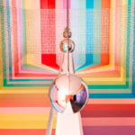
26.09.2024 –
31.12.2025
RÅW
Trapholt Museum of Modern Art, Kolding, Denkmark
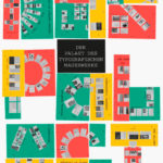
22.02.2025 –
11.05.2025
Der Palast des typografischen Mauerwerks
Museum für Angewandte Kunst, Frankfurt am Main

01.03.2025 –
30.04.2025
Mut zur Wut 2025
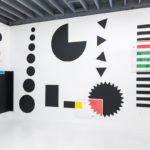
09.04.2025 –
29.04.2025
Collective Cosmo: SET v.26
Gallery of the HBKsaar, Keplerstraße 3-5, 66117 Saarbrücken
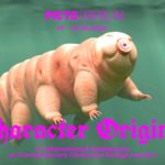
01.05.2025 –
04.05.2025
21st Pictoplasma Conference
silent green Kulturquartier, Gerichtstraße 35, 13347 Berlin
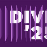
08.05.2025 –
10.05.2025
DIVE’25
Fat Cat in Munich, Germany
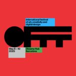
08.05.2025 –
10.05.2025
OFFF Festival 2025
Disseny Hub, Barcelona, Spain
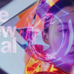
09.05.2025 –
01.06.2025
Design Month Graz 2025
Graz, Austria
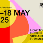
10.05.2025 –
18.05.2025
munich creative business week 2025
Munich, Germany
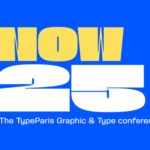
31.05.2025 –
31.05.2025
TypeParis Now 25
Novotel Paris Vaugirard Montparnasse 257 rue de Vaugirard , Paris
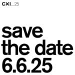
06.06.2025 –
06.06.2025
CXI Conference 2025
Bielefeld, Germany