Experimental typographic artwork to celebrate this year as a leap year. We only get one every four years!
Antiphony is a type family that explores typographic extremes and orchestrates commonalities through opposites. Antiphony is a dualistic system that challenges the…
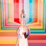
Affection (1) is a sculpture. It is made out of wire, concrete, plaster, acrylic paint and a reflective stainless steel plate, measuring…
YO, street style with the help of AI
Metabolic Type is a typography inspired by the Japanese architectural movement Metabolism. What would the movement be like if letters changed shape…
This experimental lettering is one of the results of visual experiments conducted for the "ARRIVEDERCI E GRAZIE" publishing project. It is a…
This experimental lettering is one of the results of visual experiments conducted for the "ARRIVEDERCI E GRAZIE" publishing project. It is a…
“unform actress” is a geometrically constructed typeface that tries to jump between classical latin and abstract forms. all letters are related to…
Analogously created letterforms were digitally captured and interpreted by an image-generating AI. Influences such as transparent foil, Y2K product design, X-ray images,…
A play on Backgammon, Snap!Gammon pushes the iconic format of the game into a new visual field and narrative. The starting point…
The workplace has evolved from an office cubicle, to the home. With the rise of prioritising self-care, work-life balance, and home office…
The designers created a number of bespoke typographic ‘BIKE’ tracks. The tracks were made into ‘rollergraphs’.
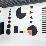
The letterforms form the squares themselves. The designers aimed for the type to be abstract, allowing it to be perceived as squares…
Custom font family developed for a narrative game. The different variations gave players a clearer understanding of how the conversation was shifting…
Lettering embossed by hand on re-used aluminium. This is time-wasting and inefficiency translated to the design process. An experiment and speculation about…
A poster for Thomas Sharp’s talk at The Typographic Circle about his adventures in writing. The words morph into each other -…
The font was developed as a means of displaying the written language of digital systems and algorithms that communicate without human participation.…
This typography for the music group Cachou, merges childish carelessness and adult audacity. Like a coloring overflowing with spontaneity. Each line represents…
"Space-Typeface" explores transforming flat letter forms into three-dimensional shapes. It emphasizes legibility and aesthetics in spatial and temporal dimensions. The project offers…
"Bubble Type" is a bilingual legibility spectrum exploring the transformation of letters from a liquid state to bubbles, pushing visibility and legibility…
A study investigating how the process of an analog material changing over time can affect Arabic/Latin letterforms.
solit is a sound-based writing system and typeface that bridges the gap between English spelling and pronunciation. It uses segments of Latin…
The project explores the experimental use of analog tools repurposed for new graphic outputs. A laser cutter was modified to act as…
We all sound like letters. Letters form into sounds, sentences, everything is very distinctive. AI helped create a connection in these worlds.
Upcoming Events
26.09.2024 –
31.12.2025
RÅW
Trapholt Museum of Modern Art, Kolding, Denkmark
22.02.2025 –
11.05.2025
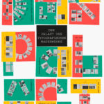
Der Palast des typografischen Mauerwerks
Museum für Angewandte Kunst, Frankfurt am Main
01.03.2025 –
30.04.2025
Mut zur Wut 2025
09.04.2025 –
29.04.2025
Collective Cosmo: SET v.26
Gallery of the HBKsaar, Keplerstraße 3-5, 66117 Saarbrücken
01.05.2025 –
04.05.2025
21st Pictoplasma Conference
silent green Kulturquartier, Gerichtstraße 35, 13347 Berlin
08.05.2025 –
10.05.2025
DIVE’25
Fat Cat in Munich, Germany
08.05.2025 –
10.05.2025
OFFF Festival 2025
Disseny Hub, Barcelona, Spain
09.05.2025 –
01.06.2025
Design Month Graz 2025
Graz, Austria
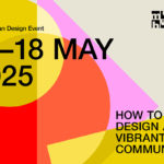
10.05.2025 –
18.05.2025
munich creative business week 2025
Munich, Germany
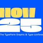
31.05.2025 –
31.05.2025
TypeParis Now 25
Novotel Paris Vaugirard Montparnasse 257 rue de Vaugirard , Paris
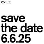
06.06.2025 –
06.06.2025
CXI Conference 2025
Bielefeld, Germany